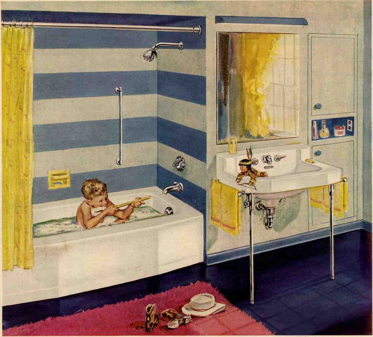
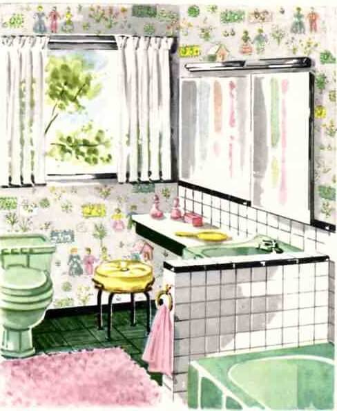
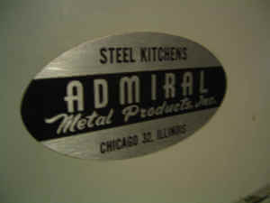
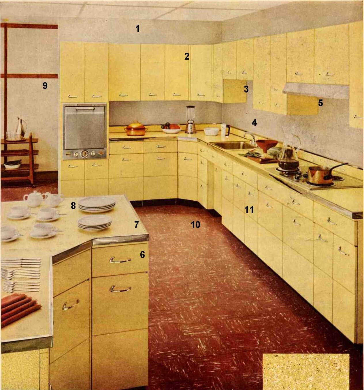
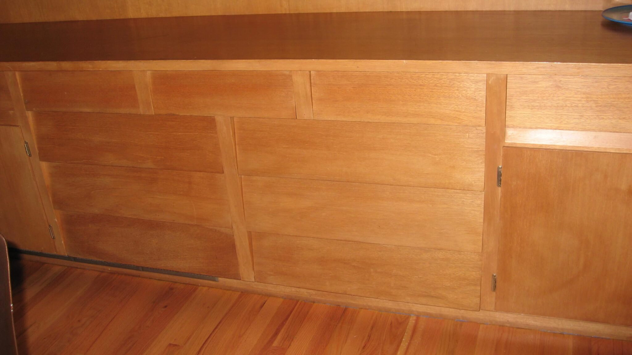
A 50s bathroom trimmed in two-tone blue

1953-kohler-bathroom-cropped.jpg

retro dark bright wedgewood tile by aoretro bathroom 50s blueWhat a lovely 1953 bathroom. If you prefer to go with white fixtures – tub, toilet and sink – but still want some classic retro flair, choose a 50s colored field tile for the shower surround and/or walls.

Blue tiles are fresh and timeless – I used the Olympia Tile Heron Blue in a bathroom, trimmed with white 2x6s. White floor, white fixtures and a wallpaper with additional soft green and 50s tile retro color olympia tile heron bluefaded cherry red that pulls it all together. Interestingly, I think it’s the retro styled wallpaper that takes the bathroom truly back to the 50s and in fact, it would be easy to change to wallpaper to dial the era up or down — with all the expensive basics like tile and fixtures not having to change.

So for anyone concerned about going too over-the-top retro (like, you’re concerned about resale) — such is the benefit of accessories, carefully executed. Another way to think about it: The more expensive the feature, the more conservative you may want to be.

In this Kohler bathroom, they’ve chosen just to tile the tub, so they added more design ooomph with a two color treatment. In the rest of the bathroom, I love the yellow punch, the great built-in storage to the right of the sink, and the dark gleaming floor.

A Mondrian kitchen for Anne and Gary?

1957 Mondrian kitchen

mondrian artanne and garys kitchenAnne and Gary’s 1959 ranch home in Oregon is a wonderful work in progress and I love checking in with their blog as they settle into their new old classic and continue to make it their own. Currently, they are planning a kitchen update. When I saw their existing kitchen and its layout, I thought immediately that it had “Mondrian” potential. Mondrian = color blocks, like the famous artist. This style had a following from about 1955-1965. Heck yeah there is more →

1953 storybook ranch home – envy strikes, bigtime!

I love my home and everything in it. But when I saw this house. OMG. This is what they call a “storybook ranch.” I suppose, for all the bric-a-brac trim… the mimicking of a Hansel and Gretel cottage. You think we are trying to relive the past with our kitsch? We have nothing on these people!

1953 storybook ranch home

1953 storybook ranch home yellow paintClick all photos to enlarge.

Note all the details – the mix of horizontal and vertical siding, the bracketed eaves, the decorative roof supports and the jutting roof line, the coach light, the shutters, the roof shingles and window ledges and different mullions on each window…and is that brick under the bay window? This design is all in the details! The living room is a 50s classic, too.

This just might be the most awesome 50s house of all time.

1953 storybook ranch home

Vintage bathroom tissue prints, mint in box – today’s ebay pick

vintage bathroom prints northern tissuevintage bathroom prints northern tissue

vintage bathroom prints northern tissue

vintage bathroom prints northern tissue
You know how everyone always posts comments about things that remind them SO MUCH of their childhoods? Well this one hit me right smack in the gut. Pastel prints of the adorable faces used on the toilet tissue! Mom, can you confirm – we must have used Northern?
sarah.jpgUpdate: Regular reader Sarah emails that she also has some of these at her etsy shop – check ‘em out. And look, I nabbed this awesome photo of Sarah!

Retro cabinet hardware for the Austins’ dream kitchen

1957-painted-wooden-cabinets_11.jpg

1957-painted-wooden-cabinets_2.jpg

amerockpull-bp76299-hb.jpgamerockpull-bp19303-rin.jpgamerockpull-bp76298-hb.jpg

amerockpull-bp76299-r1.jpgamerockpull-bp76298-r1.jpgamerockpull-bp19304-rob.jpgamerockhinge-bp3404-ac.jpgamerockpull-bp3401-ac.jpgamerockhinge-bp3406-ac.jpg

“Meet the Austins” recently linked to my site saying they liked one of my living room post illustrations. So, I dug up these two 1957 kitchens for them, too. What do you think, Austins?

Like so many other elements of postwar homes, these kitchens very often had a Colonial flair. The paint colors are like colonial Milk Paint. Also notice the colonial style ceiling lights, chairs, curtains and accessories in both photos. In reality, 50s painted wood kitchen cabinets pull can lean either colonial or modern, but for the Father Knows Best look, I’m a sucker for colonial.

All of these cabinet pulls are available from Amerock — a large manufacturer whose prices and quality are just fine.

amerockhinge-bp1600-cb.jpg<——-I also adore this hinge – it’s a wrought-iron strap-style hinge that you use to install a 3/4 overlay door onto a cabinet; you know, those thinnish birch or maple plywood doors so very common in postwar kitchens. Strip, prime with the best primer you can find, and paint the wood, install with strap/hinge, add pull in same shade of black iron. Very cool look.

Retro cabinet hardware, Amerock Crosley satin nickelRetro cabinet hardware, Amerock Crosley pewterRetro cabinet hardware, Amerock Crosley oil-rubbed bronze

Finally, Amerock also has several more modern style cabinet pulls worth considering — the first set of three Crosley pulls (just above) kind of a traditional steel cabinet pull… the second (below), getting closer to the famous yet elusive Youngstown chevron pull…the final (below, right), similar to a streamlined waterfall pull, sweet.

amerockpull-bp3415-26.jpgamerockpull-bp1394-26.jpg


A smoke gray palette for a retro living room

smoke-gray-living-room.jpg

smoke-grey-living-room-with-chinese-influence.jpgclick to enlarge both images

The smokey gray walls of the living room in a recent post on Chinese Ancestor paintings really struck me as gorgeous — and not something you’d really see a lot of today. The illustration above is from vintage materials – also really beautiful. It would be so easy to put this look together using colors straight from the Sherwin-Williams Suburban Modern palettes (both interior and exterior.)

Colors to experiment with to achieve these looks:

  • Classic French Grey
  • Pink Flamingo (maybe – for the coral)
  • Sunbeam Yellow (I also love New Colonial Yellow)
  • Fairfax Brown

Also note from the illustration:

  • A pair of chairs in your accent color – no matter what their lines — is always great.
  • Nice use of color inside the bookcases, and nice arrangement/variety of collections
  • Dishes on shelves pick up the bright accent color, coral, in a very pleasing and understated way
  • Pinch pleat, traverse rod draperies with upholstered valance in a large floral barkcloth tone down the formality of the room. So does the lamp – both are tailored, like the rest of the room, but with some whimsy
  • Black laquered tables keep your eyes moving, but they are not too big so it’s not overdone

Another timeless room — and a horse of a different color for those of you who don’t want….well, the stereotypically ”exuberant” 50s colors. Hi, Mary-Frances!