

It’s been a while since I did a Tuesday flashback kitchen design – only because I had so many other posts lined up. But I’m reviving them, because they are so much fun.
Holey moley, look at this pink Formica kitchen. I have to admit, I wanted a pink kitchen, not aquamarine. My husband won, and anyway, it was meant to be, because that’s the kitchen that found us. Even so, there is a super soft spot in my heart for this kitchen and others like this. Here are some flashback observations, starting at 10 o’clock:
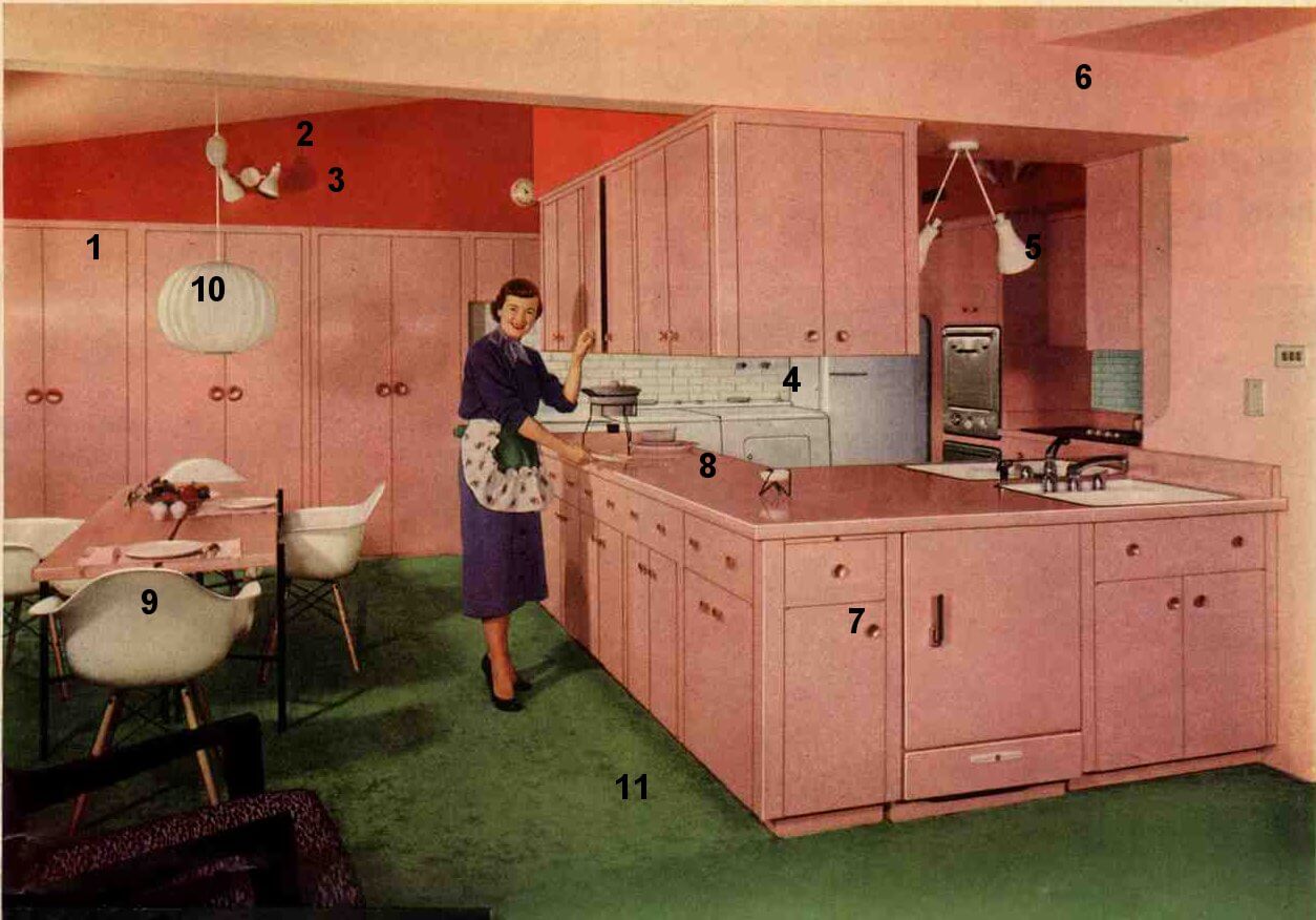
- If you have the space, built-in pantries are ideal. Notice how the soffit extends to enclose them. And how the pantries themselves create an enclosure of sorts for the washer and dryer. Fitted=50s.
- On the orange accent color: With such a dynamic cabinet color, the accent has to be strong, too, or it will disappear.
- I love this light fixture – very very modern, like the chairs and lamp. The “appliance white” repeats in the chairs, the lamp, the tile, and the appliances.
- I haven’t seen a lot of photos from this period featuring subway tile (vs. 4″x4″ tile). Here, the horizontality (word?) of the subway tiles contrast nicely with the verticality of the pantries. Also in this space, see the washer and dryer. There certainly was a move to convince women to do their laundry in the kitchen …. it didn’t work. Finally, this whole block of appliances is treated as one working “white space” and is a part of what keeps your eye moving around the kitchen.
- Notice the second light above the two sinks, same idea as the one above the pantries.
- The designer used the soffits throughout the room as a design element. This can be very important in kitchens. I’ll do more on soffits sometime soon.
- Notice the cabinet pulls. Is there a word for this style? They are awesome.
- Monotone countertops. Considering the strong orange and green accents, it works.
- Shell chairs are cool. Get authentic repro’s from modernica.net.
- George Nelson bubble lamp. Also from modernica.
- Green carpet – exact opposite of orange, on the color wheel. In fact, when you put together the pink, orange, green and white blocks, this kitchen takes on a Mondrian-esque color block feel.
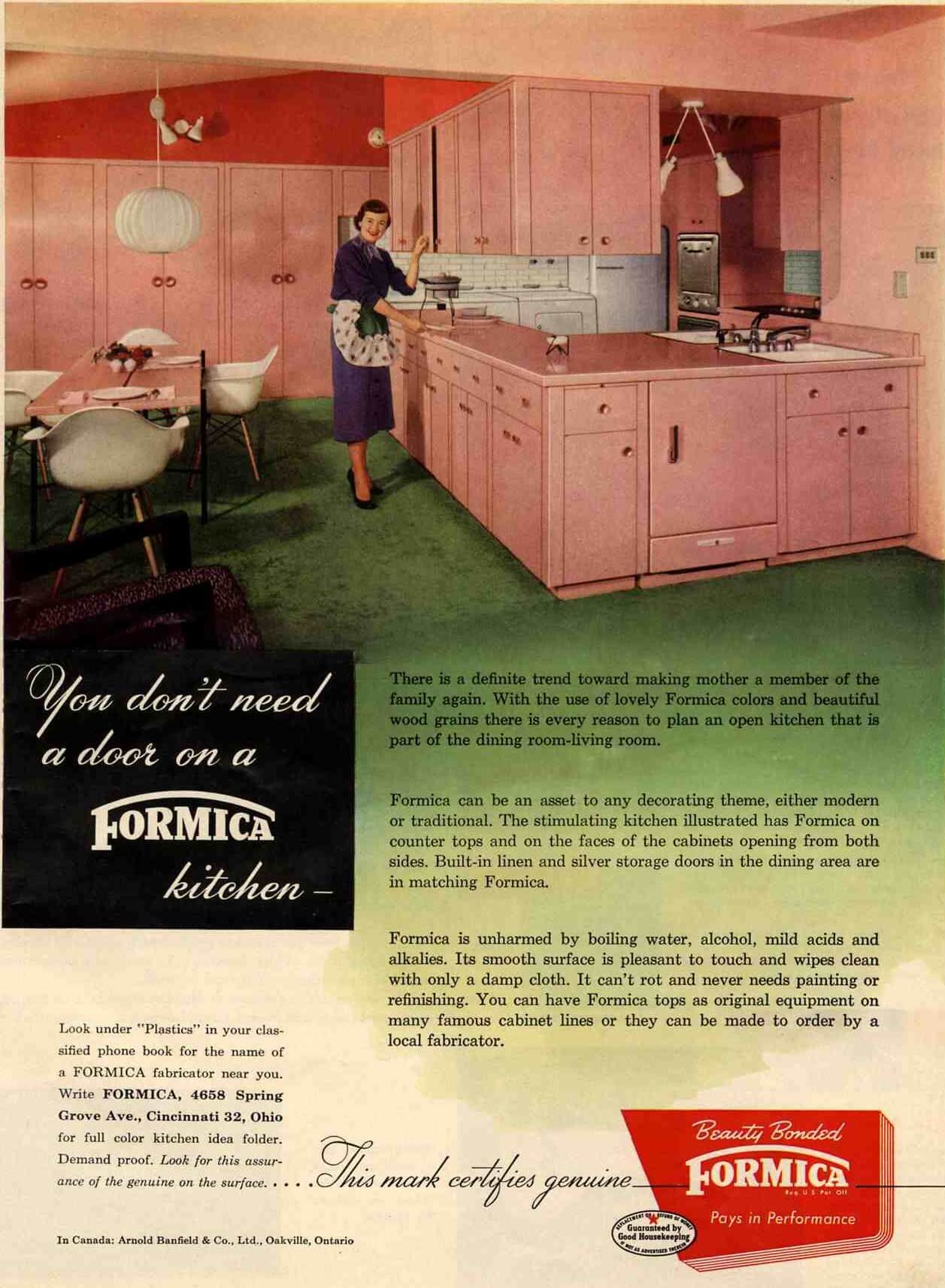
One more interesting note. As the 50s progressed, we really saw kitchens opening up to the other spaces, rather than remaining a separate room. “…a definite trend toward making Mother a member of the family again,” as the Formic ad says. Of course, the open concept kitchen is a trend that continues strong to this day. And mom not only made it back into the family, she is in the Board room, too!


Rita Grover says
I have several 1950’s appliances including a Maytage Dutch Oven Gas Range for sale and am looking for buyers. They are located in Wichita, KS. Are there companies out there who buy and restore these? I would appreciate a referral.
Pam Kueber says
Here you go: https://retrorenovation.com/2011/11/04/13-places-to-buy-restored-vintage-stoves/
Please note, no buying or selling here on the blog comments or it becomes chaos.
Kelly says
I don’t think that’s subway tile – I think it’s brick. Reminds me of my Gram’s kitchen and she had brick – actual white brick, not painted – behind the stove and on one wall that looked just like this.
linoleummy says
Eeew, dirty laundry in the kitchen! What is the countertop edging, wood ya think?
christi Harris says
One of the most unique features of this kitchen is the sink placement. Not a double sink, but single sinks used on separate sides of the counter. Get Daddy to help with the dishes? Most likely a “bar” sink.
Love it, thanks for sharing.
Joe Felice says
Pink was a popular color, but mostly for fixtures and appliances. Aqua metal cabinets were more popular, as I recall. Yellow was another popular color. Also, pink was preferred in the bathrooms. I guess the idea was to wake us up in the morning! Never heard the term “bulkhead.” Sounds like something left over from WWII. But the soffits (and I don’t think we called them that back then, either) were never closed in, except that lots of folks built custom cupboards up there with paneled doors. It was very popular to store things up there (especially our newly-invented electrical appliances), and also to have display dioramas — cats were popular, but you could display almost any knick-knacks you had.
50sPam says
Ok. I’ll say bulkhead. For you, Femme 1!
Femme1 says
No controversy here! Decorating is so subjective, it’s all just opinions, and each individual puts their own decorating stamp on the place where they live. Actually, those pitchers are the only place in my entire house where things are lined up!
(Oh, Sue, ball pitchers are those that are shaped like a ball—think the old Kool-Ade advertisements). Or look here: http://www.trocadero.com/gleem/items/159628/item159628store.html
The editor in me balks at using “soffit” instead of “bulkhead” (hee), but I admit I’m a little anal about precise terminology, because I’ve worked as a science editor for a long time. My husband gets rather annoyed with this.