

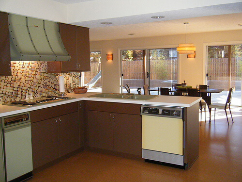
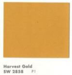
Alas, it has now become a cliche, this time of year, for all manner of manufacturers doing business in the color arena to declare their Color of the Year. As a result, I am now evolving to dislike this tradition — seems to me yet another way that marketeers are trying to convince the mass of America to dislike what they already have for grass that is greener (or purpler, or whatever). Nonetheless, I will give this a try for at least one more year. My annual Color of the Year selection is a bit of a different stripe: I like to show how colors of bygone days are just fine, very pretty, thank you very much. So, for 2014, our Retro Renovation Color of the Year is one of the most disparaged of vintage colors: Harvest Gold. I like this color very much. This is a wonderful color. Phlew on you, marketeers and interior design fascionistas, who try to convince us that harvest gold is h***** and d**** and must be banished in favor of (the baloney you are trying to sell us today). Above: Formica selected a harvest gold shade for both the walls and carpet in this 1966 advertisement. See how harvest gold plays so nice with others? Above: Maribeth’s kitchen came with a harvest gold dishwasher.
Harvest Gold as we know it catches fire in 1967
I have not done all the historical research to back this statement up, but: I believe that what we now call harvest gold — a somewhat muddy lightish gold — has always been a popular color in home decorating. A tarnished brass is not too far off from harvest gold. And before polymer lacquer was invented, brass tarnished. Linen takes on a lovely gold patina, all the more so when it oxidizes.
Gold has the effect of bringing a bit of yellow sunshine into a room. I think of it as a neutral. I have a harvesty gold wall to wall carpet in my basement, which has cherry paneled walls and overall, an early American feel, and it is a wonderful, warm base for the space. My bedroom walls are gold.
Of course, today we associate the color Harvest Gold with the 1970s, when it became a very popular as a color for kitchen appliances, in particular.
Important history of Harvest Gold for kitchen appliances: According to reader Patrick, who has done a lot of research on appliance colors, GE introduced the color Harvest (never officially know as Harvest Gold) in 1967 Spring 1968. “This color along with Avocado,” he said, “catches on like wild fire and is offered until circa 1984.”
In an updated comment (originally posted in comments, below), Patrick says:
General Electric introduced the color Harvest (GE never called it Harvest Gold) in the Spring of 1968 and soon other manufacturers followed suit. In 1976 all the appliance manufacturers picked a standardized color palette to begin being offered in 1977. Prior to this decision the colors offered by one manufacturer did not exactly match the colors that an other manufacturer offered, ergo if you wanted to mix and match appliance brands your only choice was to pick white so the colors would be harmonious. At the end of 1976 General Electric started running a campaign introducing its New Naturals color palette in home magazines of the day. The new colors were Harvest Wheat, Fresh Avocado, Coffee, Onyx, Snow White, and a new color called Almond……. Harvest Gold as it became known was offered into the mid 80’s.
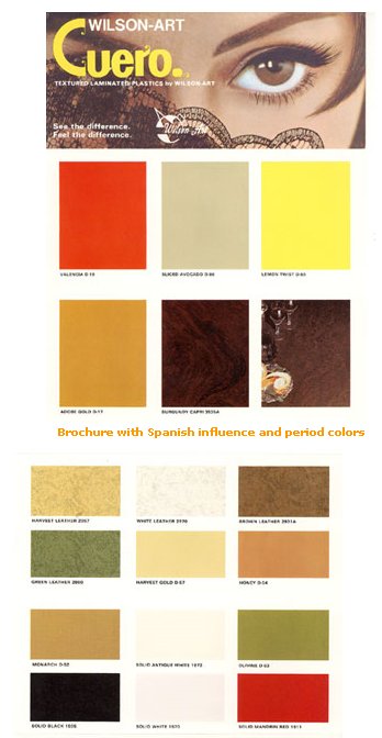 Above: Wilsonart put this color on to laminates in the late 1960s, although I squinty squinty cannot see what they named this color.
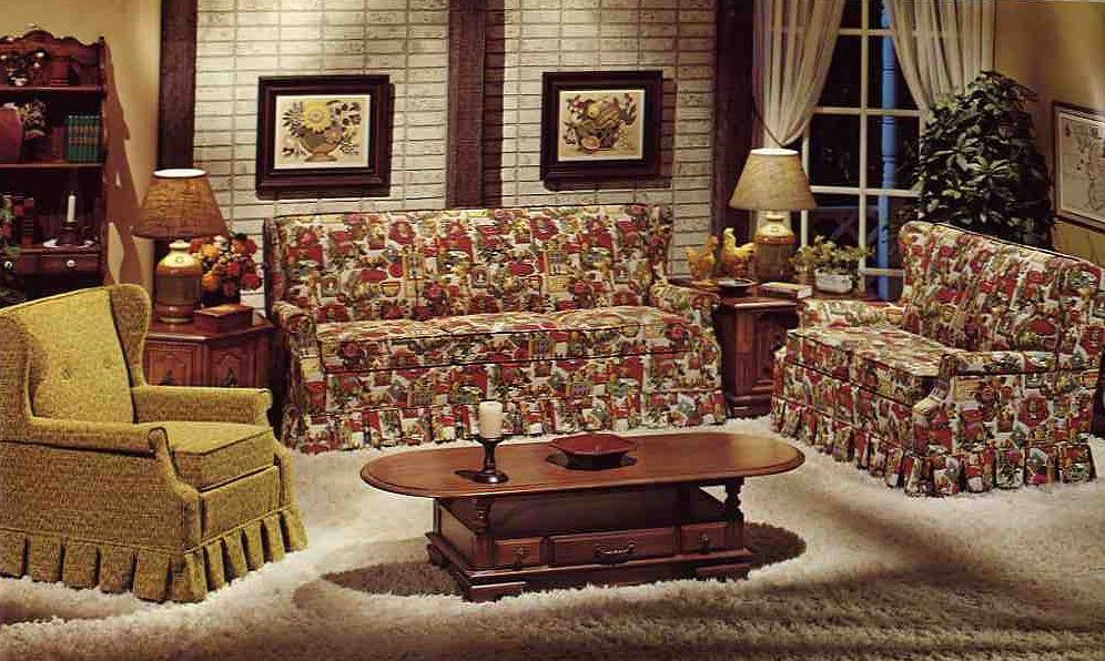
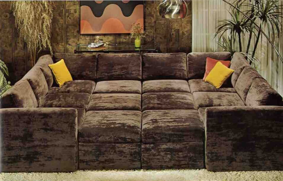 Above: The color was popular on upholstery and as an accent color in earth-toned interiors popular in the 1970s. But HEY, pretty much this same color can be found on sparkly frieze upholstery back in the 1950s, too. Okay, maybe the old gold has a little less green in it, but it’s darn close. Both photos from: 10 Kroehler sofas from 1976.
Why did Harvest Gold fall from favor?
In a consumer-driven society, these big color trends eventually collapse under the weight of their own popularity. Actually, it’s a testament to the fact that through the 1980s, we were so less consumer-driven that color trends like harvest gold even lasted as long as they did. Today, I think that the color cycles of what’s “in” and what’s “out” are turning faster and faster. Beware buying according to trends!
Disclaimer
I love all colors.
I am saying “harvest gold” in a wide sense. Warm golds and even yellows that tend toward the warm gold — like ripened cornfields… the leaves on sugar maples in the fall… and Sting’s mesmerizing fields of gold:
Do you use this color in your house today?


Mary Elizabeth says
Pam, welcome back from your brief vacation!
In the Wilsonart chart, the second group of swatches, middle row, second from top says “Harvest Gold.” I can’t read any of the other gold ones, but I love the other gold color and design of the left row top in that same group.
When the daughter of the original owners of my 1959 house came to see the changes we had made, she liked my vintage fruit pattern curtains and told me the kitchen (now cream colored) was once painted the gold background color of my curtains. Inside the cabinets we found the rest of the history of the wall color–it had originally been painted a green somewhere between a sage and a light avocado–almost the exact color we picked for the new laminate for the counters. Then it was painted a light peach. All of these colors must have been lovely with the gold glitter white Formica, knotty pine cabinets and either avocado or gold appliances.
Although we have fewer color choices in appliances these days–black, white or stainless–the paint palettes for companies like Sherman Williams and Benjamin Moore are on a very broad spectrum. Vintage fabrics and reproduction fabrics are available, as are curtains in good condition, because some people in the 1950s and 1960s used them foor a short time and then stored them away in the attic. So there is no reason not to have the colors you want in a kitchen.
Wendy M. says
Our living room carpet may be harvest gold (depending on who you ask)…not the shade in the Formica ad, but more like a lighter version of the SW paint chip that has more orange in it.
We thought about replacing it last year (it’s original from ’64- preserved under a wall-to-wall area rug before we bought the house) but I couldn’t find anything in the right texture that wasn’t boring! I can’t imagine the room without that color in it.
Robin, NV says
Well, I can maybe back up the “harvest gold takes fire in 1967” claim. When I bought my house, the fridge and range/convection oven (GE, I believe) were harvest gold and the range had a manufacture date of 1967. I remember thinking that was odd considering that my house was built in 1962 – what made the original owners decide to swap out their appliances only 5 years after building the house? Maybe they just had to have harvest gold!
I’m a bigger fan of bittersweet as a 60s/70s color. I’m still kicking myself for not buying a Crock Pot in bittersweet at a local thrift store. Only $4 too. Oh well.
lynda says
Sometimes houses did not include any appliances in the price. Perhaps they just moved in old appliances until they could afford new ones.
Robin, NV says
You’re probably right but my version is more romantic. 🙂
Lynne says
In the mid to late 1960’s our living and dining rooms were Early American, with harvest gold carpet and walls, and a little orange and avocado thrown in the upholstery. Maple case goods and tables. Lamps with hobnail milk glass and ruffly shades, complete with eagle finials. Those rooms were so warm and cozy.
Must have left and impression on me, as our master bedroom has gold carpet and soon to have at least two walls painted a warm honey hue. Actually, I had trouble finding a suitable gold color paint chip. Clearly not popular among the masses right now.
Becky from Iowa says
Sorry…muddy colors make me suicidal. 😉
lynda says
I was at Ikea in Maryland this week and the Besta series had a yellow that was leaning to harvest gold.
http://www.ikea.com/us/en/catalog/products/70265148/
It did have a “new” sign on it. I too get tired of how quickly they try to convince us that our homes are hopelessly outdated. I have a friend that turned her entire home from Tuscany to mid century modern grays, turquoises and oranges. It looks fabulous. I wonder how long it will take the so-called style setters to make her feel like it is time to change again??
pam kueber says
I love it!
Lynne says
Ikea has also come out with a turquoise blue cabinet door front. Slightly greyed down, but very pretty with a bright white.
Cara says
Woo Hoo! My kitchen is retro color of the year!
My stove and fridge are photos 193 and 144 on the post where everyone uploaded their appliance photos in Sept 2012 (I couldn’t remember if I had gotten around to actually getting photos up there so I had to double check that post!)
I have the matching sink too! Unfortunately the dishwasher was rusted all the way through the front so I couldn’t even salvage the panels to try to use on my new dishwasher.
Becky says
I adore Harvest Gold, in all shades from dark to light. I always will. When we moved into a new apartment in 1975 it had harvest gold appliances and drapes, and a dark gold carpet. My Nana’s beautifully decorated late 60’s/early 70’s apartment was mostly harvest gold and turquoise. My other grandparents had sculpted medium-gold carpet. It will always say “home” to me. I have some vintage sheets and kitchen items with harvest gold in them and I’m always scanning etsy for goodies.
Mary says
Harvest Gold was also very popular in crewel/needlework of the 1970’s era. I’m trying to complete a collage wall of framed crewel pieces I’ve found at thrift stores and yard sales, as well as some I’ve stitched myself from kits I’ve found. They are mostly florals in earth tones–greens, browns and harvest gold.
Lisa says
I was given a Harvest Gold Kitchen Aide mixer as a wedding present from my mom 32 years ago. I sill have that lovely mixer (and lovely husband) 32 years later. Love them both!