

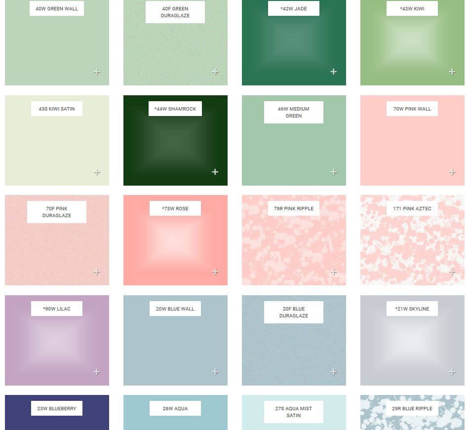
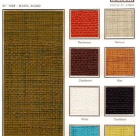
 I say this with immense love, not to be snarky: B&W Tile has entered the 21st Century! With their new website, I mean. Happily, B&W’s tile still delivers just what we want from the past: the most extensive selection, that I know of, of 4″ x 4″ pastel-colored kitchen and bathroom tiles suitable for recreating a 1930s, 1940s, 1950s or 1960s bathroom. Above: Just a smattering of the colors available. Real color colors — what the world needs now is more real color colors!
Included in the good news: You can now get a look at all their colors online. Of course, you are still going to want to get samples, because computer monitors can distort images.
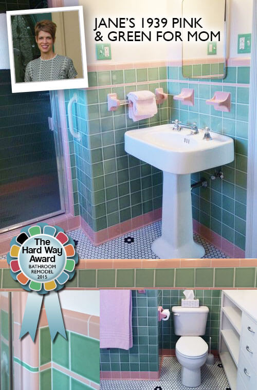 We’ve had quite a few readers use B&W Tile to create all-new retro-colored-tile bathrooms. Like: Jane, above, winner of our The Hard Way Award – Bathrooms last year. See her bathroom using B&W Tile here.
Link to get the B&W website –>> B&W Tile.
Still not what you need? See our story –> 18 places to find 4″ x 4″ ceramic bathroom tile in vintage colors


Casey says
I’ve been coming here to RR for so long, I recognize some of the featured photos on the new B&W site.
pam kueber says
I don’t know what you are referring to — I don’t see any “featured photos” from RR on their website?
casey says
On the home page of their new site, there’s some photos near the bottom. I recognize Janice’s pink bathroom and a few others I know I’ve seen here.
Robin, NV says
Pink Aztec!!! Love!!!
Debbie in Portland says
I ordered some samples from them a couple of years ago. The helpful woman on the phone could not have been nicer. The colors were gorgeous, seeing them on a computer screen does not do them justice. B&W is also the only place I have found that sells the 1920’s/1930’s-style “box cap” trim pieces (page 11 of their catalog)—a big thrill after having been told repeatedly that “nobody makes those anymore!”
The Atomic Fox says
I like the website design. Very clean looking and easy to navigate. I’ve received a sample board from them, and the tiles do indeed have a very authentic 1940s-1960s look.
Sarah R says
That’s so great that they gave you a shout-out also, on their “About” page!
pam kueber says
Oh my gosh, I didn’t know that! I gotta go look at that!!!! Thank you for letting me know!
pam kueber says
Oh my gosh, I went and looked and aren’t they sweet! It’s a mutual admiration society! 🙂
ineffablespace says
It’s great to see what these actually look like, it’s helpful in what samples to order.
Most of the mid-century houses in the urban core where I live are architect-y, because they were designed as part of urban redevelopment (offices of I.M. Pei, Louis Sauer, Frank Weise responsible for a lot of it). If the architect was involved with finishes, the bathrooms were pretty colorless (and some had stone counters).
I think that with the current Kohler (non) colors: various greys, black, biscuit, almond, Sandbar, and Mexican Sand, you could do a mid-century referential bath that could seem pretty authentic (for this area) with some of these tiles:
The Aztec, Duraglaze, and Oatmeal glazes, in the right neutral colors would all add a mid century texture to the more current Kohler colors, and keep the end product from looking too contemporary.
Geronimom says
Yippee! Finally I now know have a name for the weird “splotchy” pink/white tiles in my bathroom – “Pink Aztec” – although truthfully, from the photos it looks like it may just be a teeny bit more pink than mine, which can read pinky-peach at times. Regardless, I may order a sample of that (and the blue ripple for my other bathroom) to see if they actually have that raised, bumpy feel to them like mine do. Never thought I’d be able to find that splotchy pattern anywhere nowadays, so maybe I won’t have to live with a couple cracked tiles after all. Hopefully they will also have it in the octagonal shape for my floor, as well! Thanks for the story!
Jay says
This made me laugh – “what the world needs now is more color colors” Having absorbed so much BR remodel info here, I think I am now ready to go with salt and pepper wall tile with green trim. I liked Kate’s bath room that was featured last year(?).
Bette Jean says
Love the colors. Tired of white, cream and very cold gray.
Bobbie says
Wow, would love to do a bathroom with the 70W Pink wall and 46W medium green trim! Thanks for sharing!
pam kueber says
You made me remember Jane’s story — I just added it to this story, too — https://retrorenovation.com/2015/07/20/vintage-style-bathroom-green-pink/