

 Laura wants to add color to the walls of her pattern-on-pattern-on-pattern 1957 bathroom — we looked at it here last week. But, with only brown and beige in all the patterns, what color should she choose? You know me: I always welcome a chance to promote: Wallpaper!
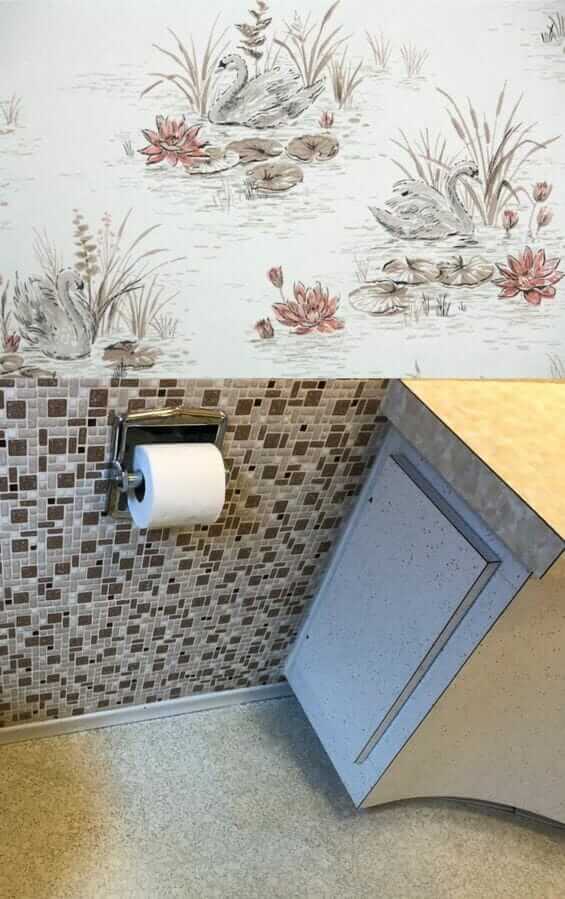
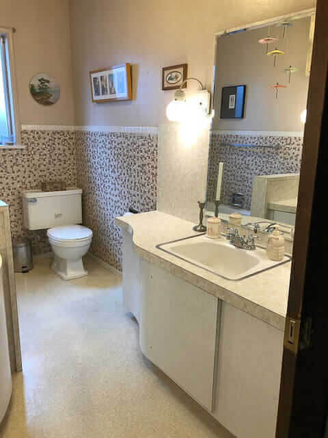 Above: Laura’s bathroom, walls painted a beige that looks to match one of the tiles in the mosaic wall. The wall color, and overall effect within the room, is nice. But: She is a fan of color.
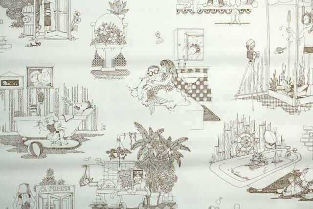 My first choice of wallpaper for the space (without spending, like, 80 hours doing research, which is what I’d do if it were my bathroom, ugh): A vintage 1970s wallpaper in a cheeky illustration design from Hannah’s Treasures that might be super fun. Mermaids! Toilets full of plants! A scuba-diving shower!
I recall that Laura said that two children, boys, use the bathroom — surely this would make them laugh and show off the bathroom to anyone and everyone who visited forevermore.
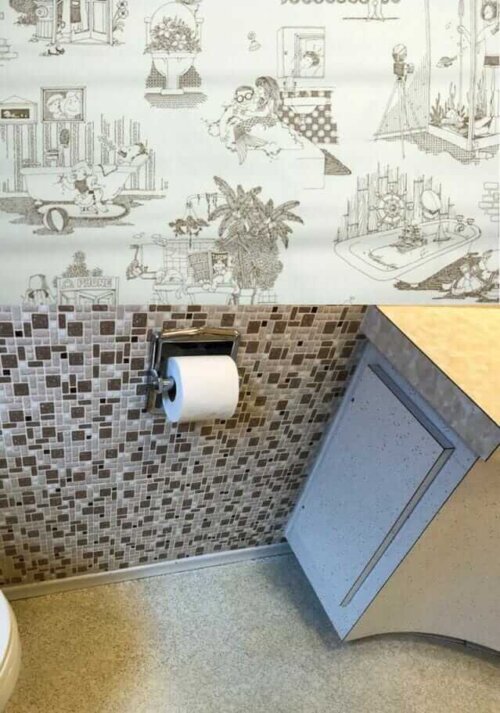
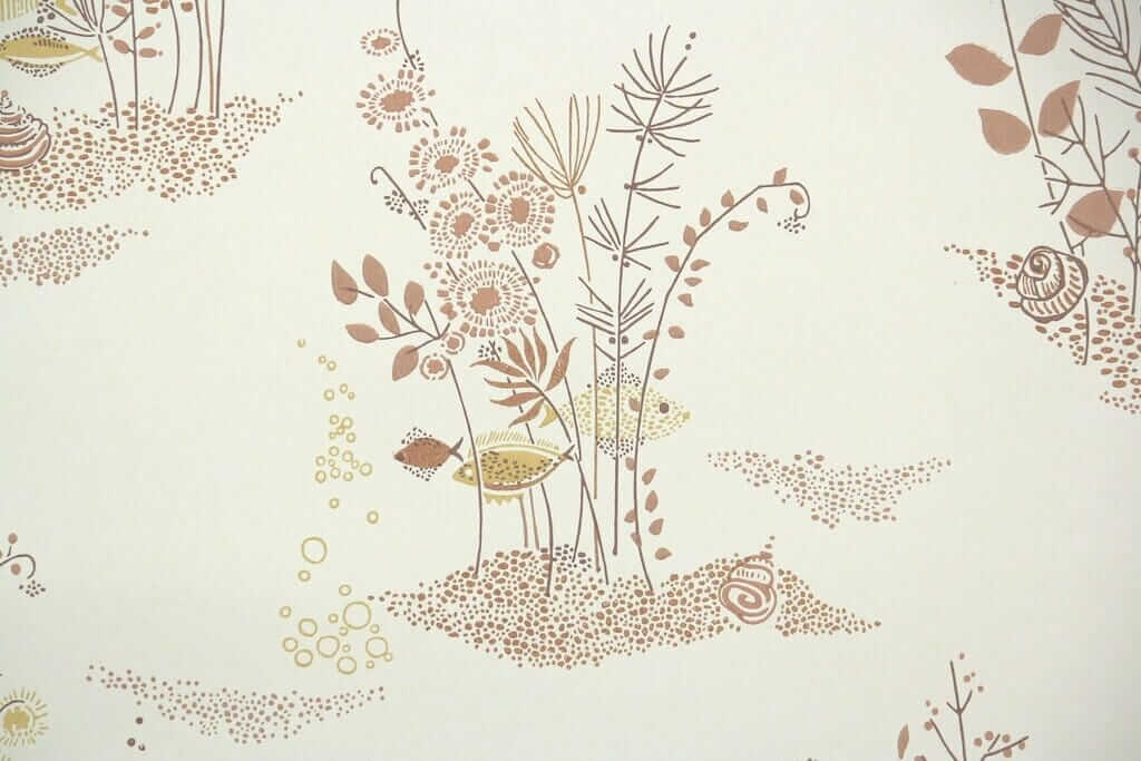
 Should Laura paint or wallpaper the walls in her 1957 bathroom? Her bathroom is so densely patterned, I say: Just go with the flow and add more pattern — add wallpaper. Above: A more serene — but very atomically appealing fish under water scene wallpaper from Hannah’s Treasures.
 With any wallpaper, you need to be sure to see a sample first, to ensure the hues, scale and shapes — all of it — are correct. For example, I tried some other brownish patterned wallpapers, but the browns were too red or something, they looked clashy. Laura is an artist. She doesn’t need my help choosing a harmonious pattern, if she is game for wallpaper vs. paint.
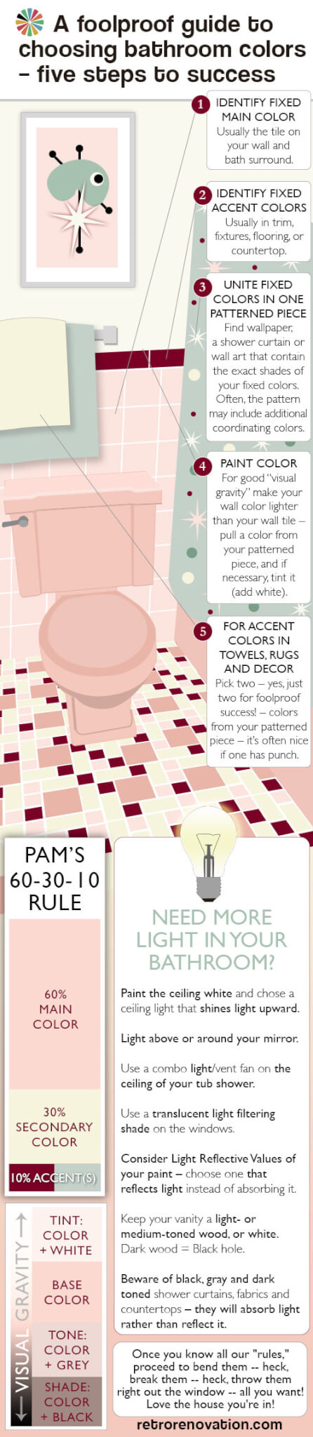 Choosing a single solid color-color (of the rainbow, not a neutral) for Laura’s bathroom is so difficult because there are no color-colors in any of her existing patterns, which are so dominant. And one of the first possible rules of pulling together a pleasing decorative palette is: Where’s your pattern? It’s from there that you pull your secondary and tertiary colors. See my guide above — it explains all.
- Or how about, stencil a pattern on the walls instead? See this story about eight ways reader used stencils to get the ‘wallpaper’ look on their walls.
 If Laura really just wants to paint, I think what I would do is: Find large-scale artwork, or multiple pieces grouped together, that include her existing pattern colors plus one or more color-colors. Then, take your wall color from one of those additional colors in the artwork. Looks like her ceilings are pretty high. To get a color on the wall, like I said, I wouldn’t go too dinky with the art on the wall. It’s a Goldilocks situation. Not too big, not too small, with the artwork, to sneak the color color from it, in there just right. You know, the mobile is so pretty, you could do it with that if its elements were the correct colors — that is, brown, beige, black — and your extra color color. Perhaps: Minty green… a seafoam like in the first vintage wallpaper in my own beige bathroom?
That said, I’m still liking, way better, the idea of tone-on-tone-on-tone color and pattern in this bathroom. Sticking to the more narrow color palette gives the crazy pattern mashup serenity. Like: It’s very clever — decorating genius — if you can cram pattern everywhere and still have it feel — calm.
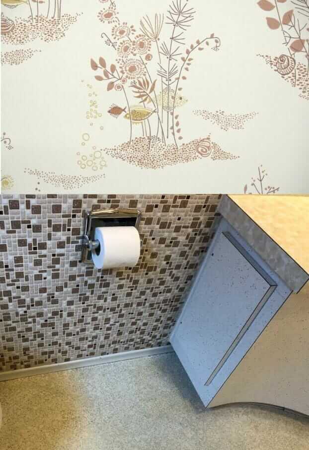
 One more wallpaper idea — this one looks like it could cleverly sneak a rosy red into the room. This shade of rose red is sooooooo 1950s perfect. Howdy, Hannahs!


Carolyn says
If this is where she puts her makeup on, I agree with the peachy colors. If it’s mostly boys and company, take a vote of the family to narrow down the color options. So far we can take out brown, white, and black. To really narrow it down, tell them they can only choose one of the colors in the mobile. I know the appeal of wallpaper but I also know little kids like to pickpickpick – why? “I dunno…”
Paint first, and in the meantime, research papers. Invest in this:
https://retrorenovation.com/2017/04/24/rollerwall-paint-wall-look-like-wallpaper-146-patterns/
to play with color & scale?
Bette Jean says
I suggest picking the darkest brown tile and have paint made. Have them make it at about 80% so it will match, but not be quite as dark. Since Laura is an artist she could paint umbrellas randomly on some or all walls using metallic paint colors, tying into her mobile. Towels, mats, solid color shower curtain and accessories could be the umbrella colors. Those colors don’t look too brash for all that’s going on.
Lynne says
That tile is fabulous. It should have the whole show, with no competition from a printed wallpaper. Paint would be the easiest, of course.
That being said, if she wants a wallpaper, I’d go with a subtle texture, or grasscloth look vinyl. Its bathroom and family friendly, That would put some visual texture on the walls without competing with the tile and all the other patterns in the room. She could jazz it up with wall art .
As Pam pointed out, scale would be the sticky point in this busy room. Personally, I’d ditch all the little postage stamp pieces scattered about, and go for one statement piece just to the left of the mirror. A diptych would work too. Maybe, MAYBE a little something over the potty. I would try to match the frame to the dark brown in the tile.
sherree says
I love wallpaper, but not for this room. The wall tile is busy (not the 4″ by 4″ we usually see) and there are other patterns in the room. Since this is a bathroom used by boys I would paint it green or aqua. Those go well with the browns. Another option might be to apply some mid century style decals or stencils.
Cloudy says
Honestly, I wouldn’t do the patterned wallpaper. But that’s just me. I would paint with a dark orange. And accent with a mural or a painting with complementary colors of the neutrals and orange shades.
ineffablespace says
I think I would do wallpaper.
But since there are four random patterned elements in the bathroom, three of which really form a texture (the floor, cabinetry and countertop) I think the scale and strength of the pattern have to be a lot stronger than the papers from Hannah’s Treasures, For me those tend to fade a bit compared to the wainscot tile.
The wainscot tile is actually different than what I thought it was initially, I though it was a mottled tile mosaic with some metallic where the tile sizes varied, not a specked mosaic where the tiles varied in color and size.
Anyway, I think I would look at Cole and Son papers. They have a lot of mid century patterns from their archives, either as originally produced or reworked a bit. The patterns, including a bunch by Piero Fornasetti, are playful without being…twee, I guess; and they have some very strong botanicals and geometrics as well.
Pam Kueber says
Great thoughts. Yes, could be that a stronger pattern would be even better.
Stacia says
Totally wallpaper. It has the added benefit of being more water resistant than many paints, so is great for a bathroom. I love the choices above and the swans are my favorite. However, are the counters and floor yellowish? Maybe it’s just the lighting. The browns in the swan paper have a cooler cast. The fish one does have some yellow. Then recover the seat of the vanity in another fun pattern!
Bsrbara says
I would find the color/colors I want. No more browns!
Go to the store and get lots of colors, free, for painting. I call my paint samples, “paint index!” I would tape all the sample colors to the walls and toilet and sink and curtains. Then I gave myself a couple of days to decide. That allows me flexibility for being indecisive. And then it all comes together. Patience can save you lots…of time and money!
Good luck!
Virginia says
I am admittedly not a wallpaper fan, so my answer would be paint. I would try yellow, pink, and peach. All of those are flattering to the complexion and seem to complement each shade individually in the room.
Christine W says
Maybe Laura could try (since she’s an artist) painting her own atomic (?) wallpaper using the various colours in her room. That way she could bring in the colours in the vanity as well as the browns in her tile. Maybe with a a white background (or the colour of her top row of tiling)
Retro Retro says
Great Idea!
Pam has had a few postings about that.
Paint first, then wall paper later if you don’t like the paint.
I was thinking of a paint in a very pale yellow.
Or a very pale blue would be a good foil to the brown and beige.