

 Laura wants to add color to the walls of her pattern-on-pattern-on-pattern 1957 bathroom — we looked at it here last week. But, with only brown and beige in all the patterns, what color should she choose? You know me: I always welcome a chance to promote: Wallpaper!
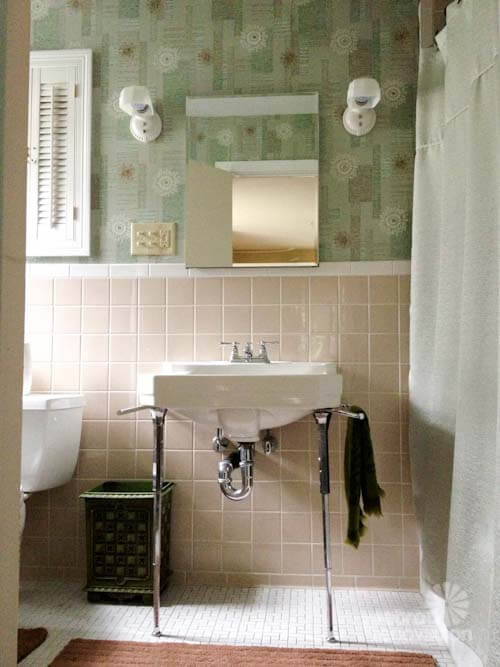
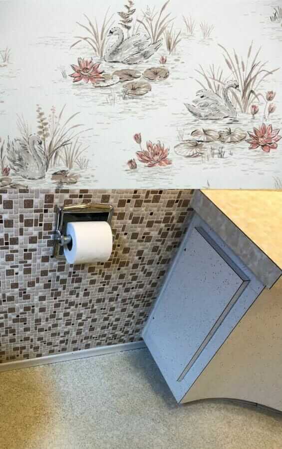
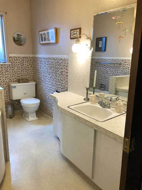 Above: Laura’s bathroom, walls painted a beige that looks to match one of the tiles in the mosaic wall. The wall color, and overall effect within the room, is nice. But: She is a fan of color.
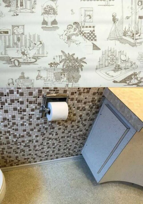
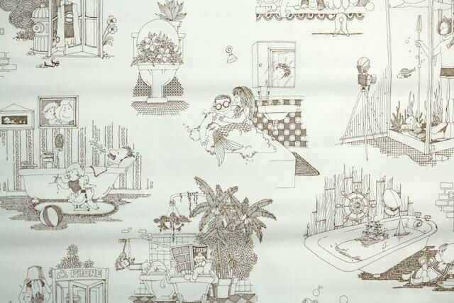 My first choice of wallpaper for the space (without spending, like, 80 hours doing research, which is what I’d do if it were my bathroom, ugh): A vintage 1970s wallpaper in a cheeky illustration design from Hannah’s Treasures that might be super fun. Mermaids! Toilets full of plants! A scuba-diving shower!
I recall that Laura said that two children, boys, use the bathroom — surely this would make them laugh and show off the bathroom to anyone and everyone who visited forevermore.
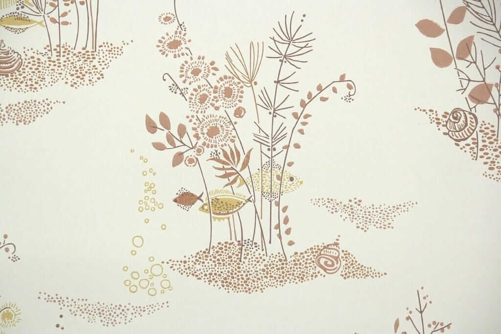
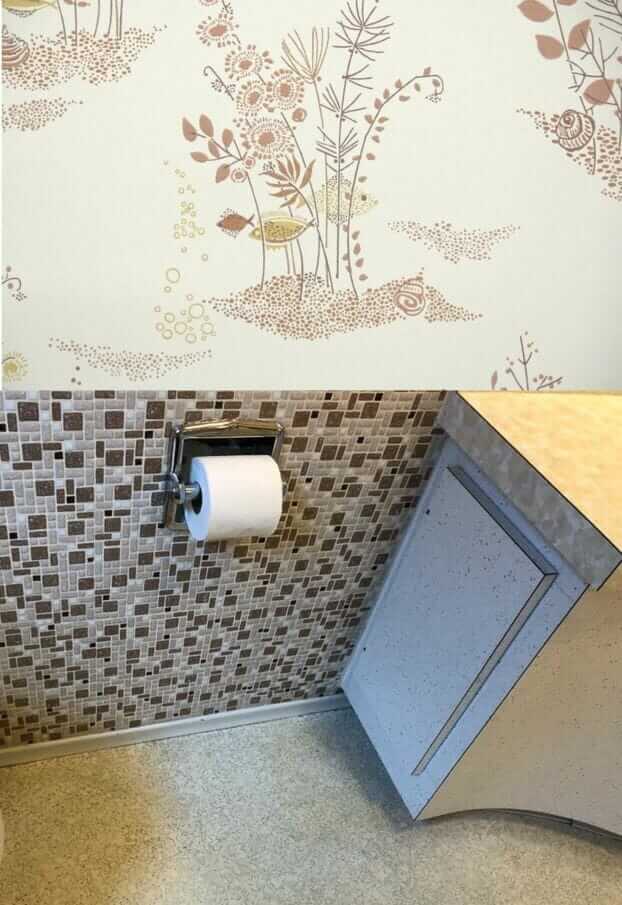 Should Laura paint or wallpaper the walls in her 1957 bathroom? Her bathroom is so densely patterned, I say: Just go with the flow and add more pattern — add wallpaper. Above: A more serene — but very atomically appealing fish under water scene wallpaper from Hannah’s Treasures.
 With any wallpaper, you need to be sure to see a sample first, to ensure the hues, scale and shapes — all of it — are correct. For example, I tried some other brownish patterned wallpapers, but the browns were too red or something, they looked clashy. Laura is an artist. She doesn’t need my help choosing a harmonious pattern, if she is game for wallpaper vs. paint.
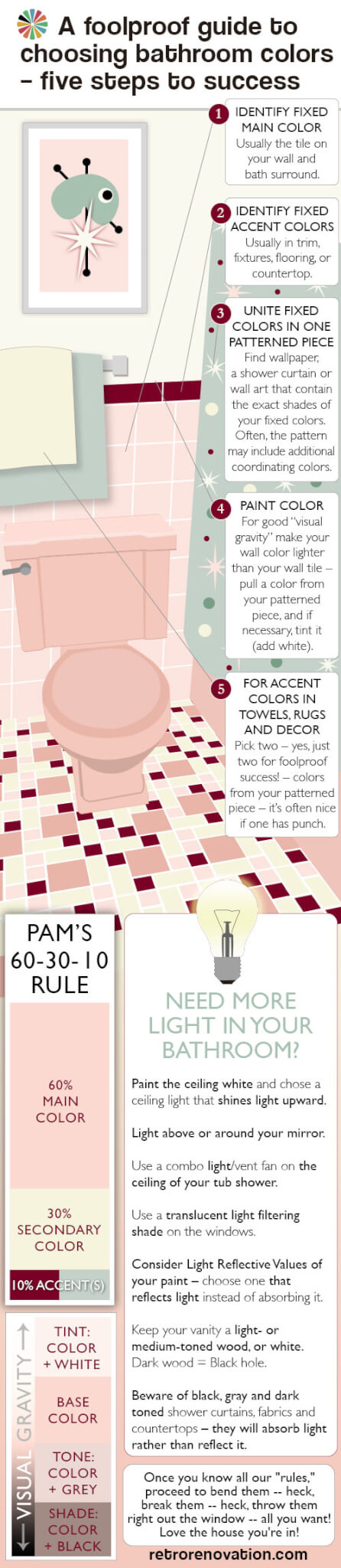 Choosing a single solid color-color (of the rainbow, not a neutral) for Laura’s bathroom is so difficult because there are no color-colors in any of her existing patterns, which are so dominant. And one of the first possible rules of pulling together a pleasing decorative palette is: Where’s your pattern? It’s from there that you pull your secondary and tertiary colors. See my guide above — it explains all.
- Or how about, stencil a pattern on the walls instead? See this story about eight ways reader used stencils to get the ‘wallpaper’ look on their walls.
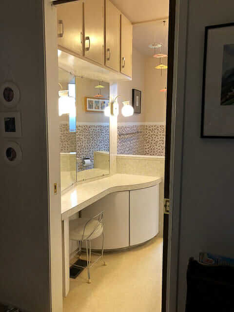
 If Laura really just wants to paint, I think what I would do is: Find large-scale artwork, or multiple pieces grouped together, that include her existing pattern colors plus one or more color-colors. Then, take your wall color from one of those additional colors in the artwork. Looks like her ceilings are pretty high. To get a color on the wall, like I said, I wouldn’t go too dinky with the art on the wall. It’s a Goldilocks situation. Not too big, not too small, with the artwork, to sneak the color color from it, in there just right. You know, the mobile is so pretty, you could do it with that if its elements were the correct colors — that is, brown, beige, black — and your extra color color. Perhaps: Minty green… a seafoam like in the first vintage wallpaper in my own beige bathroom?
That said, I’m still liking, way better, the idea of tone-on-tone-on-tone color and pattern in this bathroom. Sticking to the more narrow color palette gives the crazy pattern mashup serenity. Like: It’s very clever — decorating genius — if you can cram pattern everywhere and still have it feel — calm.
 One more wallpaper idea — this one looks like it could cleverly sneak a rosy red into the room. This shade of rose red is sooooooo 1950s perfect. Howdy, Hannahs!


Greg rusnak says
Would paint wall white , then stencil on what ever you like.
Debbie in Portland says
I think I would go with paint. You already have the patterned floor, the pattern on the cabinets, the mosaic tile, and the patterned countertop. I think a patterned wallpaper would tip this from “wow” to “overkill”. There is so much fabulousness going on in this bathroom already, I wouldn’t want to detract from that.
Michelle says
Paint for sure! The tile is already busy and patterned wallpaper would push it over the line.
Patti says
I agree with your “rules” 100%. There are so many options here because the colors in the tiles and other fixed surfaces are all neutrals. I love color too and I think I would get a really funky graphic wall paper with tons of bright colors, and curves that mimic the curving vanity. Right now, the vanity is the only thing in the room with curvature as everything else is vertical and horizontal lines. This Sanderson wallpaper is pretty awesome…https://www.retrotogo.com/2014/06/1950s-mobiles-wallpaper-remade-by-sanderson.html
Allison says
I would embrace the Hollywood glam potential implicit in this bathroom and go for a metallic gold bamboo trellis paper. Jazz up the lighting and the incidentals with gold and you can accent the browns and beiges without losing the serenity of the palette.
Even the boys can co-exist with a little glitz.
Felicia Alexander says
Another thought about having a (light-toned) contrasting color on the wall above the wall tile: it will help move the eye upward. As the room’s color scheme stands now, it leads the eye straight down to the floor. A not-too-busy wallpaper with some aqua or seafoam green in it (for instance), and perhaps a darker green or teal bathmat or bath rug, would help alleviate that.
Joe says
If it were my bathroom, I would not wallpaper, paint designs, add a mural, etc. The purpose of those mixed-tone mini-mosaics is to provide interest. There’s enough going on already with the tile, floor, countertops, cabinet surfaces. Just paint the walls a nice mid-range shade of blue, green, soft copper-orange or orchid. If you pull colors from nature, you can’t go wrong with your existing sand-tone finishes, which look very beachy. Paint the ceiling in a nice linen shade. I wouldn’t be in a rush to put up works of art or knick-knacks, because I believe less is more when you already have so much going on visually. Just take a cue from that attractive mobile, and get a George Nelson Atomic Ball wall clock for that expanse between the toilet and sink. If one cannot fight the urge to add something to a wall, just put up a glass shelf held by pelican clips, and you can put little things on there! Have fun introducing color with towels and rugs that either match or complement your wall color. Find a nice antique glass genie bottle and some vintage glass canisters or apothecary jars to hold cotton balls, accessories, etc. and arrange on the counters. If you don’t like the idea of glass for storage, there are lots of vintage kitchen canisters that would look equally at home in a bathroom. BTW you’d be surprised how MCM a pleated cellular shade looks on a window! You are only limited by your imagination, so have fun with your project!
Felicia Alexander says
Whether Laura decides on wallpaper or paint (and I think either could look great!), the room could use a complementary but contrasting accent color to relieve the eye of all that beige and brown. Others have mentioned aqua or seafoam green, which I think could work very well either as a paint color or as a secondary color in a wallpaper. Teal is another possible accent color. I put teal towels and a teal bathmat in our 1962 Suez Tan ‘n’ gold sparkle Formica master bathroom, and it looks terrific. (It will look even better once we have our Merola University Beige mosaic floor tile installed–the same tile that’s on Laura’s bathroom wall. Stay tuned!)
Eartha Kitsch says
I’m a wallpaper loving fiend but in this case, I think a simple paint color would help that beautiful tile shine – and not compete. I vote paint!
Diane C Chambers-Stewart says
I love the second wallpaper sample (with the fish.) It’s the perfect balance of whimsical/historical – and I think the boys would approve. The pattern repeat is large while still offering a ‘rest’ for eyes. Hope to see the finished room!