

 Laura wants to add color to the walls of her pattern-on-pattern-on-pattern 1957 bathroom — we looked at it here last week. But, with only brown and beige in all the patterns, what color should she choose? You know me: I always welcome a chance to promote: Wallpaper!
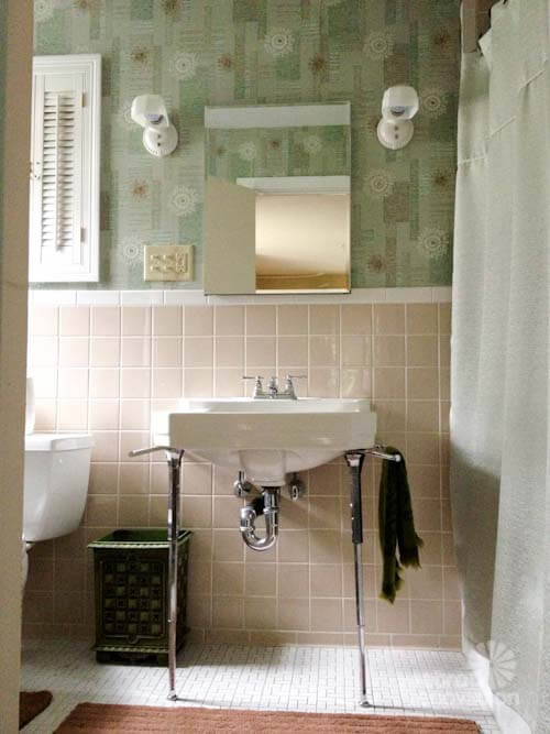
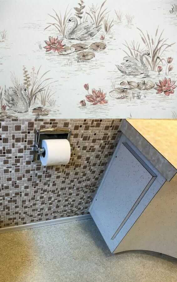
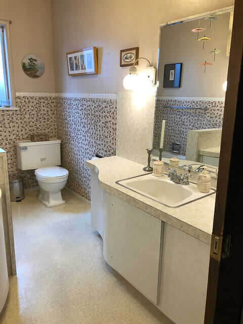 Above: Laura’s bathroom, walls painted a beige that looks to match one of the tiles in the mosaic wall. The wall color, and overall effect within the room, is nice. But: She is a fan of color.
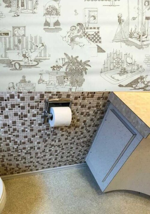
 My first choice of wallpaper for the space (without spending, like, 80 hours doing research, which is what I’d do if it were my bathroom, ugh): A vintage 1970s wallpaper in a cheeky illustration design from Hannah’s Treasures that might be super fun. Mermaids! Toilets full of plants! A scuba-diving shower!
I recall that Laura said that two children, boys, use the bathroom — surely this would make them laugh and show off the bathroom to anyone and everyone who visited forevermore.
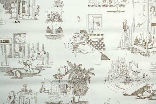
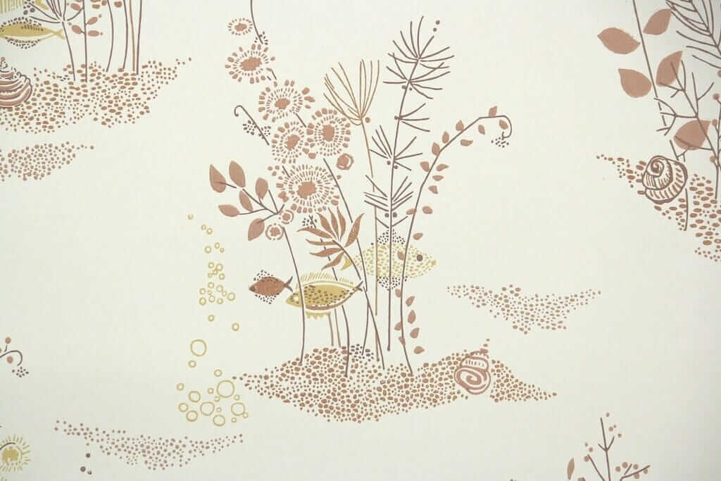
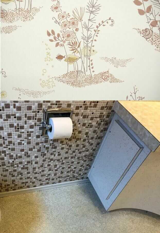 Should Laura paint or wallpaper the walls in her 1957 bathroom? Her bathroom is so densely patterned, I say: Just go with the flow and add more pattern — add wallpaper. Above: A more serene — but very atomically appealing fish under water scene wallpaper from Hannah’s Treasures.
 With any wallpaper, you need to be sure to see a sample first, to ensure the hues, scale and shapes — all of it — are correct. For example, I tried some other brownish patterned wallpapers, but the browns were too red or something, they looked clashy. Laura is an artist. She doesn’t need my help choosing a harmonious pattern, if she is game for wallpaper vs. paint.
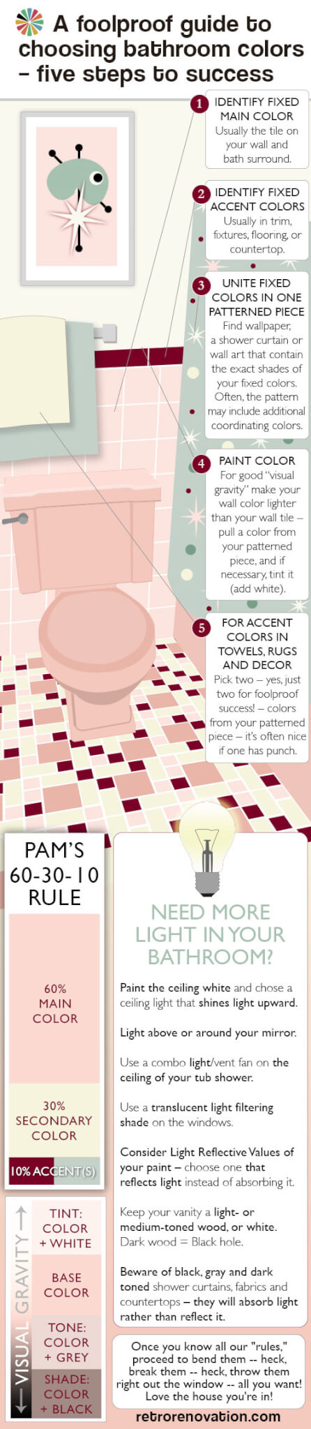 Choosing a single solid color-color (of the rainbow, not a neutral) for Laura’s bathroom is so difficult because there are no color-colors in any of her existing patterns, which are so dominant. And one of the first possible rules of pulling together a pleasing decorative palette is: Where’s your pattern? It’s from there that you pull your secondary and tertiary colors. See my guide above — it explains all.
- Or how about, stencil a pattern on the walls instead? See this story about eight ways reader used stencils to get the ‘wallpaper’ look on their walls.
 If Laura really just wants to paint, I think what I would do is: Find large-scale artwork, or multiple pieces grouped together, that include her existing pattern colors plus one or more color-colors. Then, take your wall color from one of those additional colors in the artwork. Looks like her ceilings are pretty high. To get a color on the wall, like I said, I wouldn’t go too dinky with the art on the wall. It’s a Goldilocks situation. Not too big, not too small, with the artwork, to sneak the color color from it, in there just right. You know, the mobile is so pretty, you could do it with that if its elements were the correct colors — that is, brown, beige, black — and your extra color color. Perhaps: Minty green… a seafoam like in the first vintage wallpaper in my own beige bathroom?
That said, I’m still liking, way better, the idea of tone-on-tone-on-tone color and pattern in this bathroom. Sticking to the more narrow color palette gives the crazy pattern mashup serenity. Like: It’s very clever — decorating genius — if you can cram pattern everywhere and still have it feel — calm.
 One more wallpaper idea — this one looks like it could cleverly sneak a rosy red into the room. This shade of rose red is sooooooo 1950s perfect. Howdy, Hannahs!


Neil says
No room for more pattern in this busy bath. Needs to be pretty close to a solid to cause all those lines and curves, and textures, to make sense. Go for gold! It’ll kick the vibe up to glam, unify and dazzle, and revivify the mid-cent happies of ’57.
Neil
Phyllis says
I dig all of those wallpapers, but what’s missing is a transition element, which could be solid color tile, molding paint, etc….add a transition and that bathroom will be fabulous!
Maria says
Another color wave would be this one. Although this is kitchen wallpaper the color wave would look good in her bathroom and I would still Pull the bit of blue into towels and rugs.
I happened to be very familiar with this pattern because it’s the original wallpaper in my 1959 kitchen!
https://hannahstreasures.com/products/1950s-kitchen-vintage-wallpaper-yk155
Maria says
If I were to do any kind of wallpaper it would only have a hint of the brown. I think I would go with a blue background either in wallpaper or paint. A robins egg type blue and repeat on the floor with rugs.
Nancy says
Blush pink. Farrow and Ball has an amazing one.
alison says
I am with Pam and support patterning it up, but also like the art work inspiration idea. Perhaps something like this http://www.atomiccrushdesign.com/project/custom-atomic-boomerang-triptych/?
And pull a fun color for the walls.
Mary S says
I thought the first wall paper was the best until I saw the last. I am a sucker for swans and water lilies! They just seem so serene to me.
Ranger Smith says
Oh how I loves me some wallpaper! But sorry, no can do with this bathroom; just too many patterns. You’re right Pam, with the current paint color the room looks nice. Since Laura likes color, this is a great opportunity to slap some stronger colors up there and pick what she likes. A great opportunity for the color enthusiast.
Lisa says
I think blue would be the best choice, perhaps with some artwork that brings in the beige/brown/cream. Light green could also work.
Diana says
I love the look of the last one as well as Pam’s wallpaper in her own bathroom. Very pretty. Would definitely try to sneak in some color somehow. I’m also not a fan of wallpaper…I’ve had to strip too much of it. But I do like the patterns it allows on the wall. I’ve done stenciling before and if you get tired of it you can just paint over it!
Pam Kueber says
Here are our eight stories about readers who have stenciled “wallpaper” onto their walls – https://retrorenovation.com/2014/10/30/7-retro-wall-stencils/