

 Reader Cathy is working on remodeling her tiny 1949 kitchen using a set of vintage pale yellow and maple St. Charles steel kitchen cabinets that she found on craigslist. She likes the vintage look but isn’t quite sure what elements would work best with these cabinets. While her St. Charles cabinets are from the early 60s, they have a timeless look about them and we think Cathy could go in any number of directions and still get a fantastic retro-inspired result. She wants our ideas — what do you think she should do?
 Cathy writes:
I have an old house (1949) and a very small kitchen. I recently purchased a set of St. Charles cabinets, they are from I believe 1963 or 1964. They are butter yellow with maple doors on the upper cabinets. They came from a much larger kitchen than mine, so my husband can make them work with some extra for the adjacent laundry room.
I am looking to do a late 50s/early 60s style. We purchased the house 14 years ago and the kitchen and laundry room are the last major projects (I want to continue the look into the adjacent laundry room). We had three kids at home when we purchased the house and now we are down to one 18 year old (yay!) so it is finally time for my kitchen. I have come to love vintage/retro in the last few years (due it part to a fondness I have acquired for The Adventures of Ozzie and Harriet), so I am glad that we didn’t get to the kitchen until now 🙂
I originally planned to get basic generic cabinets and paint them and get hardware for a retro look. While searching Craigslist for a vintage sink, I came across the St. Charles, and I knew they would be perfect. To top it off, the seller literally lives two miles from my house.
So that has changed my ideas around quite a bit, and I’m not sure what color/style counter tops to go with. I definitely want laminate, and was thinking a black, but now I’ve started to rethink and I’m just not sure. Maybe a metal edge? I am planning on a black and white checkerboard floor in vinyl composite tiles. But the colors of the floor aren’t set in stone yet. Also wanted to do a white subway tile back splash.
I have also considered painting the maple upper doors, but my husband isn’t going along with that one, so I will probably keep them as is.
The cabinets are in a rental storage unit right now, and they are as my husband would say: jammed jelly tight, so the only photos I have right now are from the Craigslist listing. They show the cabinets in the seller’s house, with the original yellow laminate counter top (which I did not have the option of getting). Of course the configuration of my kitchen is much different, and considerably smaller.
Right now my kitchen is pretty much down to the studs, and we are moving just about everything: the sink, the fridge, the stove, adding a window, etc. The cabinets appear a bit darker than they really are in a couple of the photos, they are a pretty light yellow.
I appreciate your time and consideration.
Pam and I have some suggestions prepared for Cathy’s kitchen — ideas for counter top, backsplash, flooring and wall treatments. We’ll be back at noon to share our mood boards.
Readers, what are your suggestions for Cathy’s kitchen cabinets?
Pam’s mood boards:
Cathy, agree with the commenters who said that subway tiles are not post-war vintage style — these are a pre-war style. And, I think that black-and-white checkerboard floors could be overwhelming considering your cabinet finishes. That said, it’s your kitchen — do what makes you happy.
If this were my kitchen, I think that I would try to keep the counter top and floor a single color, to simplify around the two-tone cabinetry, which provides a lot of visual interest already. I’d probably look for an off-white laminate for the counter top. Although, this kitchen really makes me moan for the loss of gold sparkle laminate — I think gold sparkle counter tops would look amazing. Back to laminate choices: I’m obsessive about the “just right white” — I showed Dover White Formica in my mood boards, but I am not sure that would really be just right. You need something that stands out from the yellow, just enough, but harmonizes with all the yellow and maple tones. Here is a story I did with all the laminate manufacturers with product in the U.S. that I know of. Regarding the edge: I might go for a postformed edge, which we now know existed as early as 1952. I say postformed rather than metal edge — because your cabinets have a more modern 60s feel than they do early 50s — and because you already have graphic action going on what with the two-toned cabinets including wall cabinets with molding.
For the backsplash, I would try to match the counter top as closely as possible with simple, matte finish square field tile. I have shown vintage 2″x2″ tile (I think that’s the size) from World of Tile in all my mood boards. I spotlighted World of Tile tile ‘cuz if I had a kitchen to remodel, I think I would do ‘most anything to use some of their New Old Stock vintage tile. That said, you could also use 4″x4″ file tile — which would be very inexpensive — and which is timeless.
After that, the decorating sky is the limit. You can choose a solid floor and wall treatments in almost any combination — however I would keep the colors kind of “dulled”, or else they will overwhelm your yellow cabinets.
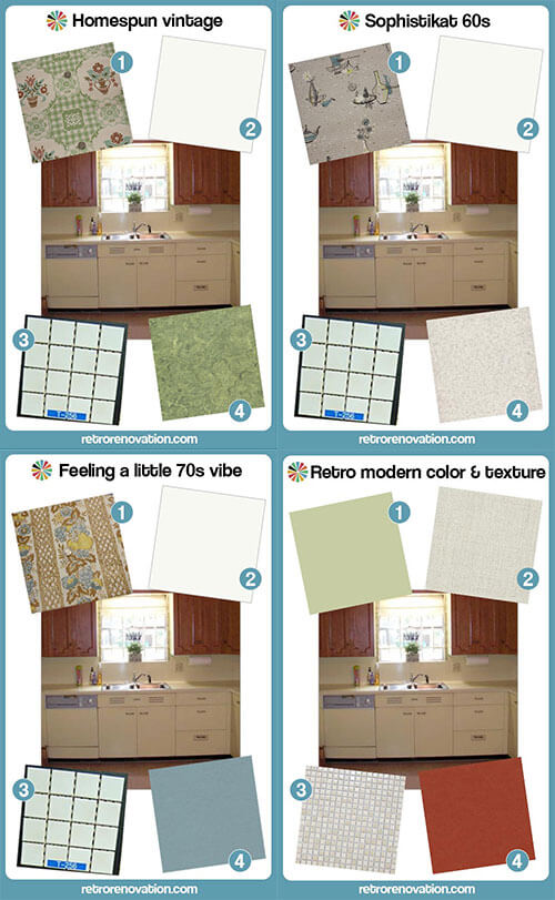
My mood boards all show my “basics” — laminate counter and tile backsplash — partnered with different flooring and wallpaper to demonstrate the different varieties of “retro” that can be achieved.
BEAUTIFUL cabinetry — good luck!
 “Homespun Vintage” has a sort of early 50s look, especially with the true linoleum flooring. Notice how I always chose wallpaper that included the colors in the cabinetry and flooring choices. Wallpaper is amazing for pulling a retro kitchen together. If you do not want wallpaper, you can accomplish a similar effect with curtains and other linens in the room:
- Vintage wallpaper from Hannah’s Treasures
- Dover White Formica or Abet Laminati off-white (Abet Laminati says it has the largest selection of solid color laminates in the U.S.) with a postformed edge
- NOS Romany Spartan 1.5 inch square off-white mosaic tile from World of Tile.
- Armstong Linoleum in Parrot Green
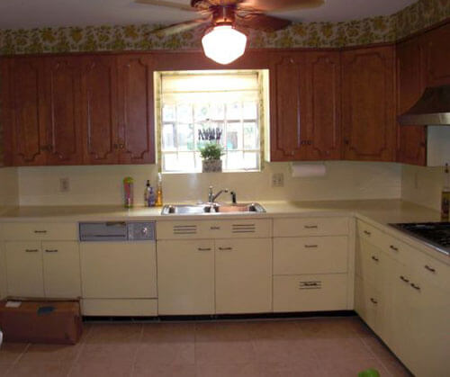
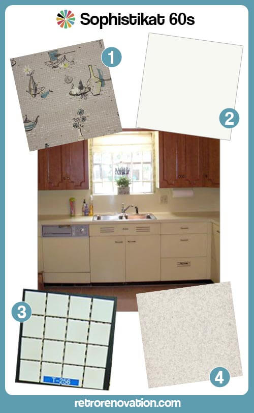 “Sophistikat 60s” uses vinyl sheet flooring in a lightly speckled pattern (to hide dirt.) Tip: Look in the COMMERCIAL sections of floor maker’s websites to find sheet flooring for a retro kitchen:
- Vintage wallpaper from Hannah’s Treasures
- Dover White Formica or Arpa Laminati off-white with a postformed edge
- NOS Romany Spartan 1.5 inch square off-white mosaic tile from World of Tile.
- Johnsonite Commercial Vinyl Sheet Floor — Full Moon
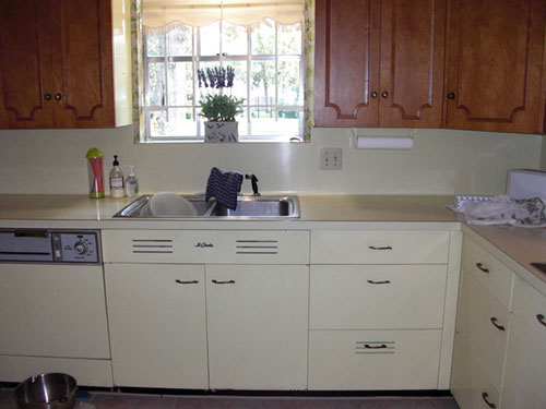
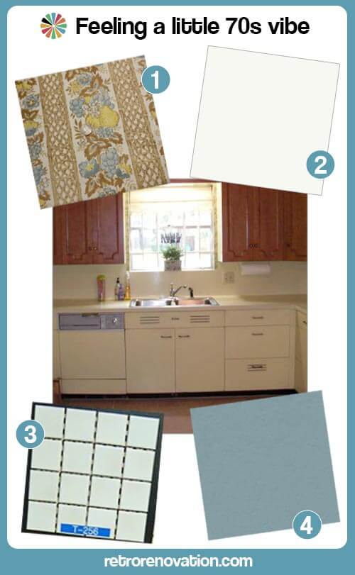 “Feeling a little 70s vibe” reminds me of the original kitchen. It again shows you can choose a muted floor color that harmonizes with the yellow and brown cabinets — then pull it all together with wallpaper:
- Vintage wallpaper from Hannah’s Treasures
- Dover White Formica or Arpa Laminati off-white with a postformed edge
- NOS Romany Spartan 1.5 inch square off-white mosaic tile from World of Tile.
- Marmoleum Vintage Blue linoleum
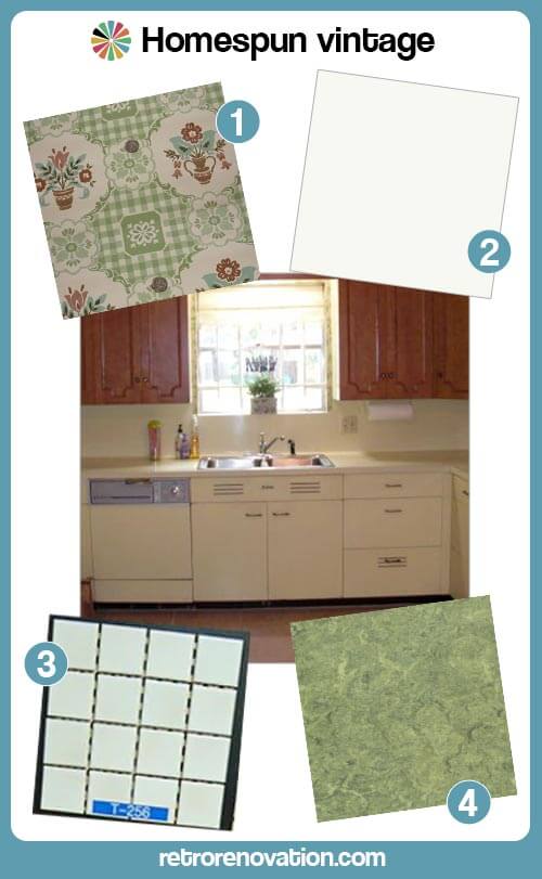
Kate’s mood board:

- Light Sage Green wall paint similar to Sherwin Williams Baize Green
- Nevamar Laminate in Cool Chic
- Merola Tile Cosmo Pixie Almond .5 in tile mosaic from Home Depot
- Marmoleum Walton Cirrus Linoleum in Berlin Red
Sage green, butter yellow, almond and burnt red are a classic vintage color combination. In my mood board, I’ve chosen to use the Berlin Red Marmoleum flooring to balance the warmth and intensity of the upper maple door cabinets in Cathy’s vintage set in the hopes that creating this balance will help the gorgeous wood doors more visually pleasing to her — so whe will decide to keep them their original wood finish. The counter tops have a vintage linen-like texture and the warm almond color will work nicely with the butter yellow cabinets as well as the maple cabinet doors. Instead of a stark white subway tile, the half inch square ceramic tiles in almond both go nicely with the countertop and add more texture to the space — and feel both vintage and modern at the same time. To finish of the room, I’d paint the walls a light sage green color, which will complement all of the other colors and finishes in the room and add more color interest to the kitchen. Finish this look off with a few bold red and green accessories to tie the look together and this retro modern room is complete.


Paul says
I’m thinking linoleum. I’m biased; it’s what I did 🙂
Try looking at Armstrong Marmorette. I’m looking at samples on the computer, so it’s not 100% accurate, but I think a sheet floor of Marmorette in LP048 Firebird Red or LP008 Aztec Red with an accent design of LP072 Goldenrod or LP076 Yellow Straw could be really nice with the yellow and maple cabinets. I agree that I would not do subway tile. I would do linoleum counters and backsplashes. They look great and are soft and quiet when placing dishes and other items. Do a metal edge.
If you go with linoleum for the counters, I might reverse my color suggestions for more contrast, putting down a yellow floor with maroon accents and a maroon counter/backsplash. Or do the maroon floor and counters for unity with some yellow accents in both. A good linoleum installer can cut patterns in your material and make any designs you want. A strip of yellow running along the maroon backsplash could be very nice. A small pattern or “medallion” in the center of the floor could be nice too. I did three strips in the center that formed a two-foot or so diamond shape design: two strips of equal length bracketing a longer one in the middle. I designed it to mimic the ventilation strips cut in the drawer blank just below my sink.
Cathy says
Hi, everyone, and thanks so much for all the suggestions!!! I love Paul’s idea about the diamond pattern accent in the middle, kitchen is VERY small and that would be better than a checkerboard.
My husband is DYI and he’ll be putting in the floor, so I’m not sure if he could figure that out though. I got some great samples from Azrock so I’ve been looking into those, too.
I’d like to show the current configuration of the kitchen, but I’m not sure how to post the photos? Can I upload them and link to them? Just let me know.
I’m really looking forward to Pam’s ideas, I know they will be great 🙂 I saw Pam’s post about the GE Artistry appliances yesterday and I think we will wait till they come out in Sept and see if the fridge and range will work for us. We have a free standing range, and not a wall oven. We have the original St. Charles dishwasher panel, so I don’t think it would work with the handle on the GE dishwasher.
Just to mention, I talked to the laminate people about doing the countertops with a metal edge. They told me I would have to purchase the “classic edge” which would cost 2X as much as the other edges, and we’d have to do the trim ourselves. I’m willing to pay for the edge, and I’m sure my husband can figure out the installation, but just wanted to be sure before committing.
Oh, and the sink has already been purchased, Kohler single bowl enameled cast iron. I have always wanted one!
Again, thanks everyone for all the ideas.
pam kueber says
Hi Cathy, yes, you can upload your photos and link to them.
Chad says
Another option is to use a 3D kitchen design thing – IKEA has a good one, though you’d be limited to their Akurum cabinet sizes – you could draft it in 2D but then see a 3D model. If you need to figure anything out as far as placement goes, it’d probably do you good, and then I think you could share it.
Julie says
I love retro kitchens. We just finished ours. I had custom cabinets made in almost the same light shade of ivory/yellow. We chose a black quartz countertop with flecks of glass in it that sparkle (retro!) but also hide dirt. They are stunning and everyone comments on them. I do not regret shelling out the $ for them one bit. They’re called starlight. We chose a vintage 60s backsplash tile from an eBay huge NOS lot that Pam featured a while back. It’s a tiny veined mixture of slate blue gray with an alabaster background and black random streaks. Sounds funny, but the overall look is super neutral for my bright orange and yellow countertop accessories and pans! I wanted mainly neutral things attached to the house (a tiny mid-century modest cottage style) in case we sell or decide to change things up. Our floors are a silver spruce wood plank that are wood-look that read gray, which I adore with the backsplash neutrals, and darker hides all the dog dirt – bonus. My dinette was a great Craigslist find. Burnt orange vinyl chairs with a white laminate table from the 60s. I was ecstatic to find it locally and get it delivered free! I researched color combos online for my kitchen plans for months and finally was happy with my choices, but every kitchen is different with unique personality. Have fun because it can be stressful otherwise :). Retro Renovation is a huge help and great resource, as we all know!
Julie says
Totally forgot to mention we did a center island with butcher block top because I wanted to bring in warm accents of wood. Your maple upper cabinets could be a blessing in disguise with so much warmth. I have wood fruit bowls and a wood hutch (even found cute woodgrain kitchen hand towels on etsy!) to bring in even more 60s grandeur.
Lynne says
My first thought would be a wood floor close to the color of the upper cabinets. I think that would tie them in, make things more cohesive. I just can’t see the black and white check working, or the subway tile. Sorry. I see that as a more 30’s look, not late 50’s early 60’s.
I think I would work towards finding some vintage or vintage looking wallpaper for that back splash. Something butter yellow and brown. The kind with the coffee grinders, and kitchen-y pictures.
I’s do a wall color to match the yellow lowers. Everyone likes a sunny yellow kitchen!
Sarah says
With the mismatch between the upper and lowers I would try to focus all my decisions around trying to make that look intentional. I would do this by keeping the color scheme to just yellow, white and wood.
Have you considered a yellow and white checkerboard floor? It would look beautiful. To bring wood into the room I would use a wood dining set or island, another big ‘wood’ element to balance the uppers.
pam kueber says
FYI – that was “intentional” at the time the cabinets were designed by St. Charles. It was a particular look – to bridge steel and wood. Others had it, too. See this story: https://retrorenovation.com/product-guides/metal-kitchen-cabinets-history-design-faq/
lynda says
Wonderful research, Pam. You should get an honorary degree in design, for sure. I think the wood and metal could look great together. it is fun to reuse something of great quality.
pam kueber says
🙂
Andy says
Maybe a marble laminate with curved edges would look good with the yellow and the maple. If you decided to do subway tile, the two would pair up nicely. If it is available, a subtle terrazzo flooring or something similar would make it very period appropriate. For walls, a fun funky color like aqua or avocado would give it a cool 60s vibe.
linda h says
I liked the idea of tying uppers to lowers with knobs the color of lowers on uppers also maybe outlining the inset with yellow,too.(not changing color) Well, that is the only idea I have. I know Pam &Kate will have good ideas for countertops and accent colors.
Patty says
I think they should leave a gap in some of the upper cabinents and put some painted open shelves in the color of the lowers.
lynda says
I think a total mix and match look could be great. Wood floors or for ease of care, a luxury vinyl wood look floor, would compliment the wood top cabinets. I think your black counter might be in the right direction. A soapstone counter would be nice too. A backsplash that compliments the yellow would be great too. I don’t think everything has to be 100% period correct to make the kitchen fabulous. A maple butcher counter might look nice too. You could just do part of the counter in the wood. A stainless sink with a drainboard would work with the wood counter. Look at some of the creative mix and match kitchens on the web for inspiration. This post really shows some mixed up kitchens. The last one is use of Smallbone cabinets found on Craigslist. I think you have found some quality cabinets and it can all turn out fabulous!
http://www.remodelista.com/posts/remodelista-considered-design-awards-vote-for-the-best-kitchen-reader-submissions
Patty says
Having a hard time visualizing these 2 together. Maybe if you paint the base cabinets a red and then use bright red knobs on the upper maple cabinets and red accent pieces. Or maybe the same thing with yellow – or mix up the knobs and accents with 2 colors but only one of them as the base paint color.
James Owens says
I really like the color of the lower cabinets. The maple on top doesn’t feel like they go. Seems like they were changed out at some time but I could be wrong. I might have some simple flat doors made and paint them to match the lowers. Make them so they close without gaps between them. No need to try to match handles. My set of Youngstown cabinets have handles on the bottoms and none on the tops. It would help bring them together. Just my two cents.
pam kueber says
St. Charles look is original, see this story: https://retrorenovation.com/product-guides/metal-kitchen-cabinets-history-design-faq/
Andrea says
I am with you on this one, James.
Tom says
I am with James and Andrea! The uppers have nice looking doors, but to me they just don’t go with the lower cabinets – even if they came that way to begin with. Especially since the “new” kitchen is rather compact and I’m thinking all that wood may make it shrink visually even more. But like a friend of mine used to often say, “Opinions are like noses, everybody’s got one…” 🙂
pam kueber says
Yes, and some noses are bigger than others! hahahahah, good one!
Mary Elizabeth says
Based on my experience in my first house, which was built in 1939 and had a kitchen redone in the early sixties but never touched again (the house came with records of all the work), I am with Pam on this one. St. Charles did indeed feature metal cabinets with original wood doors. Mine, like the ones Cathy bought, had wood only on the top. I think the idea was that if you splashed hot water, food, etc., it would drip down and would be easier to wipe up off the high-gloss metal. My wood doors were a slightly different style, with a flat surface and a lighter finish, but they were definitely maple. What’s more, the whole neighborhood (one family neocolonial and Tudor revival styles) had St. Charles kitchens, and most of them had wood doors on the top cabinets.
If you read the article on steel cabinets, it refers to the competition between metal and wood cabinets, and St. Charles might have tried to attract customers who preferred wood by giving them wood on the top cabinets. Also, different colors of top and bottom cabinets were part of the aesthetic of the period. To us, they don’t seem to go.
Chad says
Ironically, I was thinking of doing the opposite of this with my kitchen, whenever I get to it. I’d like wood cabinets for not showing dirt, with painted on top.
Sarah g (roundhouse) says
While black and white are classic and go with everything, some great accent colors for a 50s look that will go great with yellow and maple would be red or aqua depending on your preference. If you wanted more of a sixties look avocado would go great too.
Paul says
Great color suggestions, Sarah. I think a maroon/oxblood and yellow combo on the floors would be amazing. In a small space I would consider doing a solid color floor, perhaps with an inset contrast color. I have a 10X9 kitchen and took this approach. I did a deep green marmoleum floor with three golden yellow strips in the center that formed a diamond shape design: two strips of equal length bracketing a longer one in the middle. It gave punch to the floor, but didn’t visually shrink the small space like a checkerboard pattern or a solid floor and border might.
Cathy says
Hi, Paul. I was just wondering if you could show a picture of your floor? I really like the idea. Thanks!
Paul says
Cathy, I would be happy to share a photo. Not sure how to upload here. How do I do that?
Paul says
Cathy, I remembered I had a before/after album of photos. Here’s a link to them on Google Picasa: https://picasaweb.google.com/107173262158449166093/Kitchen?authuser=0&authkey=Gv1sRgCIa87aykyrnAEw&feat=directlink
There’s one of the floor in there.
Paul
Cathy says
Thanks so much for sharing those, I really like that idea for the floor! My kitchen is about 7X12, so I think that would be a great way to have a little bit of pattern but not be overwhelming like a checkerboard.
I also love your countertops, they are fabulous! And that fridge!! It’s grand!
Paul says
Thanks, Cathy! I was very pleased with the way everything came out. I waited about six years to do the kitchen. The counter tops and backsplash have held up beautifully. I love the link they provide to the floor color, too. I used Armstrong Marmorette, but there’s Forbo Marmoleum, too. Probably other sources that Pam has on here and I haven’t seen yet. 🙂
That fridge is terrific. It’s a 1947 Frigidaire. Got it at an estate sale. It was free for helping the guy who ran the sale 🙂 I have had good luck finding affordable, functional vintage appliances. The stove is a perfect working condition 1956 GE that cost me $250 from a local used appliance shop.
Best of luck with your kitchen! Looking forward to seeing the “after” photos.
Cathy says
I would like to thank Pam so much for featuring my dilemma, and for her fabulous suggestions! Also thank you to everyone who posted, I really appreciate all the great ideas.
I think my next step will be to try and get some more samples based on some of the suggestions. And hopefully soon I can get at least one upper cabinet and one base cabinet in the kitchen (even if they are just sitting there, lol) and try the samples with the cabinets to see what feels best to me.
I will be sure to let Pam know when the kitchen is done so she can share some pictures. It will probably be at least the fall, maybe a little later than that. It’s a one man show for my husband, and even though he’s taken a several vacation days, it’s mostly a weekend thing.
Oh, and btw, even though I don’t have an eat-in kitchen I do have a gold flecked dining table from 1961. I bought it from Craigslist in Austin and my daughter was nice enough to drive it to Houston for me. The original chrome leg chairs were recovered in blue checked fabric at some point, and after the kitchen is done I hope to get them recovered in vinyl. So even though I can’t get the gold flecked counter tops, at least I have the table 🙂
Mary Elizabeth says
Cathy, I envy you your St. Charles kitchen; I lost mine (cream colored with plain maple upper cabinet doors) to my ex-husband. I agree with your husband that you should leave the maple doors. If they are a bit scuffed, they can be touched up and eventually restained and refinished (which I planned to do with mine). I would go with Pam’s color palettes that feature either green and brown or blue and brown. Those will both go with the ’60s or ’70s look and with your cabinets.
In terms of your table with the gold flecked top–I take it that the dining room is connected to the kitchen? I would wait to choose the upholstery until you have the kitchen colors settled. That way it will look very connected to the kitchen.
Cathy says
I’m sorry to hear about your cabinets 🙁 The dining room is right off the kitchen, you will be able to see it once we get the pass through window opened up. And I think that’s definitely a great idea to wait to reupholster the chairs. That way they will go with the kitchen, and plus hopefully I can afford it by then, lol.
philq says
I agree with the color suggestions. I have the same sunny yellow cabinets (upper and lower) in my original 1957 kitchen with stainless and turquoise counter tops and turquoise appliances – great color combo! The wall paper took forever to find – an ivy pattern with turquoise instead of the usual green and shadows almost matching the cabinets. The floor is the original vinyl squares inlaid with black strips to create a large plaid pattern running diagonally across the kitchen.. My kitchen is only about 13 x 12 with cabinets on all walls, so not much floor space, but it adds a dramatic touch. Perhaps you could use a brown strip to compliment the cabinet.