

 Reader Cathy is working on remodeling her tiny 1949 kitchen using a set of vintage pale yellow and maple St. Charles steel kitchen cabinets that she found on craigslist. She likes the vintage look but isn’t quite sure what elements would work best with these cabinets. While her St. Charles cabinets are from the early 60s, they have a timeless look about them and we think Cathy could go in any number of directions and still get a fantastic retro-inspired result. She wants our ideas — what do you think she should do?
 Cathy writes:
I have an old house (1949) and a very small kitchen. I recently purchased a set of St. Charles cabinets, they are from I believe 1963 or 1964. They are butter yellow with maple doors on the upper cabinets. They came from a much larger kitchen than mine, so my husband can make them work with some extra for the adjacent laundry room.
I am looking to do a late 50s/early 60s style. We purchased the house 14 years ago and the kitchen and laundry room are the last major projects (I want to continue the look into the adjacent laundry room). We had three kids at home when we purchased the house and now we are down to one 18 year old (yay!) so it is finally time for my kitchen. I have come to love vintage/retro in the last few years (due it part to a fondness I have acquired for The Adventures of Ozzie and Harriet), so I am glad that we didn’t get to the kitchen until now 🙂
I originally planned to get basic generic cabinets and paint them and get hardware for a retro look. While searching Craigslist for a vintage sink, I came across the St. Charles, and I knew they would be perfect. To top it off, the seller literally lives two miles from my house.
So that has changed my ideas around quite a bit, and I’m not sure what color/style counter tops to go with. I definitely want laminate, and was thinking a black, but now I’ve started to rethink and I’m just not sure. Maybe a metal edge? I am planning on a black and white checkerboard floor in vinyl composite tiles. But the colors of the floor aren’t set in stone yet. Also wanted to do a white subway tile back splash.
I have also considered painting the maple upper doors, but my husband isn’t going along with that one, so I will probably keep them as is.
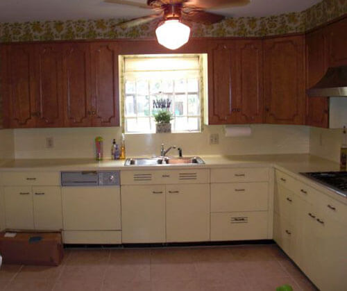
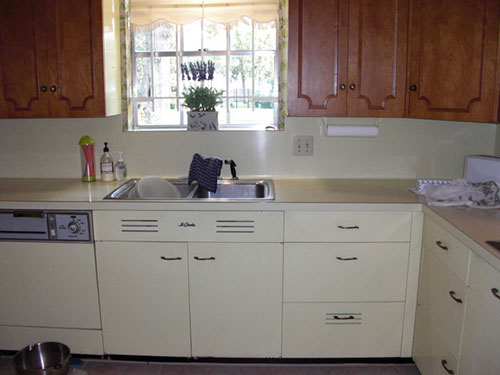
The cabinets are in a rental storage unit right now, and they are as my husband would say: jammed jelly tight, so the only photos I have right now are from the Craigslist listing. They show the cabinets in the seller’s house, with the original yellow laminate counter top (which I did not have the option of getting). Of course the configuration of my kitchen is much different, and considerably smaller.
Right now my kitchen is pretty much down to the studs, and we are moving just about everything: the sink, the fridge, the stove, adding a window, etc. The cabinets appear a bit darker than they really are in a couple of the photos, they are a pretty light yellow.
I appreciate your time and consideration.
Pam and I have some suggestions prepared for Cathy’s kitchen — ideas for counter top, backsplash, flooring and wall treatments. We’ll be back at noon to share our mood boards.
Readers, what are your suggestions for Cathy’s kitchen cabinets?
Pam’s mood boards:
Cathy, agree with the commenters who said that subway tiles are not post-war vintage style — these are a pre-war style. And, I think that black-and-white checkerboard floors could be overwhelming considering your cabinet finishes. That said, it’s your kitchen — do what makes you happy.
If this were my kitchen, I think that I would try to keep the counter top and floor a single color, to simplify around the two-tone cabinetry, which provides a lot of visual interest already. I’d probably look for an off-white laminate for the counter top. Although, this kitchen really makes me moan for the loss of gold sparkle laminate — I think gold sparkle counter tops would look amazing. Back to laminate choices: I’m obsessive about the “just right white” — I showed Dover White Formica in my mood boards, but I am not sure that would really be just right. You need something that stands out from the yellow, just enough, but harmonizes with all the yellow and maple tones. Here is a story I did with all the laminate manufacturers with product in the U.S. that I know of. Regarding the edge: I might go for a postformed edge, which we now know existed as early as 1952. I say postformed rather than metal edge — because your cabinets have a more modern 60s feel than they do early 50s — and because you already have graphic action going on what with the two-toned cabinets including wall cabinets with molding.
For the backsplash, I would try to match the counter top as closely as possible with simple, matte finish square field tile. I have shown vintage 2″x2″ tile (I think that’s the size) from World of Tile in all my mood boards. I spotlighted World of Tile tile ‘cuz if I had a kitchen to remodel, I think I would do ‘most anything to use some of their New Old Stock vintage tile. That said, you could also use 4″x4″ file tile — which would be very inexpensive — and which is timeless.
After that, the decorating sky is the limit. You can choose a solid floor and wall treatments in almost any combination — however I would keep the colors kind of “dulled”, or else they will overwhelm your yellow cabinets.
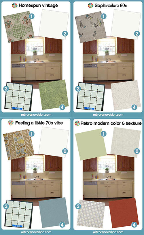
My mood boards all show my “basics” — laminate counter and tile backsplash — partnered with different flooring and wallpaper to demonstrate the different varieties of “retro” that can be achieved.
BEAUTIFUL cabinetry — good luck!
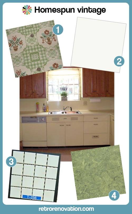 “Homespun Vintage” has a sort of early 50s look, especially with the true linoleum flooring. Notice how I always chose wallpaper that included the colors in the cabinetry and flooring choices. Wallpaper is amazing for pulling a retro kitchen together. If you do not want wallpaper, you can accomplish a similar effect with curtains and other linens in the room:
- Vintage wallpaper from Hannah’s Treasures
- Dover White Formica or Abet Laminati off-white (Abet Laminati says it has the largest selection of solid color laminates in the U.S.) with a postformed edge
- NOS Romany Spartan 1.5 inch square off-white mosaic tile from World of Tile.
- Armstong Linoleum in Parrot Green
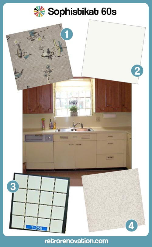 “Sophistikat 60s” uses vinyl sheet flooring in a lightly speckled pattern (to hide dirt.) Tip: Look in the COMMERCIAL sections of floor maker’s websites to find sheet flooring for a retro kitchen:
- Vintage wallpaper from Hannah’s Treasures
- Dover White Formica or Arpa Laminati off-white with a postformed edge
- NOS Romany Spartan 1.5 inch square off-white mosaic tile from World of Tile.
- Johnsonite Commercial Vinyl Sheet Floor — Full Moon
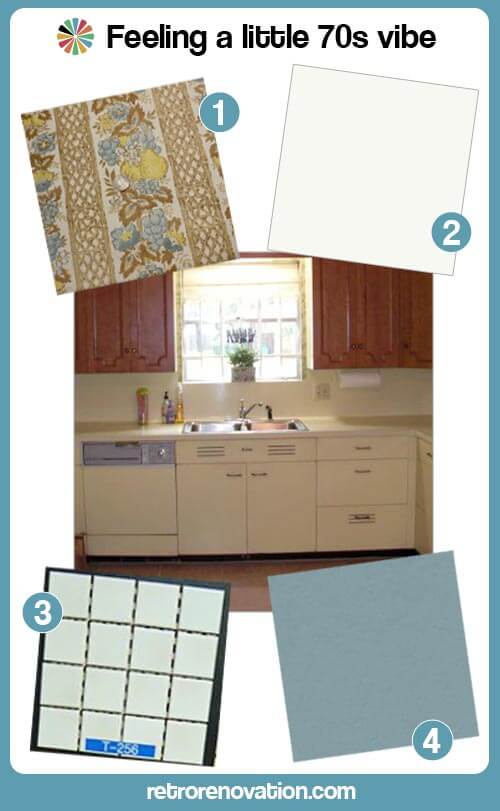 “Feeling a little 70s vibe” reminds me of the original kitchen. It again shows you can choose a muted floor color that harmonizes with the yellow and brown cabinets — then pull it all together with wallpaper:
- Vintage wallpaper from Hannah’s Treasures
- Dover White Formica or Arpa Laminati off-white with a postformed edge
- NOS Romany Spartan 1.5 inch square off-white mosaic tile from World of Tile.
- Marmoleum Vintage Blue linoleum
Kate’s mood board:

- Light Sage Green wall paint similar to Sherwin Williams Baize Green
- Nevamar Laminate in Cool Chic
- Merola Tile Cosmo Pixie Almond .5 in tile mosaic from Home Depot
- Marmoleum Walton Cirrus Linoleum in Berlin Red
Sage green, butter yellow, almond and burnt red are a classic vintage color combination. In my mood board, I’ve chosen to use the Berlin Red Marmoleum flooring to balance the warmth and intensity of the upper maple door cabinets in Cathy’s vintage set in the hopes that creating this balance will help the gorgeous wood doors more visually pleasing to her — so whe will decide to keep them their original wood finish. The counter tops have a vintage linen-like texture and the warm almond color will work nicely with the butter yellow cabinets as well as the maple cabinet doors. Instead of a stark white subway tile, the half inch square ceramic tiles in almond both go nicely with the countertop and add more texture to the space — and feel both vintage and modern at the same time. To finish of the room, I’d paint the walls a light sage green color, which will complement all of the other colors and finishes in the room and add more color interest to the kitchen. Finish this look off with a few bold red and green accessories to tie the look together and this retro modern room is complete.


lynda says
This is an amazing project to take on. Just keep your eyes on the fabulous vision and good luck. I like Kate’s last choice for a simple look.
http://samples.wilsonart.com/p-622-sea-glass-4900.aspx pretty for counter. Looks like a pale yellow in the swirl. Check out the Karndean Mosaics too. Doesn’t go with the sea glass Wilsonart– but may go with another choice for the counter. http://www.karndean.com/en/floors/iconic-floors/mosaic-flooring.aspx
nice retro look. Look at Karndean Loose Lay floors too for really easy diy job.
Cathy says
A little embarrassing to post the before pictures, but I’m just glad that kitchen is gone! My husband is a plumber (he put in a temporary sink for me) and a great DYI guy. It’s going to take a lot of work, and time.
I was wondering if you had any suggestions for what type of post formed edge? The laminate people said the cheapest is “waterfall” but I didn’t care for that much. They had several others, not sure what would look best?
He is building soffits, but I don’t think we will do wallpaper because of the size of the kitchen, it’s so small. But I will do a curtain or valance in the window over the sink.
My fabulous kids got me a Dishmaster faucet for my birthday. I have a 60s toaster, blender and waffle iron. Also a 50s Kitchenaid stand mixer, I hope everything will come together well 🙂
pam kueber says
Regarding the postformed edge: I tend to revert to what was done back in the day — the look that was in place when the cabinets were made. That way, the counter tops historically match the cabinets. You have early 60s cabinets (I’d say) For them, I think I’d used simple postform edges. Here is our story on postformed edges: https://retrorenovation.com/2013/05/28/curved-postformed-laminate-1952/
See this also: https://retrorenovation.com/2013/03/25/10-ways-kitchen-counter-top-edg-1953/
Simple rounded edge.
Cathy says
Thanks so much for the info and all the references. Because the flat edge will cost me twice as much, I may go for the simple rounded edge, I’ll have to check with the laminate people again, and see all the edges they offer.
So many great ideas!
Cathy says
I forgot to ask if you would recommend a matte or glossy finish? Thanks!
pam kueber says
Either is fine. For a kitchen, I think matte is the best way to go, because it is less likely to show scratches.
Chad says
NO SHAME in your before kitchen. You’re not the one who battered it, and your patience with it won you something cooler than the generic cabinets you would have had. I don’t like the wastefulness of temporary work, so I think living with something beat up should be a point of pride.
Cathy says
Thank you, Chad 🙂 True, the kitchen was like that when we bought the house. We bought it as a fixer because my husband is a great DIY guy. In the 14 years we’ve lived here, we’ve done a ton of work, and the kitchen and laundry room are the last big projects.
Now that we only have one child left at home, it is finally time for my kitchen!! I was thrilled to find the cabinets, I love things with character, and am glad I won’t have to have generic cabinets.
And I think you’re right, at this stage I should probably concentrate on countertops and flooring, and let the other elements fall into place.
Mary Elizabeth says
Yes, Cathy, kudos to you for (1) living with that kitchen for 14 years and (2) living in the demo zone it is now. Such a sweet DH to install a temporary sink to make sure you don’t have to wash dishes in the tub.
Now that we see the size of the kitchen and the little window, I agree with those who say that you should forget about wallpaper. Also, go with the lighter color choices in such a small space–if green, pick a lighter shade, etc. Also, remember the idea I mentioned of leaving one cabinet without doors? That would be the perfect place to display and store your vintage small appliances.
Another idea–when doing my recent renovation, I decided to leave the laundry room door off to create more air flow and light. Since you are continuing the same cabinetry in the kitchen, you could try that, too.
Cathy says
Yes, I think lighter colors would look nice. Once we get the cabinets hung I will have to see if I have enough room to store all my dishes and have room left for the appliances. I will only be getting four full size upper cabinets and two shorter ones, the rest will be in the laundry room.
And we did consider leaving the doorway open between the laundry room and the kitchen, because we are continuing the same floor, cabinets, etc. But I have such a small house I use the laundry room for storage as well, and it would be somewhat unsightly 🙂
Mary Elizabeth says
Yes, I know what you mean! Everyone needs a “glory hole.” But maybe with the St. Charles cabinets in there you will be able to stow some of that stuff away. Can’t wait to see the results.
Glamorlux Nancy says
We also have a small kitchen with wood cabinets. I thought of *every* option for flooring, and am very happy with our final decision of Armstrong Commercial Connection Corlon sheet flooring (in Ocean Green). It has a very authentic “retro” look, without being overbearing. In retrospect, I think any tile (especially contrasting, like black and white) would have been too busy – especially since we have diamond wallpaper on the bulkheads. Good luck with your project! 🙂
pam kueber says
Nancy, I need to see your kitchen!!!
pam kueber says
I like the look of that Corlon — does it read like terrazzo in real life, Nancy? Corlon is here: http://www.armstrong.com/commflooringna/products/sheet/connection-corlon/_/N-67sZ1z141y8. I think that Cathy needs to be careful about not getting too much gray in her floor.
Lynne says
Pam, Mannington’s commercial flooring “Magna” has a terrazzo look about it. I considered it for a long time, but it only comes in 6′ widths. I would have had too many seams.
pam kueber says
Thank you! We’ll take a look!
Cathy says
Love the ideas! The Sophistikat 60’s and Retro Modern are my favorites. Here are some pictures of my kitchen. First Wall before: http://home.earthlink.net/~cewhalen/images/kitchen5.jpg and here is that wall now: http://home.earthlink.net/~cewhalen/images/kitchen999998.jpg the fridge will be on the right then two wall cabinets and two base cabinets. The second wall before: http://home.earthlink.net/~cewhalen/images/kitchen1.jpg and the second wall after: http://home.earthlink.net/~cewhalen/images/kitchen9999994.jpg. I got my window 🙂 Under will be the sink, then dishwasher then one base cabinet. Next to the window will be two upper cabinets. Then the laundry room door: http://home.earthlink.net/~cewhalen/images/kitchen99999.jpg. Then to the left the last wall before: http://home.earthlink.net/~cewhalen/images/kitchen2.jpg you can see on the left it had the stove then the fridge. Here it is now: http://home.earthlink.net/~cewhalen/images/kitchen9999993.jpg. Stove will stay on the right, my husband is making a pass through window. To the left of the stove will be a cabinet and countertop. There will be a short cabinet over the cabinet (the one that was over her cooktop) and he is building a small soffit over that, and taking it down lower over the stove to accommodate a vent pack over the stove.
pam kueber says
Wow, that is some serious DIY going on. Good for your DH! Renovate Safe!
Robin, NV says
Holy moly! I’m looking to do something similar with my ktichen – basically take it down to the frame to fix some electrical issues, add insulation, and get rid of the brick backsplash (sorry Pam) – but I’m going to try my gosh darndest to save my cabinets. I’m terrified to take them down. They’re nailed to the wall (is that normal?), so it’s going to be a delicate process.
Pam and Kate – love your suggestions. I’d go with either #1 or #4. I love color.
Chad says
My takeaway from those pictures is that you should focus on just the countertops and floor. You can always paint or hang wallpaper later, so either prime them white or take your best guess with a color.
Robin, it’s totally possible to get your cabinets down in good shape but you’re going to have to be gentle. My kitchen cabinets are relatively new and about the flimsiest on the market, and they were nailed and glued onto a wall that was drywall directly on plaster directly on brick with no studs. My cabinets were screwed together through the face frames, so you may want to look carefully around the door openings and see if you can find any fasteners there. Also, with the countertops out, check the very tops of the base cabinets. Once you’re pretty sure that they’re not attached to each other, break off or score with a utility knife anything stuck to the cabinets at the walls (paint, caulk, tile and grout). I don’t know if caulk would damage good cabinets, but it pulled mine apart. You might want 2 people to take the cabinets down. One will have to use a crowbar starting in an inconspicuous area, drive it behind the cabients. Don’t pull when you start, just drive it in a few inches in several locations and make sure that the cabinet seems to be coming free. If it’s stuck anywhere, take care of that spot. Your helper will need to hold the cabinet once it finally comes loose. Just really, really take your time and coax them off gently so they don’t break.
Pam, I’ve done some demo work on my house and managed to save fragments of plaster with original wallpaper on them. I have 4 pieces of flamingos, 3 of fish, and 2 of kitchen paper with teapots and the like. I’m thinking of hanging them just as they are – ruins of previous iterations of my house.
pam kueber says
And Precautionary Pam chimes in: Be sure to renovate safe. Old materials including the walls, paint, adhesives, etc etc may contain vintage nastiness such as lead and asbestos etc — find your own properly licensed professional to determine what you are working with so that you can make informed decisions.
Ranger Smith says
Cathy – Congratulations on this great, and local to you, find! The maple uppers are really unique. I think accent colors in the rust/copper/brown tones and some avacado/olive green would look very appropriate with this set of cabinets. Maybe even some orange. Marmoleum flooring has many options that would work with this and would be true to the era of these cabinets. If your kitchen space is small, it might also have limited natural light so I would try to keep everything as light as possible. In my opinion, counter tops in a lighter color would be easier to keep clean and keep the room from getting too dark. Anyway, please share pictures of the end result with us.
Hunter Hampton says
I grew up with identical butter yellow St. Charles cabinets, in a NYC apartment. I remember the kitchen so well, the floors were gray tiles, but not solid gray, they had white cloud looking streaks….. the Formica counter tops were pale yellow cracked ice…. they had a metal band….. and the appliances were white. The kitchen had upper and lower metal cabinets, no wood.
lynda says
I think the arabesque shaped tile was from the 60’s and readily around now. I think it would compliment the shape on the wooden cabinets.
http://store.missionstonetile.com/Beveled-Arabesque-Glazed-Ceramic-Wall-Tile-s/141.htm Do an image search, and lots of pictures are on the net. Subway either seems “today” or an earlier era than the 60’s.
Ana says
I like Lynda’s idea of the more curvy tile (rather than subway tile) because it would reference the design of the upper cabinet doors. A friend got her Arabesque tile on Overstock and is very happy with it (and its price).
There have been some excellent suggestions in the comments. I agree with sticking to a limited color palette and using a green like the sellers’ wallpaper as an accent color to the yellow and wood. For the countertop area, I like the idea of a darker yellow laminate and then a white tile backsplash. There are so many ways you could go with these cabinets that I’m sure you’ll find a look you love. Don’t forget to send after pics. 🙂
Valerie says
lynda,
Thanks so much for the link to the arabesque tile. We have a 1967 Cape with white arabesque tile in the bathroom. I absolutely love it but fear we will have to replace it when we do some much needed renovation. I’m so glad that I’ll be able to use the same style of tile.
pam kueber says
See Merola’s Lantern tile, too — I bet it will be the best price, you can order from a big box store: https://retrorenovation.com/2012/12/03/26-bathroom-tile-designs-for-a-vintage-or-antique-bathroom-merola-tile/
Janet in CT says
I absolutely love these cabinets just the way they are and wouldn’t change a thing about them. I would not use black countertops as they just don’t seem to be the right fit for the time period. The 1949 house I am in now had off-white wood cabinets with a brown linoleum type of stuff for a counter top, with the chrome edge band, and I think that is right for the time period. No-one has ever brought it up that the dinnerware people were right on top of the popular colors for the times. I have twice now built a kitchen around a particular dinnerware I own. I love the idea already mentioned by Paul of maroon and yellow floor and would in a minute choose maroon/brick for the countertop too. I happen to love Pennsbury Pottery with the Amish figures on it (don’t know where you live, Cathy, but that is pure Pennsylvania Dutch), and could design a kitchen around it. Oh, wait, my mother did just that! She went with the brick colored floor which would look great with your pale yellow cabinets, and had a wallpaper with that same color in it on an off-white background. Me, I would find a wallpaper or dishes and work around that color scheme. I assume you didn’t get the built-in wall oven which looks new, but if you are using the cabinet, I would jump to find an old wall oven to fit. There are lots of beauties on craigslist. Here are a couple ebay auctions for the pottery – 330891392217 and 231002882084. The hex was the most popular and had yellow in it like your cabinets. The rooster and Amish figures were very colorful and might give you some ideas. I have boxes and boxes of it in storage that my mother left me – her mother was Mennonite. She loved dinnerware and I must have seven different patterns so I guess I got it from her. That is where I would start.
Paul says
Janet, I’m in CT as well and, though I chose the linoleum for my floors and counters without thinking of it, the green turned out to be an almost perfect match with the green in my Stangl Thistle plates and the Yellow a good fit with my Stangl Fruit pattern plates. I guess our cues are there for the taking!
pam kueber says
Stangl! I have all kinds of Stangl. It was the first thing we collected! 🙂
Jay says
Oh how I wished I had collected it when it used to turn up at flea markets at give away prices.
Paul says
Love my Stangl! I’ve noticed some Thistle salt and peppers in one of your past photos. My obsession started with some hand-me-downs. I still get the occasional yard sale “find.”
Cathy says
I totally agree with Janet on this one.
Mary Elizabeth says
Yes, I like the idea of pottery or plates to display in a kitchen that is color-coordinated to enhance them. Now look on eBay and in tag sales for Ruth Price Pennsylvania Dutch pottery–those are in colors that include brown, to go with the wood upper cabinets, and a delicate yellow that would echo the lower ones. Another idea from a clever reader that has been featured on this site is to remove the doors from one of the upper cabinets, paint the inside of the cabinet a coordinating color, then display your collectible dishes and kitchen wares on those shelves. This works particularly well in a small kitchen.
Robin, NV says
It would be easier to answer this question if we had photos of Cathy’s current kitchen – just to get an idea of how the light works and the layout.
That being said, I LOVE these cabinets. I think the mix and match look is lovely, homey, and cozy. St. Charles really knew their business! I’d leave them as is. For the countertops, I would definitely go with a red or aqua laminate. Cathy could try to get a yellow but I can tell you from experience, it’s really hard to find a nice one. Although a darker yellow might just work. I’m really enamored with the color I picked for my countertops – Nevamar’s California. For the floor, a check in white/red or white/blue would look great. I like the idea of subway tiles on the backsplash but I’m probably biased because that’s my plan for my kitchen. Otherwise, I’d paint the backsplash to match the lower cabinets.
Also – notice that the original owners brought in some green with the wallpaper on the soffits. That’s another color to consider for the countertops and floors.
PJ Tolbert says
I’d keep the yellow and maple personally and add punch to the kitchen via wall and/or ceiling paint. For countertops I think laminate is a great idea – the marble look w/subway tile would look really nice and being mostly white would let the yellow of the lower cabinets stand out. Perhaps do yellow handles on the uppers too? Or at least change out to match the metal tone of the lowers. Maybe do a yellow ceiling to match the lower cabinets with a lighter yellow wall color?
I think if the kitchen is small – a black and white floor might overwhelm it depending on the size of the tile pattern. Maybe go with a solid color vinyl tile/vinyl/lino? I would want the cool cabinets to be focal point. 🙂