

 Reader Cathy is working on remodeling her tiny 1949 kitchen using a set of vintage pale yellow and maple St. Charles steel kitchen cabinets that she found on craigslist. She likes the vintage look but isn’t quite sure what elements would work best with these cabinets. While her St. Charles cabinets are from the early 60s, they have a timeless look about them and we think Cathy could go in any number of directions and still get a fantastic retro-inspired result. She wants our ideas — what do you think she should do?
 Cathy writes:
I have an old house (1949) and a very small kitchen. I recently purchased a set of St. Charles cabinets, they are from I believe 1963 or 1964. They are butter yellow with maple doors on the upper cabinets. They came from a much larger kitchen than mine, so my husband can make them work with some extra for the adjacent laundry room.
I am looking to do a late 50s/early 60s style. We purchased the house 14 years ago and the kitchen and laundry room are the last major projects (I want to continue the look into the adjacent laundry room). We had three kids at home when we purchased the house and now we are down to one 18 year old (yay!) so it is finally time for my kitchen. I have come to love vintage/retro in the last few years (due it part to a fondness I have acquired for The Adventures of Ozzie and Harriet), so I am glad that we didn’t get to the kitchen until now 🙂
I originally planned to get basic generic cabinets and paint them and get hardware for a retro look. While searching Craigslist for a vintage sink, I came across the St. Charles, and I knew they would be perfect. To top it off, the seller literally lives two miles from my house.
So that has changed my ideas around quite a bit, and I’m not sure what color/style counter tops to go with. I definitely want laminate, and was thinking a black, but now I’ve started to rethink and I’m just not sure. Maybe a metal edge? I am planning on a black and white checkerboard floor in vinyl composite tiles. But the colors of the floor aren’t set in stone yet. Also wanted to do a white subway tile back splash.
I have also considered painting the maple upper doors, but my husband isn’t going along with that one, so I will probably keep them as is.
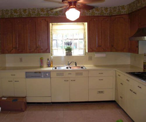
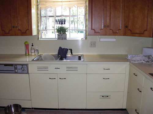
The cabinets are in a rental storage unit right now, and they are as my husband would say: jammed jelly tight, so the only photos I have right now are from the Craigslist listing. They show the cabinets in the seller’s house, with the original yellow laminate counter top (which I did not have the option of getting). Of course the configuration of my kitchen is much different, and considerably smaller.
Right now my kitchen is pretty much down to the studs, and we are moving just about everything: the sink, the fridge, the stove, adding a window, etc. The cabinets appear a bit darker than they really are in a couple of the photos, they are a pretty light yellow.
I appreciate your time and consideration.
Pam and I have some suggestions prepared for Cathy’s kitchen — ideas for counter top, backsplash, flooring and wall treatments. We’ll be back at noon to share our mood boards.
Readers, what are your suggestions for Cathy’s kitchen cabinets?
Pam’s mood boards:
Cathy, agree with the commenters who said that subway tiles are not post-war vintage style — these are a pre-war style. And, I think that black-and-white checkerboard floors could be overwhelming considering your cabinet finishes. That said, it’s your kitchen — do what makes you happy.
If this were my kitchen, I think that I would try to keep the counter top and floor a single color, to simplify around the two-tone cabinetry, which provides a lot of visual interest already. I’d probably look for an off-white laminate for the counter top. Although, this kitchen really makes me moan for the loss of gold sparkle laminate — I think gold sparkle counter tops would look amazing. Back to laminate choices: I’m obsessive about the “just right white” — I showed Dover White Formica in my mood boards, but I am not sure that would really be just right. You need something that stands out from the yellow, just enough, but harmonizes with all the yellow and maple tones. Here is a story I did with all the laminate manufacturers with product in the U.S. that I know of. Regarding the edge: I might go for a postformed edge, which we now know existed as early as 1952. I say postformed rather than metal edge — because your cabinets have a more modern 60s feel than they do early 50s — and because you already have graphic action going on what with the two-toned cabinets including wall cabinets with molding.
For the backsplash, I would try to match the counter top as closely as possible with simple, matte finish square field tile. I have shown vintage 2″x2″ tile (I think that’s the size) from World of Tile in all my mood boards. I spotlighted World of Tile tile ‘cuz if I had a kitchen to remodel, I think I would do ‘most anything to use some of their New Old Stock vintage tile. That said, you could also use 4″x4″ file tile — which would be very inexpensive — and which is timeless.
After that, the decorating sky is the limit. You can choose a solid floor and wall treatments in almost any combination — however I would keep the colors kind of “dulled”, or else they will overwhelm your yellow cabinets.
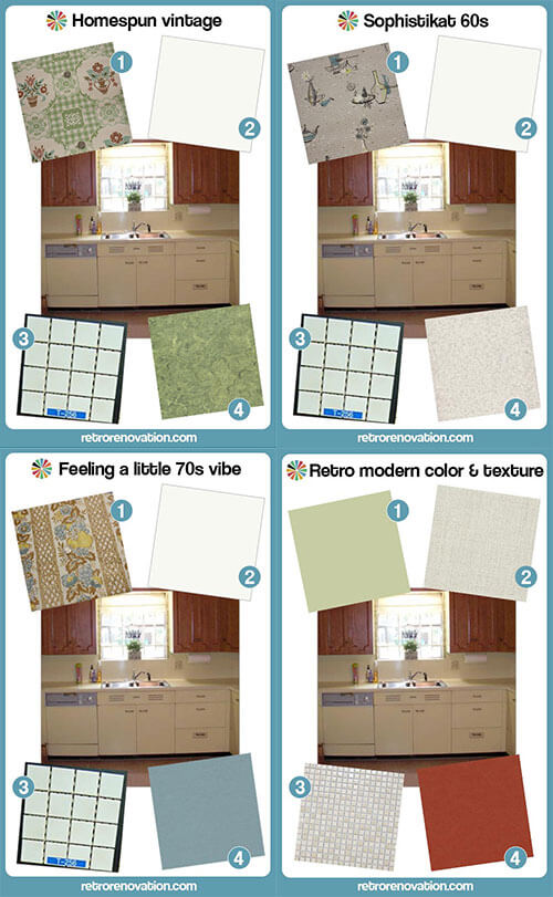
My mood boards all show my “basics” — laminate counter and tile backsplash — partnered with different flooring and wallpaper to demonstrate the different varieties of “retro” that can be achieved.
BEAUTIFUL cabinetry — good luck!
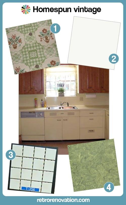 “Homespun Vintage” has a sort of early 50s look, especially with the true linoleum flooring. Notice how I always chose wallpaper that included the colors in the cabinetry and flooring choices. Wallpaper is amazing for pulling a retro kitchen together. If you do not want wallpaper, you can accomplish a similar effect with curtains and other linens in the room:
- Vintage wallpaper from Hannah’s Treasures
- Dover White Formica or Abet Laminati off-white (Abet Laminati says it has the largest selection of solid color laminates in the U.S.) with a postformed edge
- NOS Romany Spartan 1.5 inch square off-white mosaic tile from World of Tile.
- Armstong Linoleum in Parrot Green
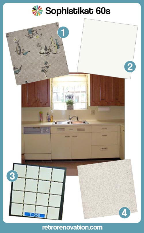 “Sophistikat 60s” uses vinyl sheet flooring in a lightly speckled pattern (to hide dirt.) Tip: Look in the COMMERCIAL sections of floor maker’s websites to find sheet flooring for a retro kitchen:
- Vintage wallpaper from Hannah’s Treasures
- Dover White Formica or Arpa Laminati off-white with a postformed edge
- NOS Romany Spartan 1.5 inch square off-white mosaic tile from World of Tile.
- Johnsonite Commercial Vinyl Sheet Floor — Full Moon
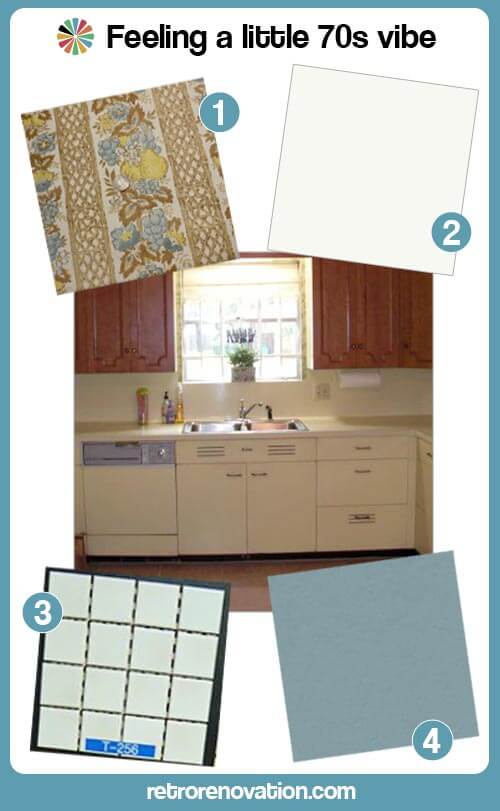 “Feeling a little 70s vibe” reminds me of the original kitchen. It again shows you can choose a muted floor color that harmonizes with the yellow and brown cabinets — then pull it all together with wallpaper:
- Vintage wallpaper from Hannah’s Treasures
- Dover White Formica or Arpa Laminati off-white with a postformed edge
- NOS Romany Spartan 1.5 inch square off-white mosaic tile from World of Tile.
- Marmoleum Vintage Blue linoleum
Kate’s mood board:

- Light Sage Green wall paint similar to Sherwin Williams Baize Green
- Nevamar Laminate in Cool Chic
- Merola Tile Cosmo Pixie Almond .5 in tile mosaic from Home Depot
- Marmoleum Walton Cirrus Linoleum in Berlin Red
Sage green, butter yellow, almond and burnt red are a classic vintage color combination. In my mood board, I’ve chosen to use the Berlin Red Marmoleum flooring to balance the warmth and intensity of the upper maple door cabinets in Cathy’s vintage set in the hopes that creating this balance will help the gorgeous wood doors more visually pleasing to her — so whe will decide to keep them their original wood finish. The counter tops have a vintage linen-like texture and the warm almond color will work nicely with the butter yellow cabinets as well as the maple cabinet doors. Instead of a stark white subway tile, the half inch square ceramic tiles in almond both go nicely with the countertop and add more texture to the space — and feel both vintage and modern at the same time. To finish of the room, I’d paint the walls a light sage green color, which will complement all of the other colors and finishes in the room and add more color interest to the kitchen. Finish this look off with a few bold red and green accessories to tie the look together and this retro modern room is complete.


Cathy says
Kitchen is finished! After 10 months, it came out great! Here are pics if anyone wanted to see:
http://home.earthlink.net/~axlfan/images/
Cathy says
We pulled a cabinet out of storage yesterday and this was on the back, I thought it was pretty cool:
http://home.earthlink.net/~tigerfan94/images/stcharleslabel.jpg
pam kueber says
very cool!!!
lisa says
Wow, that is so cool! I’d be tempted to try to remove and frame it. I guess it might be more preservation-correct to photograph it in place and display the photo instead, so some future user of the cabinets can find that same label right where it ought to be.
Doug says
I used A LOT of just that Merola tile in my own kitchen renovation. Love it and get lots of compliments on it.
pam kueber says
Sounds great!
Lisa says
I’d like to speak up for black/dark countertops! I’ve had black laminate (had some speckles of white and grey, but almost solid black) and I loved it. My kitchen was teeny, and everything else was lighter in color. It didn’t suck away all the light; not at all! I actually think you should consider darker counters and floor, even if not all the way black, to balance out the maple doors. So here’s my idea:
Matching stainless steel hardware for the uppers and lowers — can mix handles/knobs but they should match. Maybe even brushed stainless, although shiny is more period appropriate.
Creamy white backsplash. If you decide on any sort of small accent tiles or strip, bring in the light yellow and/or some brown, but all white would be fine.
Darkish countertop. Look at mustards & browns as well as dark greys. Also consider the wood-look laminates by Pionite. No integrated backsplash; not needed with the tiled backsplash and creates visual clutter that is not a great idea with the two door styles also going on.
Wood or wood-look floor. Or Marmoleum pattern that has cream, light yellow, brown, and another accent color that you like. Light blue sounds like a good choice to me.
TappanTrailerTami says
LOVE # 1, Homespun Vintage! I think that one is just perfect for the vibe of these cabinets.
Sandy says
Personally I would do whatever it takes to get my husband to agree to paint the upper cabinets. It may have been an attempt to make wood and metal go together, but to my eye it looks as if someone started to renovate and only got as far as the upper cabinets. If I wouldn’t have bought it when it was new, why renovate around it?
I remember my parents putting up a backsplash in our tract house kitchen when I was a little kid in the 60’s. They used small square pink tiles, and their vocabulary was even more colorful than the tile.
I’d advise you to think hard before going with black countertops. I tried a dark laminate and ended up going back to natural glace, the best-selling neutral when I purchased my cabinets. Why? Because it’s really hard to tell when the dark color is clean, and it was disgusting to put my hand on a missed grease spot from a previous meal. The color was pretty, but the kitchen needs to do more than look pretty.
Cathy says
I’ve been surprised that so many people have advocated changing/getting rid of the maple upper doors. It is actually the element that my husband liked the most, lol.
I believe that we are going to hang them as is, because the doors are easily removable and wouldn’t be difficult to change. I did promise him I would give it a chance, and he is doing SO much work, I figure I owe him at least that much 🙂
Thanks for the heads up on the black countertops. My daughter and a friend of mine are really advocating black. I’ve never had dark ones before so that is something I didn’t realize at all, and definitely something to think about.
I have ordered more samples based on suggestions given and hope to be able to pull one upper and one lower soon, so I can see how things will look and make some kind of decision.
Lynne says
Another con against black counter tops. When moved in there were very worn black formica counter tops. My kitchen is small, in the center of the house with ONE window. It gets very little natural light, and those dark counters sucked up every ounce of it they could. I really would go for a light to medium counter color.
vegebrarian says
I really like Pam’s first suggestion with the wallpaper and green linoleum. It would really add to the warmth of the room. Despite the brightness in my own kitchen, I really love pastel yellow in rooms.
Really, can we have a day of mourning for the gold flecked countertops? Both of my grandmothers had this and it looked so great with pastels!
Leslie says
I love the story about Cathy’s kitchen! I now reside in the home where I grew up and have the same maple cabinets upper and lower. After struggling with the idea of painting the maple, I finally painted them last year and they look great. Even the friends who said, “don’t paint them” agree it lightened up my kitchen tremendously. When first purchased in 1963, the countertops were turquoise formica, all appliances were the coppery brown. The wall paper was an avocado and turquoise floral design and my mom used accents of geranium red. Now with white cabinets, I have light grey marble-ish designed formica, no wallpaper (for the first time in 50 years!) stainless appliances and light wood floors. I change out the curtains when I’m in the mood for a different color and change out my California pottery collection to match. It has a 40’s-50’s feel. Enjoy your kitchen project ~ I love your cabinetry mix! So many great suggestions, can’t wait to see what you decide to do.
pam kueber says
It sounds lovely!
anne says
I vote for #3 Feeling a Little 70s vibe. Love yellow and blue together! Can’t wait to see the finished project!
Julie says
Cathy, even if you don’t like the idea of wallpaper everywhere, which can overwhelm some spaces, these vintage wallpapers are amazing works of art. You can use them to line the backs of open shelving, decoupage picture frames, or even just frame them alone as an art statement, which I love. Hannah’s Treasures has an Etsy store that sells smaller remnant cuts i believe. I’ve kept every sample I’ve had my hand on because they’re so precious!
Cathy says
Thank you Julie, that is a great idea! I will probably order some once I make my decisions. So many great ideas, I have a lot to think about. So nice of everyone to share their opinions and ideas, it is greatly appreciated 🙂
Janet in CT says
And don’t forget stencilling! It isn’t that hard and is fun! I loved that kitchen where the dinnerware starburst in turquoise blue was stencilled on the walls. You can make your own easily enough and it shows YOUR taste and you can mix and match the colors you want to work with.