

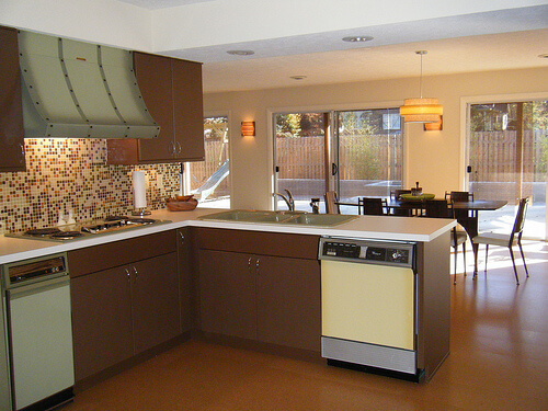
Alas, it has now become a cliche, this time of year, for all manner of manufacturers doing business in the color arena to declare their Color of the Year. As a result, I am now evolving to dislike this tradition — seems to me yet another way that marketeers are trying to convince the mass of America to dislike what they already have for grass that is greener (or purpler, or whatever). Nonetheless, I will give this a try for at least one more year. My annual Color of the Year selection is a bit of a different stripe: I like to show how colors of bygone days are just fine, very pretty, thank you very much. So, for 2014, our Retro Renovation Color of the Year is one of the most disparaged of vintage colors: Harvest Gold. I like this color very much. This is a wonderful color. Phlew on you, marketeers and interior design fascionistas, who try to convince us that harvest gold is h***** and d**** and must be banished in favor of (the baloney you are trying to sell us today). Above: Formica selected a harvest gold shade for both the walls and carpet in this 1966 advertisement. See how harvest gold plays so nice with others? Above: Maribeth’s kitchen came with a harvest gold dishwasher.
Harvest Gold as we know it catches fire in 1967
I have not done all the historical research to back this statement up, but: I believe that what we now call harvest gold — a somewhat muddy lightish gold — has always been a popular color in home decorating. A tarnished brass is not too far off from harvest gold. And before polymer lacquer was invented, brass tarnished. Linen takes on a lovely gold patina, all the more so when it oxidizes.
Gold has the effect of bringing a bit of yellow sunshine into a room. I think of it as a neutral. I have a harvesty gold wall to wall carpet in my basement, which has cherry paneled walls and overall, an early American feel, and it is a wonderful, warm base for the space. My bedroom walls are gold.
Of course, today we associate the color Harvest Gold with the 1970s, when it became a very popular as a color for kitchen appliances, in particular.
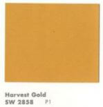
Important history of Harvest Gold for kitchen appliances: According to reader Patrick, who has done a lot of research on appliance colors, GE introduced the color Harvest (never officially know as Harvest Gold) in 1967 Spring 1968. “This color along with Avocado,” he said, “catches on like wild fire and is offered until circa 1984.”
In an updated comment (originally posted in comments, below), Patrick says:
General Electric introduced the color Harvest (GE never called it Harvest Gold) in the Spring of 1968 and soon other manufacturers followed suit. In 1976 all the appliance manufacturers picked a standardized color palette to begin being offered in 1977. Prior to this decision the colors offered by one manufacturer did not exactly match the colors that an other manufacturer offered, ergo if you wanted to mix and match appliance brands your only choice was to pick white so the colors would be harmonious. At the end of 1976 General Electric started running a campaign introducing its New Naturals color palette in home magazines of the day. The new colors were Harvest Wheat, Fresh Avocado, Coffee, Onyx, Snow White, and a new color called Almond……. Harvest Gold as it became known was offered into the mid 80’s.
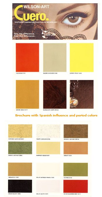 Above: Wilsonart put this color on to laminates in the late 1960s, although I squinty squinty cannot see what they named this color.
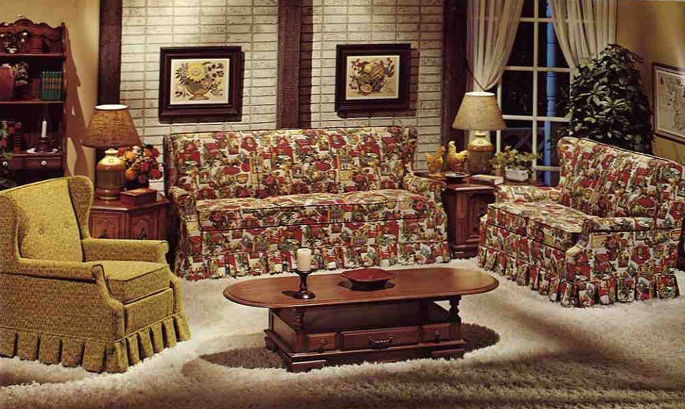
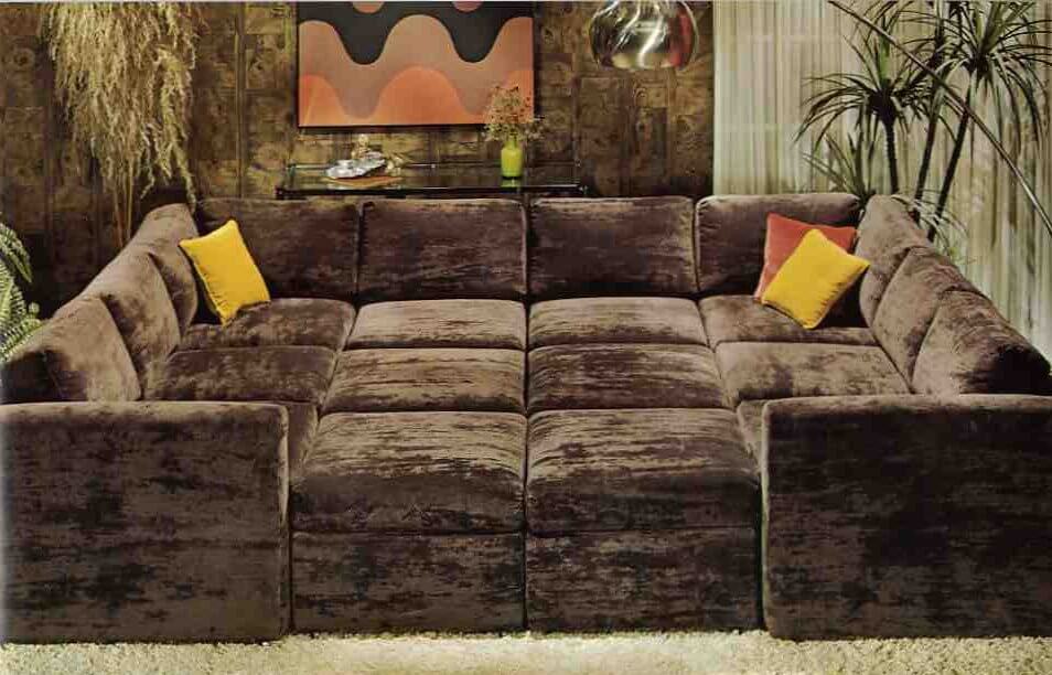 Above: The color was popular on upholstery and as an accent color in earth-toned interiors popular in the 1970s. But HEY, pretty much this same color can be found on sparkly frieze upholstery back in the 1950s, too. Okay, maybe the old gold has a little less green in it, but it’s darn close. Both photos from: 10 Kroehler sofas from 1976.
Why did Harvest Gold fall from favor?
In a consumer-driven society, these big color trends eventually collapse under the weight of their own popularity. Actually, it’s a testament to the fact that through the 1980s, we were so less consumer-driven that color trends like harvest gold even lasted as long as they did. Today, I think that the color cycles of what’s “in” and what’s “out” are turning faster and faster. Beware buying according to trends!
Disclaimer
I love all colors.
I am saying “harvest gold” in a wide sense. Warm golds and even yellows that tend toward the warm gold — like ripened cornfields… the leaves on sugar maples in the fall… and Sting’s mesmerizing fields of gold:
Do you use this color in your house today?


Donald says
Excited to see Harvest Gold for color of the year! I have my new harvest gold Peerless sinks and toilet out in the garage. They are destined for my Spanish styled retro bathroom that I hope to complete in the next 6-months.
Hope to see some good articles and reader input, great stuff already here in the comments.
Andi says
Harvest Gold. This color brings back very vivid memories. Beginning in the early 60s, my mother painted every living room she ever lived in that color. I well remember one house with a green carpet, and later, she bought a deep blue Oriental style carpet.
I always promised myself that when I grew up, I would paint my living room anything BUT Harvest Gold! That held during the 16 years we had a Victorian, because every square inch of the house was wallpapered.
We bought a 1952 Cape Cod eight years ago…and after much agonizing, the living room color we decided upon is…yep, Harvest Gold. More or less. It’s actually Sherwin Williams Restrained Gold, but it is SO close to the glowy gold walls I remember from my youth. The original pinch-pleat drapes are still in that room, and they are almost the exact color of Restrained Gold. We LOVE the color and get so many compliments on it.
Painted the dining room Bungalow Gold (from Lowe’s), a deeper shade than the living room but totally within the Harvest Gold range.
My mom woulda loved it!
philq says
I purchased my Kenmore Harvest Gold refrigerator in 1986. I was not crazy about the color at the time, but it matched the rest of the kitchen in my old apartment.
Sally says
I moved into a condo built in 1978 a year ago, with the original harvest gold stove and laminate counter tops in the kitchen. Never did I think I would actually be in style! I was not fond of it when I moved in, but it’s grown on me. I painted the walls Benjamin Moore Covington Blue and it’s a really nice contrast between the two colors.
Blondie7 says
I am a huge fan of harvest gold. The pinch pleat curtains in my living room are 1960s harvest gold and brocaded; they are also Hollywood regency or French provincial style, and I will never get tired or depart from them.
I tried searching the web for similar curtains, but all I could find is fabric similar to my curtains. I even, have short harvest gold brocaded pinch pleat curtains across my kitchen windows.
https://www.etsy.com/listing/130060736/sumptuous-french-silk-brocade-vintage?ref=market.
Geronimom says
By any chance do your drapes look anything like this?: http://smg.photobucket.com/user/DianeLu/slideshow/Drapes ? I found these two vintage damask panels (made by JC Penny’s, I believe) at a thrift store for $2.99 total 🙂 They perfectly match the BM Chestertown Buff (aka “Harvest Gold”, if you ask me!) paint almost perfectly!
Mary Sletten says
We too had Harvest appliances when we moved into our circa 1975 ranch in 1988- they were replaced in about 2004 after a long and useful life. Along the way, I had a dishwasher installed and was able to obtain a reversible panel from the manufacturer with Avocado and Harvest in order to make it coordinate with the old appliances.
Several years ago I decided we needed some color. I had painted everything neutral after moving in as the prior owners had some unusual color schemes which didn’t go with any of our stuff or our tastes, and was now looking to add a touch of “something”. I bought samples of 3 paint colors and did test segments: my lovely cinnamon, sage, and mustard selections suddenly revealed themselves as the Coppertone, Avocado, and Harvest of the 70s! We ended up nixing the coppertone, but the sage is now on 2 bedroom walls and the harvest is the base of a faux-plaster glazed accent wall in the eat-in kitchen which picks up on the harvest gold/yellow tile backsplash which remains.
Your site has caused me to look at the 1960s and 1970s styles and colors with more appreciation than I had previously had. Thanks for all the enjoyable reading!
Josie says
I have a story of two retro fans and their yellows.
I LOOOVE yellow. It’s my favourite colour. Mostly light-and-bright annoyingly peppy buttercup and lemon though. I love chartreuse and lemongrass and lime too, the yellow-drenched greens. Harvest Gold is not always “my” yellow, which is lighter and honestly more childlike. (I dig ’50s pale yellow-and-white schemes).
But in it’s softest and lightest variations, by your generous definitions, I’m in. Part of me really loves the way gold gives a room a sunny effect I’ve got pale yellow walls throughout my place – I needed the sunshine.
My sister will maintain she doesn’t like yellow. But don’t worry! This is not a hate post. She loves deep, rich jewel tones. Lots of antique wood, bitossi blue, rich emeralds, violets. A bit of ’70s bohemian caravan, lots of Oriental rugs and fringed lamps. And what goes better with that than sand-gold and Harvest Gold? Nothing. She’s got the “grown-up gold” and “sophisticated sand” to my “daycare daffodil.” And it looks great.
I think it’s all how you use the colours, and how they speak to you. Nobody would ever mix up her house and mine. But neither of us is really in lockstep with fashion – you can’t be and have your OWN style.
T says
Josie is my twin. Not the sister of jewel tones. The sister who loves lemon yellow. I even sided my house in yellow.
I have since moved to a much older house and this past summer installed really old looking linoleum and painted the walls that old buff/ivory/pale gold/1940 gold. More yellow than beige. If you’ve ever seen that color you know what I mean. And I did finally buy the Formica table and chairs I had passed up a few years ago for much less than they wanted then. They are YELLOW but work with the walls because my curtains are toweling with lots of colors.
Scott says
I must have received this via telepathy as I just picked up a set of Harvest Gold Lustro-Ware measuring scoops on Saturday! 🙂
Geronimom says
I’m not so sure “Harvest Gold” color is so vintage any longer. When we bought our 1960 house this summer, the entire living room/dining room was newly painted by the seller in Benjamin Moore “Chestertown Buff” – a color I find very similar to Harvest Gold. Curious, I googled the color to see how it appeared in other homes – and found that it apparently is quite popluar. I also found this interesting thread challenge on an old gardenweb forum: http://ths.gardenweb.com/forums/load/kitchbath/msg0422050126364.html The color is actually darker on our walls and looks even more like rhw Harvest Gold I remember growing up than it looks on the gardenweb sample photo, tho. I will say that it does go quite well with the vintage avocado green sofa and and turquoise/avocado rug we have – and makes a nice backdrop for our artwork. Here are some photos from an old blog post that show how it looks in our living room (you’ll have to scroll down the link) – although unfortunately the poor lighting quite show it in all it’s glory except in a few shots: http://retroranchretreat.blogspot.com/2013/08/saturday-morning-and-oh-how-i-am.html
pam kueber says
My bedroom walls are from a similar color in the BM historic colors line. My color is Puritan Ivory (as I recall). As with Chestertown Buff, it looks beige on the sample card but quite a lovely gold when it’s on the wall. I have had the color in my bedroom for 12 years now, and have not tired of it one whit.
pam kueber says
Haha, read that thread, I’ve written about Rosemary Sprig, too! https://retrorenovation.com/2012/04/02/benjamin-moore-rosemary-sprig-2144-30-a-timeless-color/
Geronimom says
Too funny, Pam! Apparently “Avocado”, when going by another name, just doesn’t seem so da**ed any more! Either that, or the “d” word only applies to appliances? I think the color, if paired properly, can definitely look classic. Then again – I am the person whose mother, back in the mid-sixties, recovered our 3 piece living room sectional sofa in “avocado” naugahyde, with accompanying arm chairs of neon orange naugahyde and brilliant turquoise naugahyde, respectively (all perched upon a lovely harvest gold shag carpet :-O!). So you might want to take my opinion with a grain of salt! 😉 . Looking at the photo on the Rosemary sprig link you posted does seem to bear me out, however – that living room is lovely and the rosemary sprig (AVOCADO!) looks just perfect in that room. I’m curious – did you end up painting your trim Rosemary Sprig after all?
pam kueber says
No, I have not followed through on the painting yet — but I’m re-inspired now to do so. 2014, avocado trim, here we come!
Becky from Iowa says
I am newly in LOVE with avocado…because I’m pairing it with mainly cool tones of turquoise, aqua, and teak–my LR sofa, rya rug, and drapes all are this color–instead of muddy colors like harvest gold, which always made me depressed. I’m featuring it in my master bedroom, too, but once again with cool tones; lilac, lavender, and Herculean blue, this time.
Becky from Iowa says
Ummm…that’s “cerulean” blue! 😉
pam kueber says
haha, I liked “Herculean blue”!
T says
Becky, did you see the sectional in green on Mason City craigslist? A thousand bucks or best offer. You haul.
pam kueber says
I love your walls!
Marjie says
rofl…I just remembered… my childhood home was Gold/yellow brick ,built in ’58