

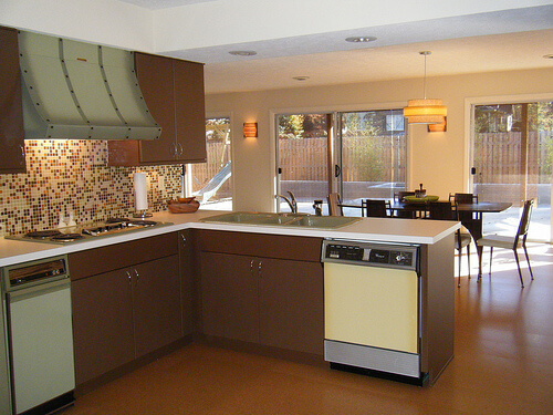
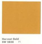
Alas, it has now become a cliche, this time of year, for all manner of manufacturers doing business in the color arena to declare their Color of the Year. As a result, I am now evolving to dislike this tradition — seems to me yet another way that marketeers are trying to convince the mass of America to dislike what they already have for grass that is greener (or purpler, or whatever). Nonetheless, I will give this a try for at least one more year. My annual Color of the Year selection is a bit of a different stripe: I like to show how colors of bygone days are just fine, very pretty, thank you very much. So, for 2014, our Retro Renovation Color of the Year is one of the most disparaged of vintage colors: Harvest Gold. I like this color very much. This is a wonderful color. Phlew on you, marketeers and interior design fascionistas, who try to convince us that harvest gold is h***** and d**** and must be banished in favor of (the baloney you are trying to sell us today). Above: Formica selected a harvest gold shade for both the walls and carpet in this 1966 advertisement. See how harvest gold plays so nice with others? Above: Maribeth’s kitchen came with a harvest gold dishwasher.
Harvest Gold as we know it catches fire in 1967
I have not done all the historical research to back this statement up, but: I believe that what we now call harvest gold — a somewhat muddy lightish gold — has always been a popular color in home decorating. A tarnished brass is not too far off from harvest gold. And before polymer lacquer was invented, brass tarnished. Linen takes on a lovely gold patina, all the more so when it oxidizes.
Gold has the effect of bringing a bit of yellow sunshine into a room. I think of it as a neutral. I have a harvesty gold wall to wall carpet in my basement, which has cherry paneled walls and overall, an early American feel, and it is a wonderful, warm base for the space. My bedroom walls are gold.
Of course, today we associate the color Harvest Gold with the 1970s, when it became a very popular as a color for kitchen appliances, in particular.
Important history of Harvest Gold for kitchen appliances: According to reader Patrick, who has done a lot of research on appliance colors, GE introduced the color Harvest (never officially know as Harvest Gold) in 1967 Spring 1968. “This color along with Avocado,” he said, “catches on like wild fire and is offered until circa 1984.”
In an updated comment (originally posted in comments, below), Patrick says:
General Electric introduced the color Harvest (GE never called it Harvest Gold) in the Spring of 1968 and soon other manufacturers followed suit. In 1976 all the appliance manufacturers picked a standardized color palette to begin being offered in 1977. Prior to this decision the colors offered by one manufacturer did not exactly match the colors that an other manufacturer offered, ergo if you wanted to mix and match appliance brands your only choice was to pick white so the colors would be harmonious. At the end of 1976 General Electric started running a campaign introducing its New Naturals color palette in home magazines of the day. The new colors were Harvest Wheat, Fresh Avocado, Coffee, Onyx, Snow White, and a new color called Almond……. Harvest Gold as it became known was offered into the mid 80’s.
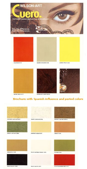 Above: Wilsonart put this color on to laminates in the late 1960s, although I squinty squinty cannot see what they named this color.
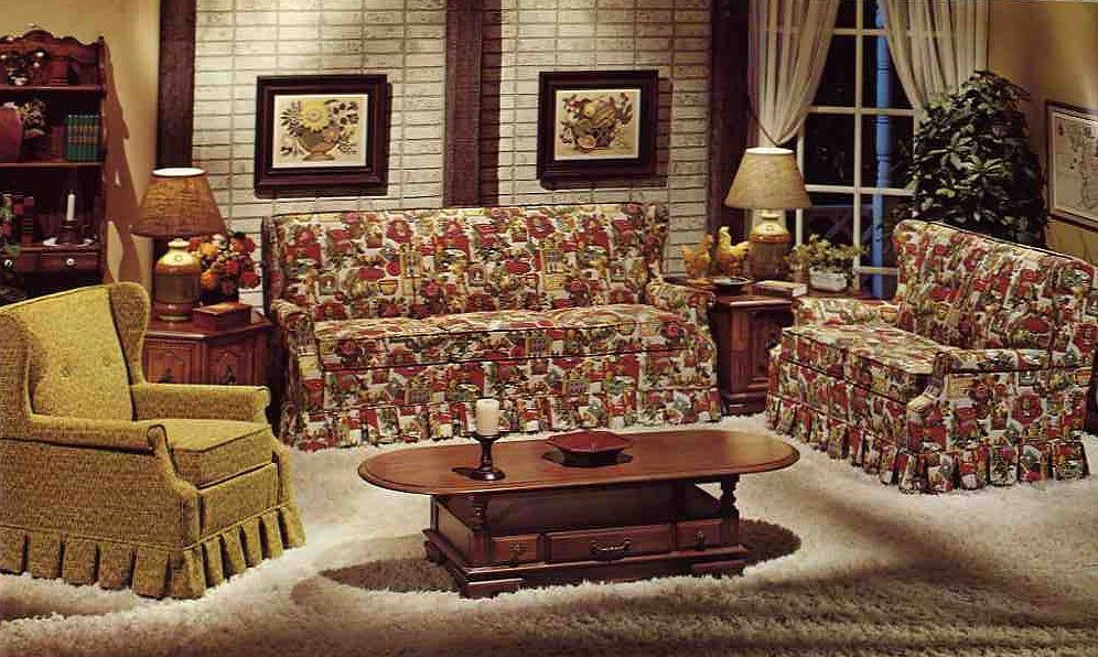
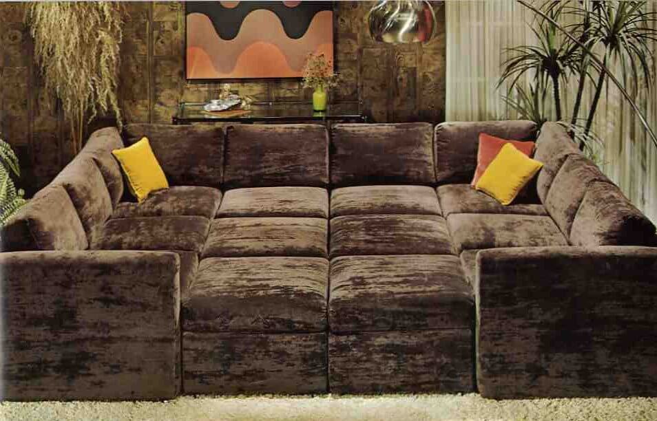 Above: The color was popular on upholstery and as an accent color in earth-toned interiors popular in the 1970s. But HEY, pretty much this same color can be found on sparkly frieze upholstery back in the 1950s, too. Okay, maybe the old gold has a little less green in it, but it’s darn close. Both photos from: 10 Kroehler sofas from 1976.
Why did Harvest Gold fall from favor?
In a consumer-driven society, these big color trends eventually collapse under the weight of their own popularity. Actually, it’s a testament to the fact that through the 1980s, we were so less consumer-driven that color trends like harvest gold even lasted as long as they did. Today, I think that the color cycles of what’s “in” and what’s “out” are turning faster and faster. Beware buying according to trends!
Disclaimer
I love all colors.
I am saying “harvest gold” in a wide sense. Warm golds and even yellows that tend toward the warm gold — like ripened cornfields… the leaves on sugar maples in the fall… and Sting’s mesmerizing fields of gold:
Do you use this color in your house today?


Pat says
If someone had told me even 10 years ago that harvest gold, avocado green, orange, etc. would once again be popular, I would have said no way! Guess everything that goes around, comes around. But having lived through the harvest gold and avocado green era, I am not as enamored with it as those that didn’t live through it – yet!
T says
If you like green……Today on craigslist! 1958 Mid Century Flexsteel Sectional $1000 OBO
http://masoncity.craigslist.org/fuo/4234793523.html
This has been in my family since I was an infant. The tag is still on it with my family name. It was the couch in the living room you don’t sit in. Extremely clean–no stains!! Absolutely mint condition!! Sturdy construction – look at that metal frame!! They don’t come like this very often. Don’t let this piece of nostalgia slip by…. Reply to this ad with your phone number. Cash only. Must be picked up in person.
There’s been a lot of MCM stuff lately. Nothing to make my heart beat faster but my era is 1940/50.
Joe Felice says
Tastes vary so widely, especially in things like color and music. I often do not like what someone else likes, but don’t disparage their taste. I never liked harvest gold, avocado green or coppertone, but they were popular from the late ’60s through the ’70s. I think harvest gold replaced sunshine yellow in the kitchen palette, and was then itself replaced by almond. Remember when almond was all the rage? (I still can’t believe I ever like that!) Now we have stainless steel, which is so overdone and unimaginative. Honestly, I think consumers are crying out for brightly-colored appliances (turquoise, canary yellow, and red) once again.
It is interesting to see how companies foist their ideas of “new” colors upon us in the hopes that everyone will rush to change everything they have. And how does one (person or company) come up with a “color of the year?” Especially ahead of time. shouldn’t we wait till the end of the year to see what color or colors was or were popular during the preceding-12 months? And we certainly can blame HGTV for informing us about how poor our taste is and how we need to “get with it.” But from what I can see in print, in actual application, in clothing, and on TV, shades of aqua and turquoise still seem to be raging, as they have for the past-several years, and that certainly hearkens to mid century. If some appliance manufacturer were to market turquoise appliances, I bet they’d sell like hot cakes!
Neil says
In one of those retro synchronicities, I just bought from an estate clean-out an in-the-box, never-used, harvest gold 70’s plastic toilet seat! Alas, it doesn’t fit our toilets at all, and remains un-Used. But it sure is a beaut.
JKM says
I grew up in two houses in Dallas in the 1960s/70s – the first, a two-story built in 1964, had an avocado green kitchen and the one in the next house, a sprawling one story ranch style built in 1972, was harvest gold. Keeping with trends for the day, the first house had cork floors and a danish modern decor with lots of green/blue/white and the seventies house was more transitional with warm tones of gold/orange/brown – and blasts of lime green and aqua blue here and there. It was beautiful in its day.
Jackie says
In the 70s, I grew up in a 50s ranch-style house in Texas, complete with shake shingles and picture window. ALL our appliances were Harvest Gold–everything in the kitchen, including blender, and the washer and dryer, too.
Also, the hallway, bathroom, and my parents’ bedroom. Coordinated very well with the Early American decor–brown plaid couch, wood paneling, etc., and all the ferns, spider plants and rubber trees that were apparently required by the decorating police of the mid-70s.
Interestingly, while the living room was largely a holdover from the 60s, the bedroom only got the gold treatment when my mom switched from the hippy-dippy water bed and batik wall-hanging to the country antiques and flower-garden quilt (in yellow) in the 70s.
philq says
Another nice touch for those harvest gold kitchens…Corelle Butterfly Gold collection. I’ve been hording them since the late ’80s. They’re getting harder to find, but I think they should now qualify as retro.
Eileen says
I just bought a 1976 rambler that I love. Tons of harvest gold. I hate how all remodels are generic beige/grey and have decided to keep a lot of the original fixtures. We are going to mix in teal put down shag carpet and rock the hell out of that harvest gold.
Joy says
LOL… Rock on Sister!
Christa says
I have noticed Harvest Gold has been sneaking back into design trends lately. I like it with deep mink brown and chartreuse.
Nancy says
Glad to hear harvest gold is coming back–I’ve always loved the color in glassware, as it was the color of my grandmother’s stemware (King’s Crown was her pattern). So far, I’ve managed to thrift an entire set of stemware, two Visions pots, and one too-large-to-lift Visions casserole (that sucker’s *heavy*, even empty!)
I