

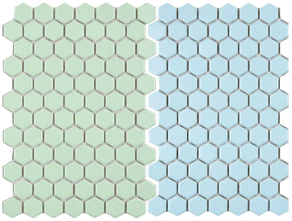
 As the retro decor revival continues, more and more options for period appropriate tile are becoming available. This is great news for anyone trying to repair, restore or build a midcentury bathroom. My latest discovery — two new options for tile flooring that would feel right at home in a pastel vintage bathroom. Merola Tile has added two new color options to their Metro Hex line of porcelain tile — light green and light blue. The tile is $7.95 per square foot — and available to order through the Home Depot website.
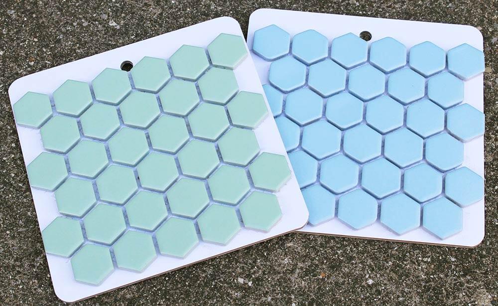 As soon as I discovered the existence of these pastel hex tiles, I contacted Maggie McBride, our contact at Merola Tile who promptly sent some samples my way — Thanks Maggie!
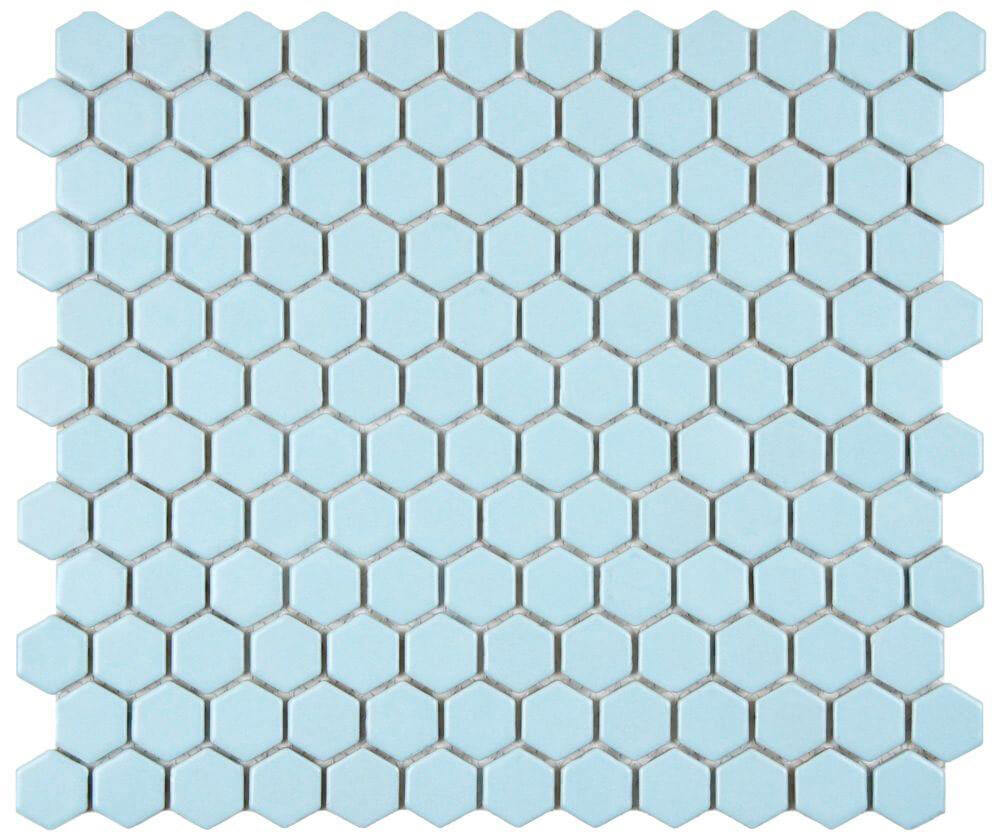 Once I received the samples, I was excited to compare them to my B&W Tile sample board to see how they measured up. I started by examining the Merola Tile Metro Hex mosaic in light blue.
 It was not a 100% perfect match for any of the B&W Tile colors, but the hex tile was not far off the B&W 20W blue and 20F blue duraglaze. Even though it wasn’t a perfect match, I think it would still be a great choice for someone wanting to create a vintage blue bathroom — or possibly repair an existing blue midcentury bathroom floor.
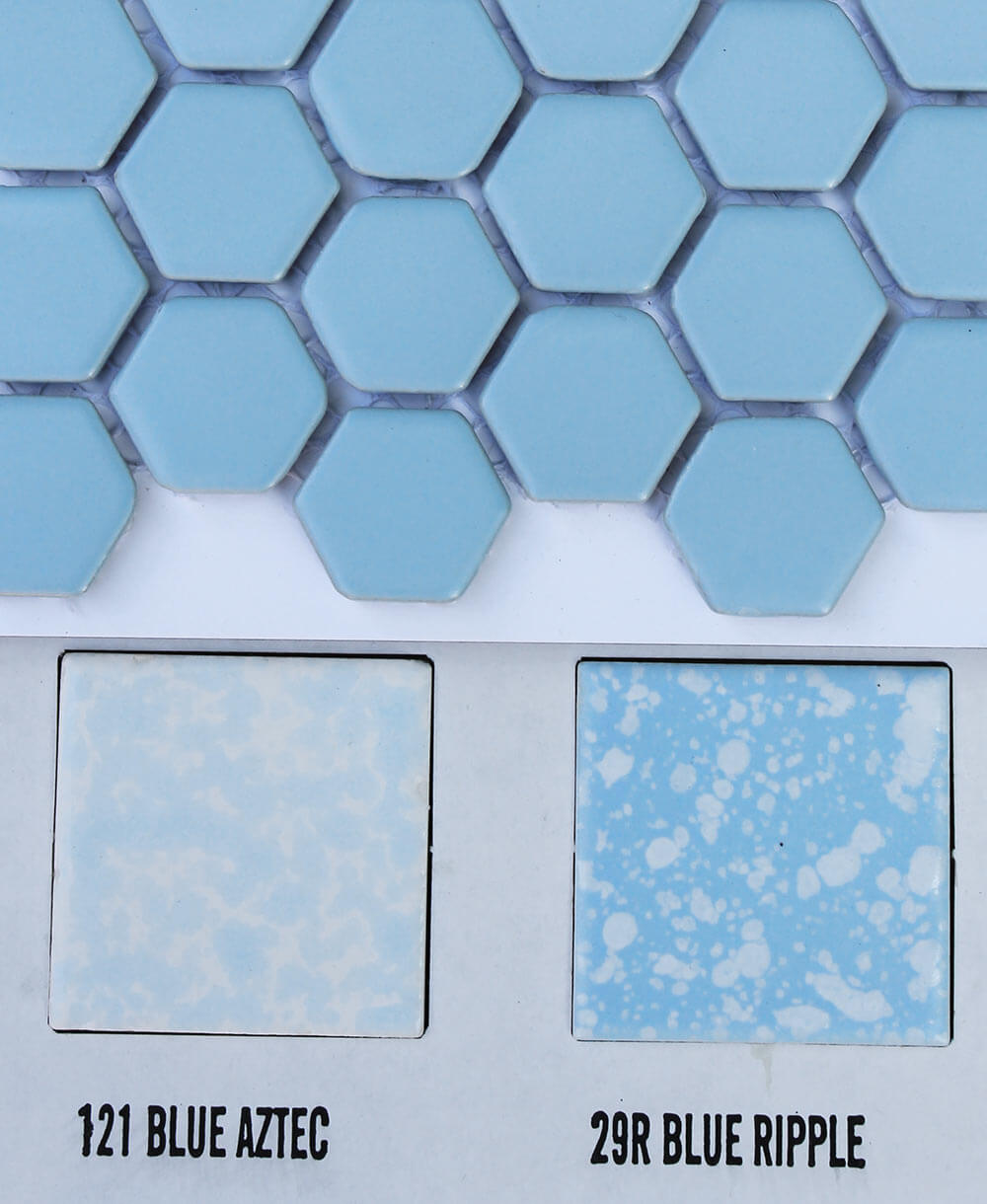 The Merola light blue hex tiles looked even better with the B&W 121 blue aztec and 29R blue ripple tiles, mostly because of the addition of white into the pairing — which acts to break up the blue a little. Another great idea for using the Merola light blue hex tiles to make a midcentury style bathroom — use the blue hex with white 4.25″ tile walls and blue (or white) fixtures.
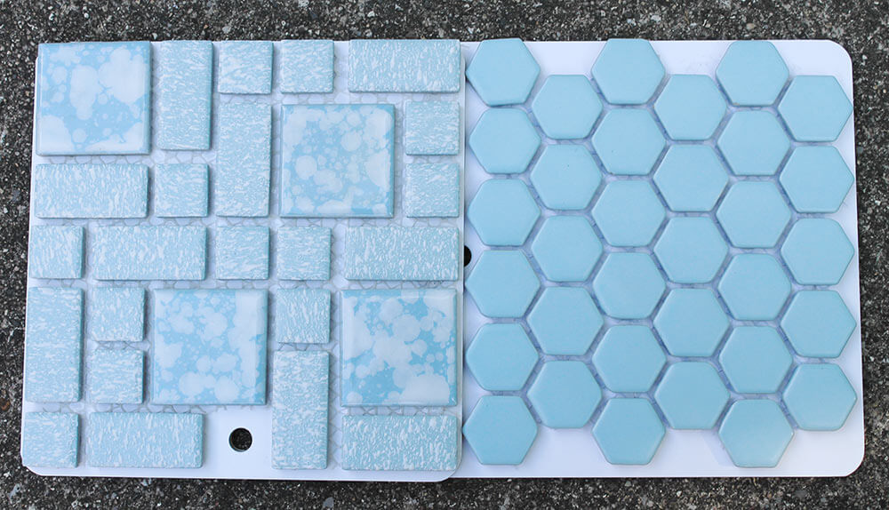 The light blue hex tile sample was a very similar blue to the Merola University blue tiles we’ve written about before. Either of these two blue tile selections could be great options to consider for anyone trying to repair, replace or build a vintage blue bathroom.
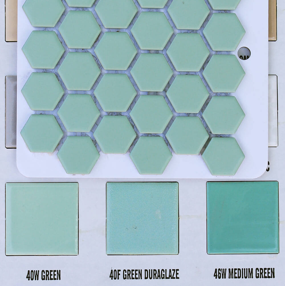
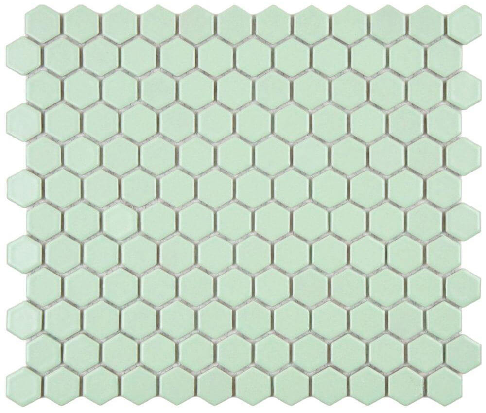 Next I studied the Merola Metro Hex porcelain mosaic tiles in light green — secretly hoping it would be the same green as my vintage mint green bathroom, which desperately needs a new floor.
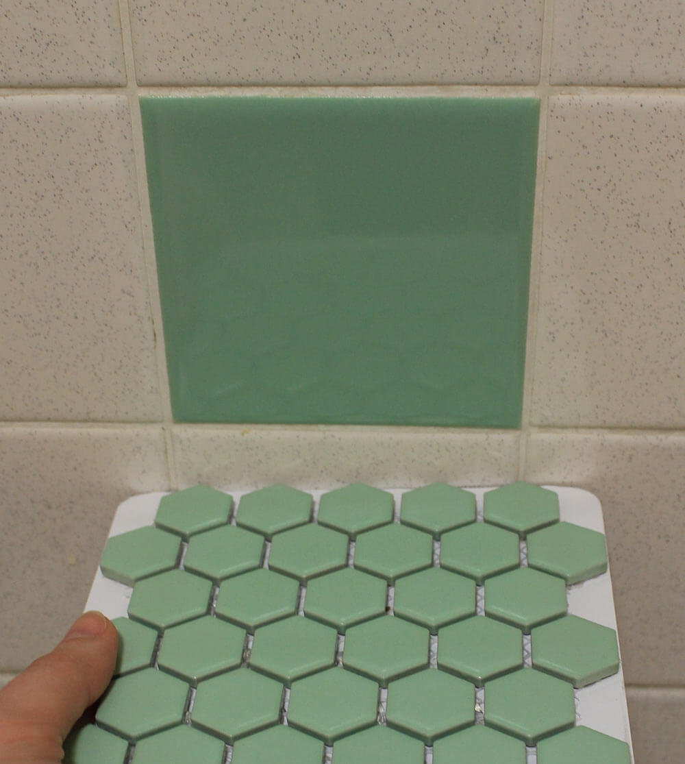 I held my breath, turned on the lights, crossed my fingers and compared the Merola hex tile sample to my original green bathroom tiles. Holy moley, its a pretty good match!

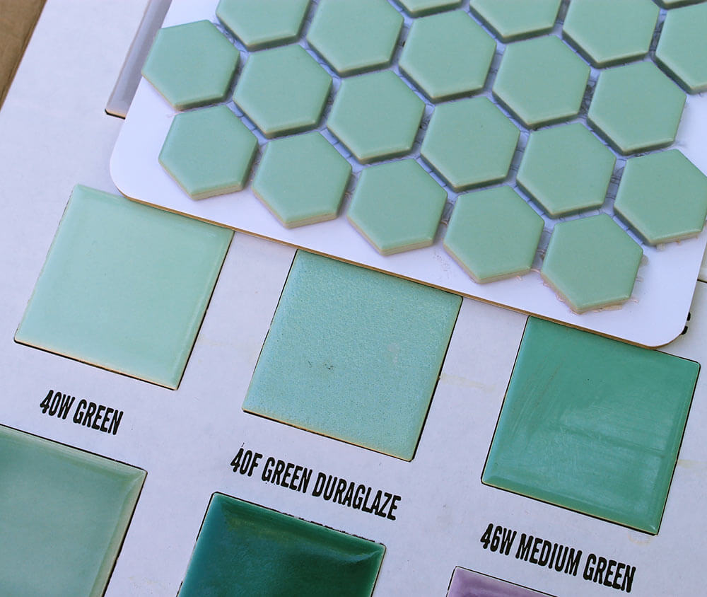 Another bit of great news — if you don’t currently have a vintage mint green bathroom, but were hoping to build one — B&W Tile’s 40W green matches the Merola Metro Hex light green tile quite well, too.
 It would seem then, that I’ve finally decided upon the perfect replacement flooring for my mint green 1962 bathroom, right? Well — almost.
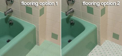
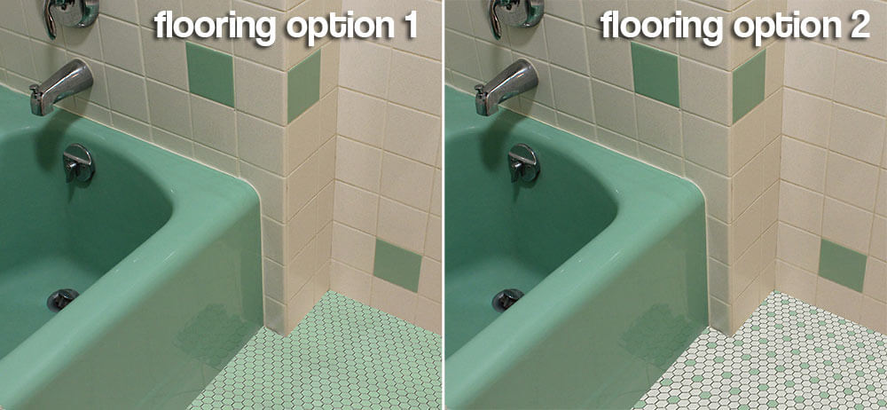
 I decided to use the power of PhotoShop to mock up an all green hex tile floor. Looks pretty good, right?
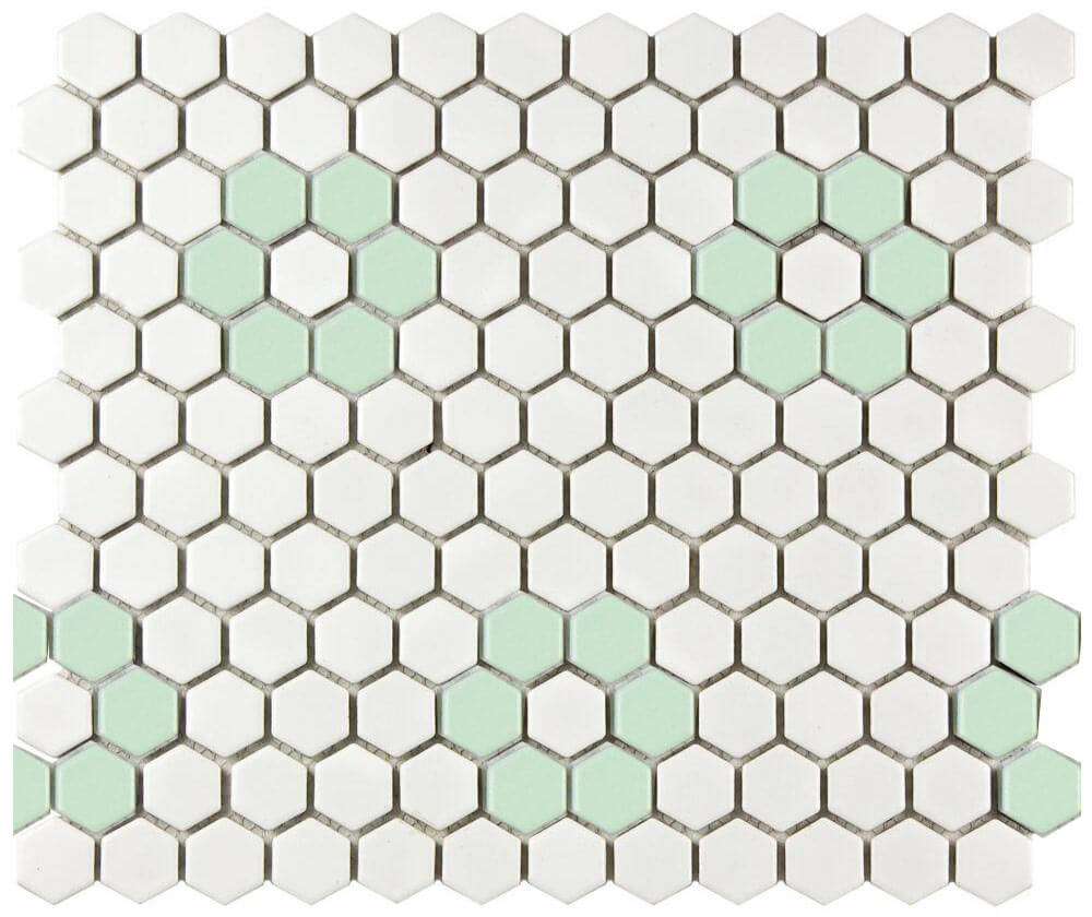
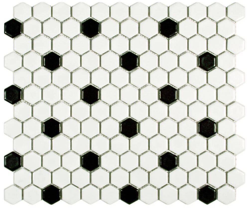 Then I realized that Merola Metro Hex tile comes in black and white patterns, that could — with just a little more effort — become green and white by swapping out the black tiles with light green. (Note — if you plan on doing any tile mixing with the light blue or light green and the black and white patterns from Merola, make sure to order the patterned tile in matte finish so that it matches the matte finish of the blue and green hex tiles.)
 Suddenly, another option has presented itself. Hmmm.
 Calling on the power of PhotoShop once more, I ‘installed’ my custom floor tile creation — which I also really like. Drat. What’s a girl to do?
 Merola also offers a fun retro black and white flower hex pattern that could be swapped out with the green (or blue) tiles.
 As much as I like the green flowers, I don’t think my sleek 1962 house wants to be quite this cute — though I think this flower pattern would look adorable in a slightly older or more ‘Coolonial’ style midcentury home.
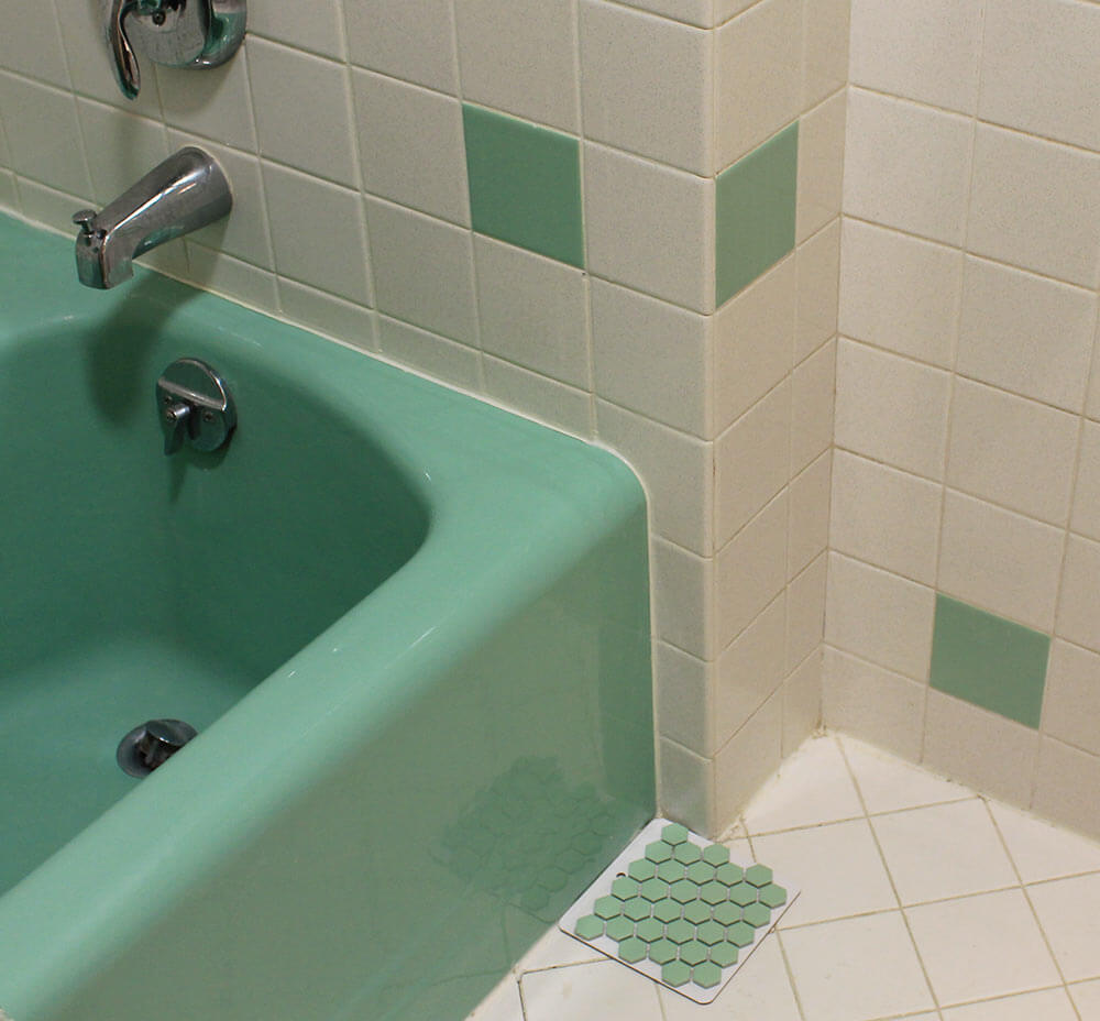
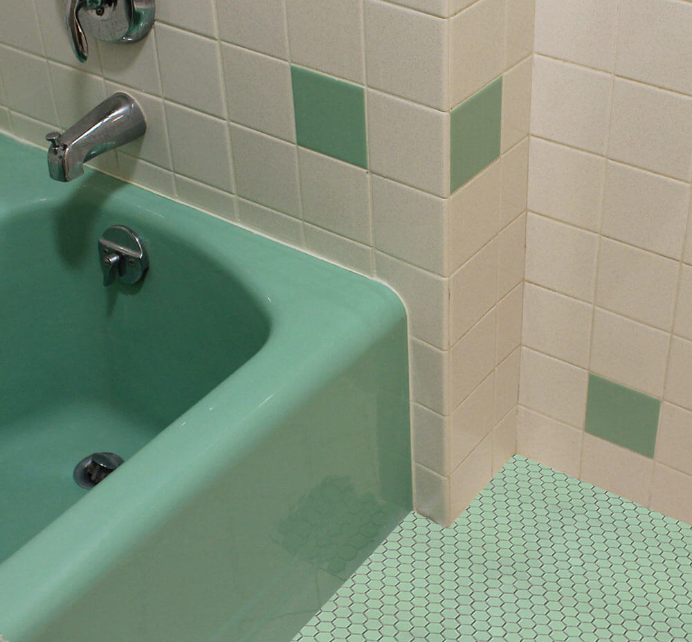
UPDATE: Since my Photoshop mock ups don’t accurately depict the green and white in the metro hex versus my vintage tile, I’ve added these two closeups below so readers can better see how the tiles match the vintage bathroom tiles.


 So now I could really use your advice, dear readers:
Which flooring option do you like best in my vintage minty green and white vintage bathroom?
Link love:


deb says
Option 2!
Carol says
Definitely option 2. It mimics the use of 2 colors on the wall and will break up so much green next to the tub. Who doesn’t love a patterned tile floor.
Roundhouse Sarah says
Option #2! The salt n pepper white and the white of the hex tiles will look just fine together.
In my purple bathroom the ‘white’ field tiles are more like grits or cornmeal, specks of beige and yellow. And somehow it goes with the white tiles of the mosaic on the floor. I would think the gray and black speckles in the salt and pepper tiles would be even more forgiving
Kate says
Thanks Sarah — good to know. I love your purple bathroom! 🙂
tammyCA says
Hmm, this might be the floor for our blue and green tiled bathroom. I vote for option 2..white and green.
Jay says
OHHHH! I think my green bath is starting to crystalize with today’s post. As a “green” person, I vote all green only because on my monitor, the wll tile looks pinkish/beigeish salt and pepper which doesn’t appear to compliment the white floor tile. My last house had a floor of this green but the tile was either 4″ or 6″ square matte finish (40s). You found a good match that works especially well with the tub, the dominant fixture in the room. Waiting to hear your decision after much thought. Pam, any input for Kate?
Kate says
Hi Jay — the salt and pepper wall tile has black and grey “pepper” no pink or beige.
I’m glad you are excited about the green tile discovery!
Sarah Foster says
Hey! I love your blog. This is a GREAT treasure trove of info and pictures to help me with my remodel! I am going to use the blue tile as a back-splash in my kitchen remodel. Personally, I like the white with green interspersed. As another comment says it doesn’t overwhelm the space with green but looks very natural. Also because the tub is so green and it doesn’t look to be a perfect match I think they would age differently and it would look funny. But having it not as close makes it look much more polished! Please post finished pictures!
H says
I vote for all green! I love the way it looks next to the tub, great flow. The white/off white combo would stress me out and looks to busy
chris says
Solid – Option 1. Whites don’t match and extra pattern makes me dizzy.
Ky says
I like Option 2 so it does not overwhelm the room with green, but like others have pointed out, if the whites don’t match, then Option 1 may be the better choice. You may want to create some large samples of each on some Masonite hardboard, including grout, to see how it would really look in the space.
SebastianFTL says
I totes think the all-green is the best way to go. Something about the accent green tiles on white is just so…turn of the century. I think the all-green gives a more timeless look.