

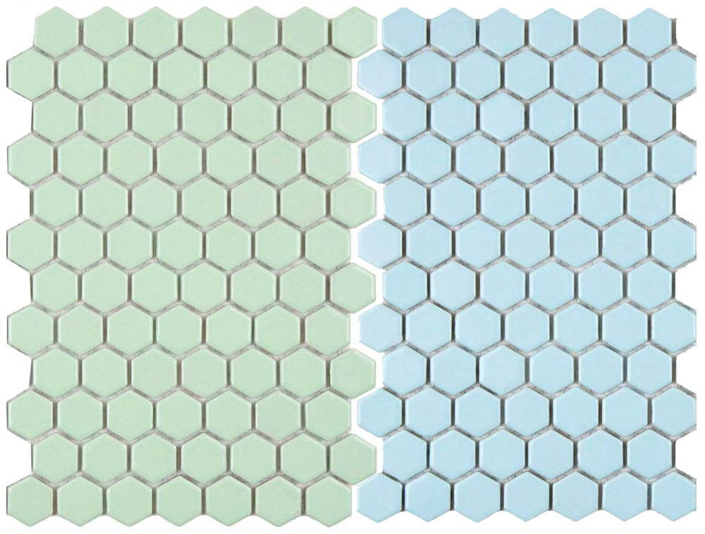
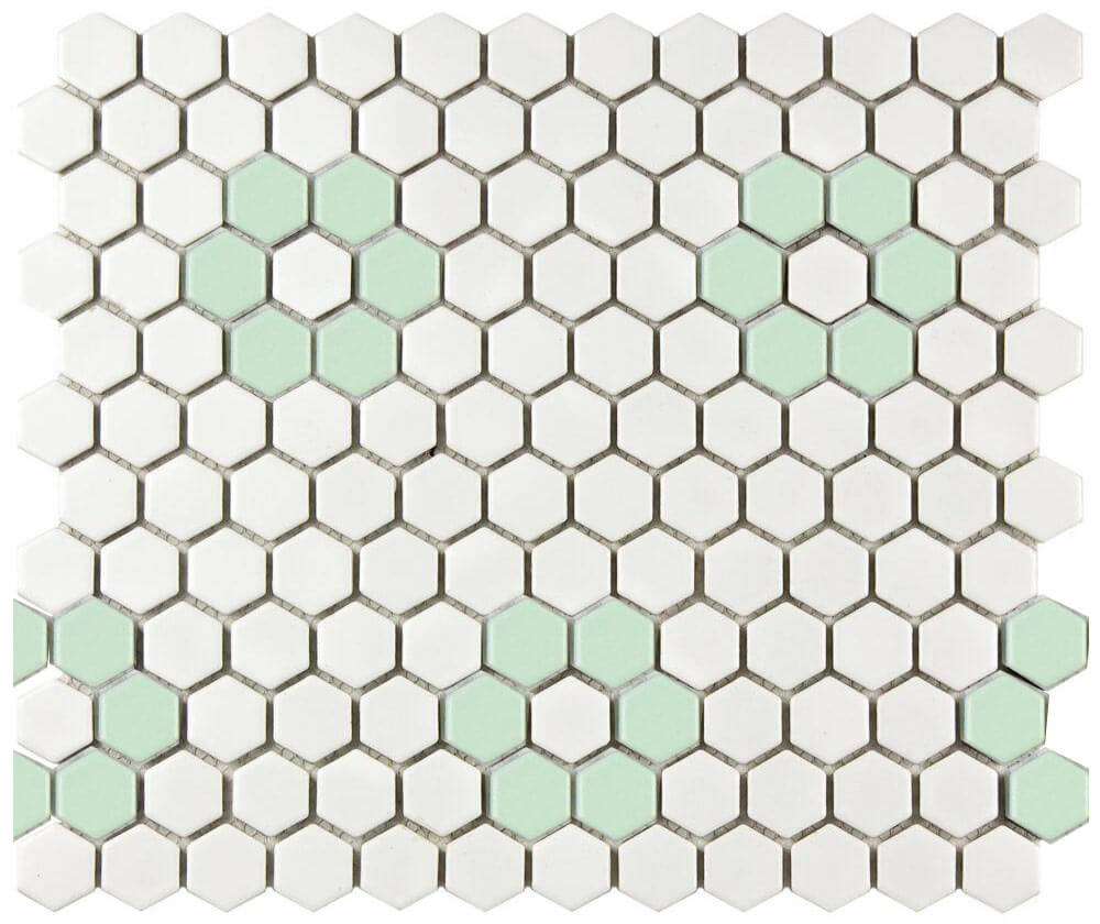
 As the retro decor revival continues, more and more options for period appropriate tile are becoming available. This is great news for anyone trying to repair, restore or build a midcentury bathroom. My latest discovery — two new options for tile flooring that would feel right at home in a pastel vintage bathroom. Merola Tile has added two new color options to their Metro Hex line of porcelain tile — light green and light blue. The tile is $7.95 per square foot — and available to order through the Home Depot website.
 As soon as I discovered the existence of these pastel hex tiles, I contacted Maggie McBride, our contact at Merola Tile who promptly sent some samples my way — Thanks Maggie!
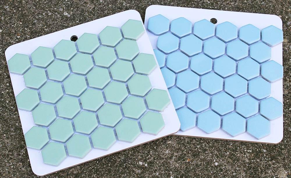
 Once I received the samples, I was excited to compare them to my B&W Tile sample board to see how they measured up. I started by examining the Merola Tile Metro Hex mosaic in light blue.
 It was not a 100% perfect match for any of the B&W Tile colors, but the hex tile was not far off the B&W 20W blue and 20F blue duraglaze. Even though it wasn’t a perfect match, I think it would still be a great choice for someone wanting to create a vintage blue bathroom — or possibly repair an existing blue midcentury bathroom floor.
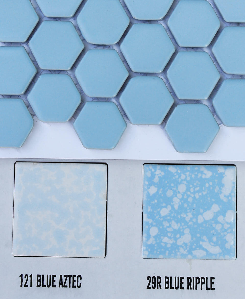 The Merola light blue hex tiles looked even better with the B&W 121 blue aztec and 29R blue ripple tiles, mostly because of the addition of white into the pairing — which acts to break up the blue a little. Another great idea for using the Merola light blue hex tiles to make a midcentury style bathroom — use the blue hex with white 4.25″ tile walls and blue (or white) fixtures.
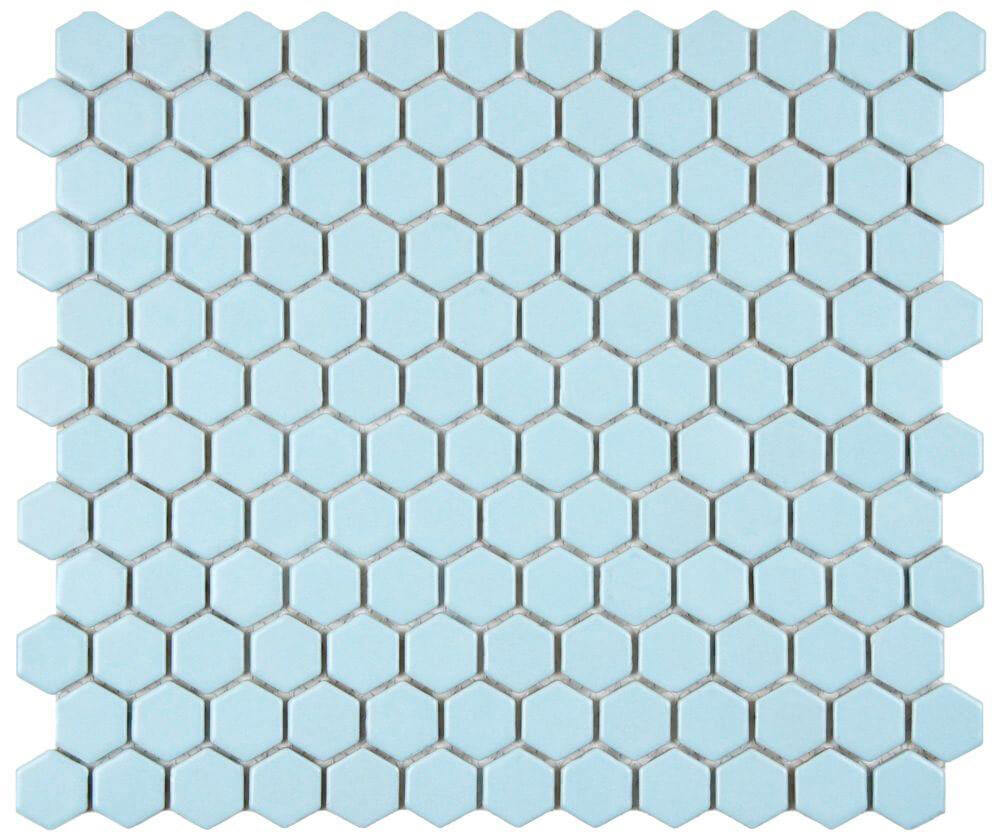
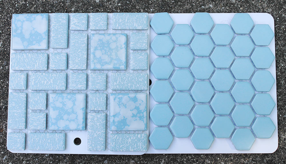 The light blue hex tile sample was a very similar blue to the Merola University blue tiles we’ve written about before. Either of these two blue tile selections could be great options to consider for anyone trying to repair, replace or build a vintage blue bathroom.
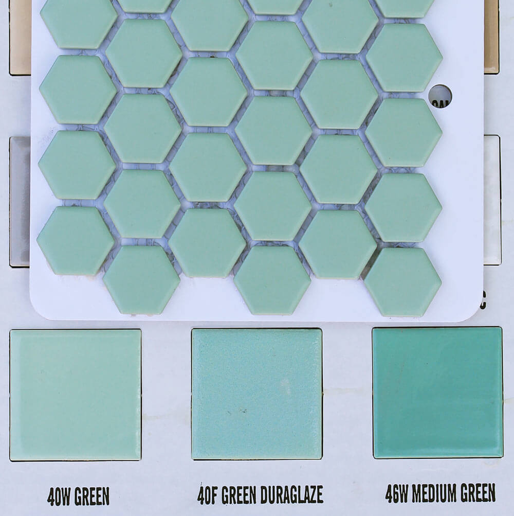
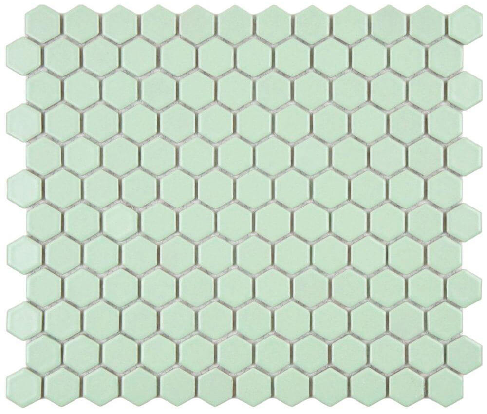 Next I studied the Merola Metro Hex porcelain mosaic tiles in light green — secretly hoping it would be the same green as my vintage mint green bathroom, which desperately needs a new floor.
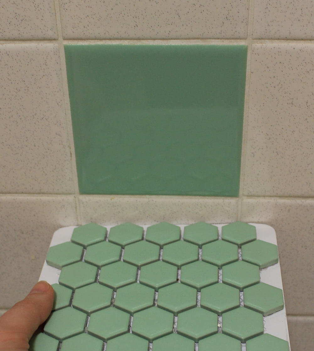 I held my breath, turned on the lights, crossed my fingers and compared the Merola hex tile sample to my original green bathroom tiles. Holy moley, its a pretty good match!

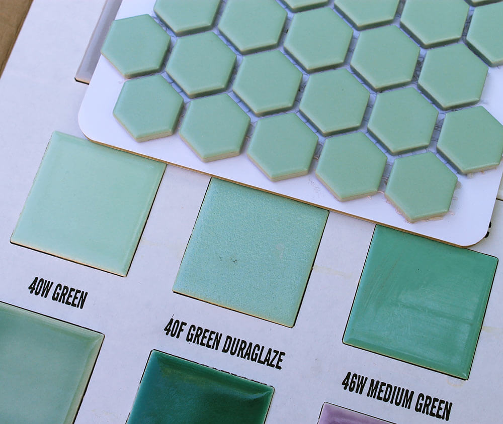 Another bit of great news — if you don’t currently have a vintage mint green bathroom, but were hoping to build one — B&W Tile’s 40W green matches the Merola Metro Hex light green tile quite well, too.
 It would seem then, that I’ve finally decided upon the perfect replacement flooring for my mint green 1962 bathroom, right? Well — almost.
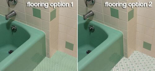
 I decided to use the power of PhotoShop to mock up an all green hex tile floor. Looks pretty good, right?
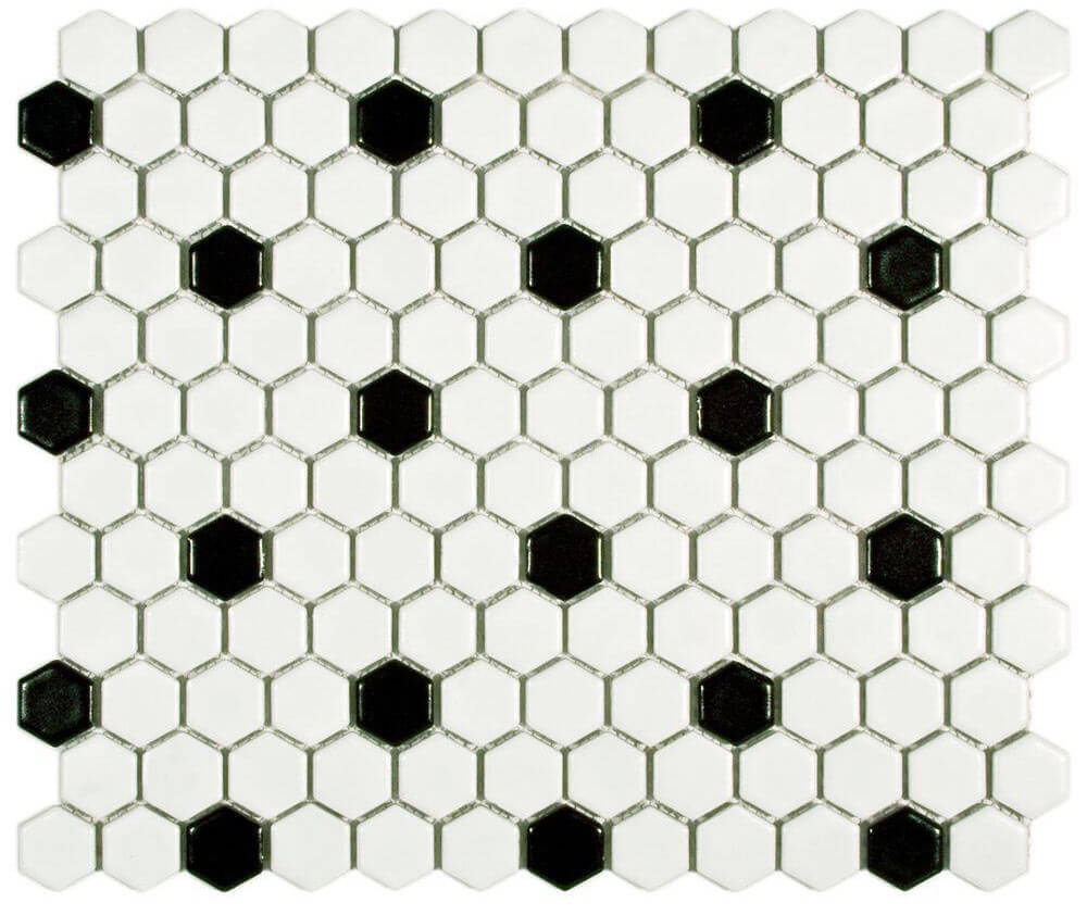 Then I realized that Merola Metro Hex tile comes in black and white patterns, that could — with just a little more effort — become green and white by swapping out the black tiles with light green. (Note — if you plan on doing any tile mixing with the light blue or light green and the black and white patterns from Merola, make sure to order the patterned tile in matte finish so that it matches the matte finish of the blue and green hex tiles.)
 Suddenly, another option has presented itself. Hmmm.
 Calling on the power of PhotoShop once more, I ‘installed’ my custom floor tile creation — which I also really like. Drat. What’s a girl to do?
 Merola also offers a fun retro black and white flower hex pattern that could be swapped out with the green (or blue) tiles.
 As much as I like the green flowers, I don’t think my sleek 1962 house wants to be quite this cute — though I think this flower pattern would look adorable in a slightly older or more ‘Coolonial’ style midcentury home.
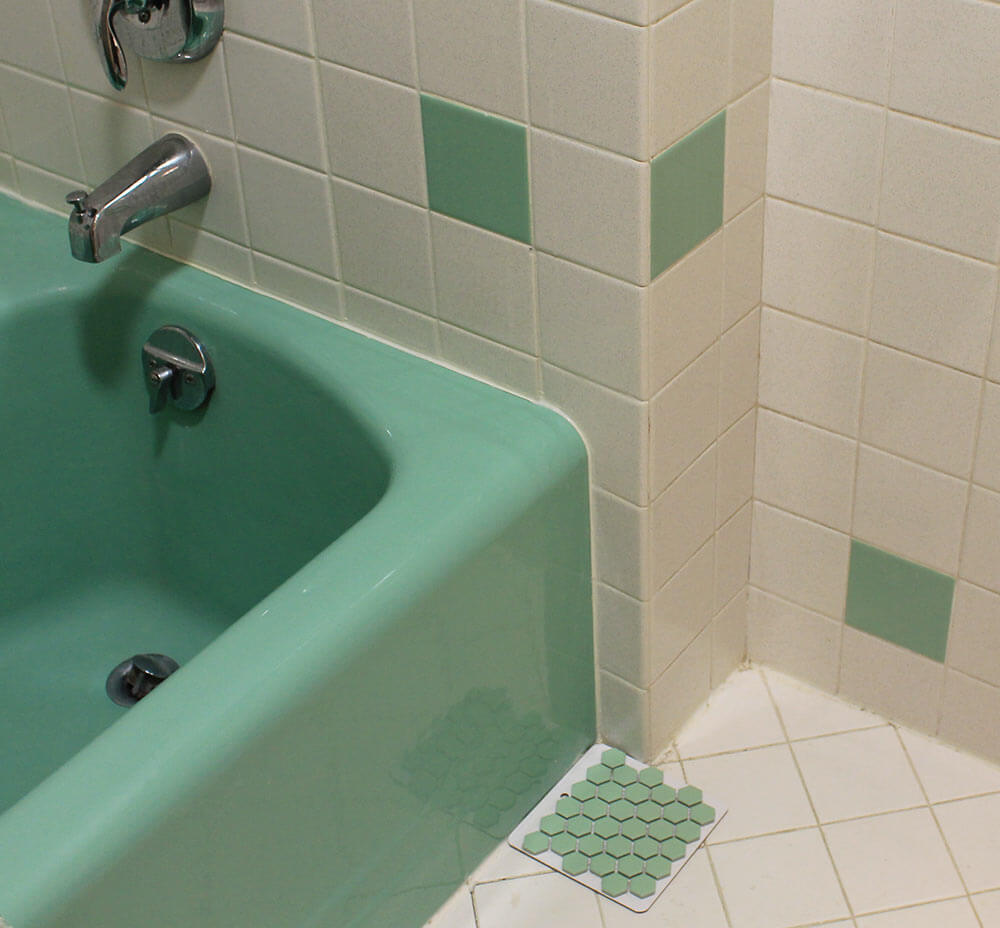
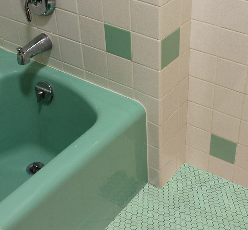
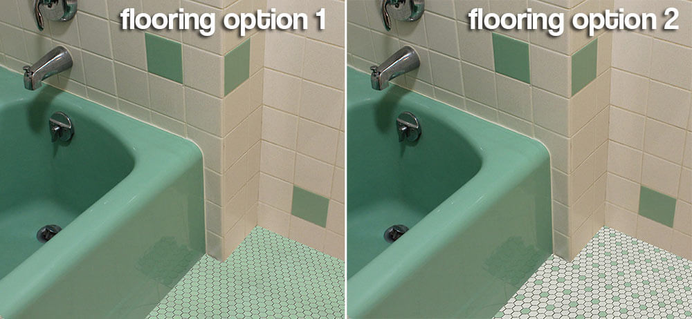
UPDATE: Since my Photoshop mock ups don’t accurately depict the green and white in the metro hex versus my vintage tile, I’ve added these two closeups below so readers can better see how the tiles match the vintage bathroom tiles.


 So now I could really use your advice, dear readers:
Which flooring option do you like best in my vintage minty green and white vintage bathroom?
Link love:


Lynne says
Oh dear. I’m going to be the rebel. I’m sorry, but I don’t care for either option. It’s not the color, its the hex shape. To me the hex shape is more 1920’s- 30’s, and the this bathroom, is clearly streamlined 60’s. The hexagon is just too much of a juxtaposition in styles for me.
Kate says
That is perfectly fine Lynne — I’m still on the fence myself. In a perfect world, Merola would make some sort of blend like the University pink that I used in my pink master bathroom — only with this shade of green mixed in. If they had that, I would have bought it already. I’m still weighing the options, but it is nice to have some that include green!
Steve H says
I really like the all green, but the white with green accents is nice too, and it lets your green tub be the “star of the show” (which it certainly deserves to be).
Amy says
Definitely option 2! Option one overwhelms with too much green, where option 2 shows off your pretty tub by contrasting it with white tile.
Brian T says
I vote for Option 2 because it’s more homey — Option 1 may strike some people as “institutional.”
I would also like to ask people to reconsider the advice about making sure you match matte tiles to matte tiles. In my current house’s main bathroom, I put down a floor of 1-inch matte tiles in a taupe color. I created a one-tile-wide border of matte bone-colored tile about three inches in from the perimeter of the room. In the interior fields, I pulled out random tiles so I could get a retro speckled effect. For the speckle, I used more matte bone and matte white but also some glossy black. The tiny variation in finish adds some fun sparkle to a floor that is in rather serious colors.
Kate says
The matte/glossy is a good idea Brian — and I think — a personal preference. I just wanted anyone contemplating this to realize that there were matte and glossy versions of the black and white tiles and they should be aware of the differences in finish so as not to be surprised when they go to install their tiles!
ineffablespace says
I am actually not sold on the Size and Shape of the small hex as 1962 period-appropriate.
Text, pinwheel, hopscotch, 2-inch square I’ve seen commonly; 2-inch or 3-inch hex or octagon and dot much less commonly. But small hex like this after WWII, never.
That doesn’t mean it didn’t exist
But if you are going for period recreation l don’t think the size is right. If you are not being a purist in this bathroom I think solid green versus white with green dots is a matter of personal preference.
A slight mismatch in colors would be appropriate to the period. I’ve seen That a lot.
pam kueber says
I agree that the shape is not likely “authentic” for any time post… 1920 or 1930. But the color is great, and if you do not weigh needing it to be historically appropriate, it’s another very good possibility.
Note, I do not think the pinwheels you get at Home Depot et.al. are very historical either. Yes: Small squares… Large octagon and dots… porcelain mosaics including the Merola University Kate put in her pink bathroom, more historically accurate. When in doubt: Go look at the mosaic walls in my first big story on World of Tile — lead image and starting in the slide show #74: https://retrorenovation.com/2011/07/10/world-of-tile-the-single-most-important-discovery-on-retro-renovation-yet-120-photos/
ineffablespace says
I agree, modern pinwheel isn’t quite the same. I can’t quite figure out what my pattern was, some kind of pinwheel or text but there is a really small dot. I have only found individual pieces in some rubble left in the ceiling cavity of the floor below the bathroom.
Sandra says
Are you seriously considering removing the black hexes and replacing them? Don’t. You can order that pattern with the black ones missing — I’m willing to bet.
I have the square pattern mosaic and was able to put a square light green piece in the middles. Since the maker probably had to run it through twice, once for each color, it makes sense that they also sell the “blanks” where you insert your own accent tile. Haven’t looked for the hex pattern with empty spots, but do that, first.
sherree says
#2 🙂
SpaceCadetNM says
You could also try leaving the black tiles in the black and white mosaic and replacing an adjacent white one with the green. I think that would tie in the salt and pepper wall tile with the floor tile. My mind’s eye is unclear whether this would look terrible or fabulous, but Photoshop would tell you.
Kathryn says
I too vote for option 2. Option 1 is too matchy-matchy and doesn’t really tie in with the wall tile.
Donna says
Love option 2! And I love your website!