

 Reader Shannan and her husband are in the midst of stripping paint from their original wood cabinets. Shannan’s dilemma: She has asked for our advice on flooring, countertops and paint to complement the lovely woodtones, copper accents and aqua appliances. Bring on your ideas, readers — and Pam and I will be back at noon with our thoughts and some mood boards.
 Shannan writes:
My husband and I peruse your site regularly for restoration ideas. We bought our 1959 ranch in 2013. We knew right away that this was the one. It was the most intact 50’s ranch we found. Most of them have been torn apart. We have painted every wall in the house and replaced the flooring. It was all carpeted, and we wanted something different. We are sticking to period appropriate flooring. We choose cork flooring for the bedrooms. We are in the process of replacing the carpet with red oak hardwood floors in the living room.
We even have a PINK bathroom upstairs. Still need a little work accessorizing, but that just takes time. We still have A LOT to do, but it will all come in time and money!
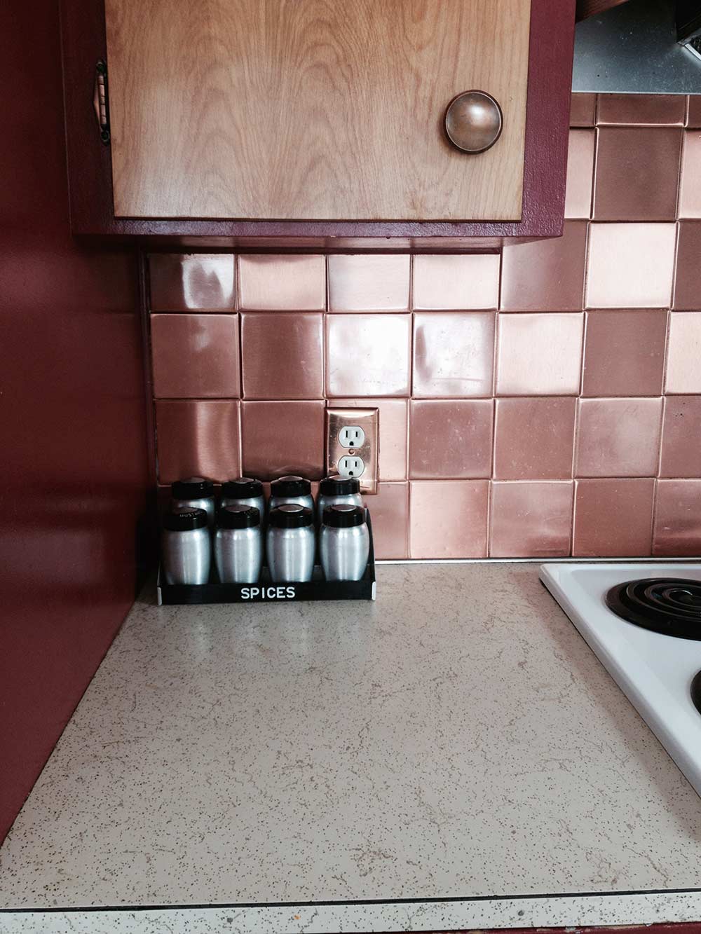
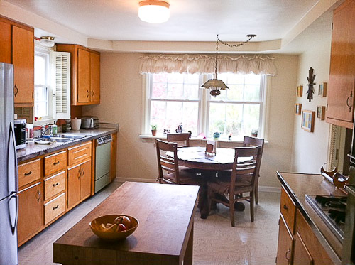
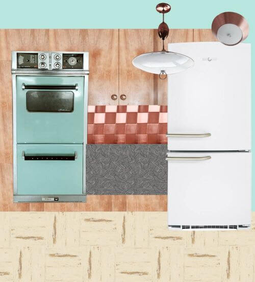
 Here are some photos of what our kitchen looks like now. As you can see, it needs some help. We started two summers ago stripping the paint off our kitchen cabinets! We didn’t realize how much work it was and how little time we actually have…. So that project came to a halt. This winter we will be restoring our kitchen with period appropriate flooring and refinishing our birch cabinets, having a contractor come in early in the year to do the whole kitchen for us. Our plans in our kitchen ‘retro restoration’ include stripping cabinets and adding drawer glides and cabinet pull outs.

Also, we are trying to think of a way to better utilize the corner. A new boomerang countertop from Heffrons in Glacier is going to be installed. We are going with a neutral countertop color, because this summer I was lucky enough to find the turquoise cooktop to match the oven!
I have been struggling with a floor pattern. We know we want a VCT floor but are not sure of the color scheme. It needs to complement the original hotpoint turquoise oven and copper backsplash. This where we need some help. We definitely want to go with a VCT that won’t clash with the copper backsplash. We will replace the fridge at a later time. Any recommendations would be helpful too.
I asked Shannon — which Glacier laminate was she contemplating? The grey and white or the turquoise? Her response:
I guess we are still trying to decide between the two for the laminate countertop. I assume we will be putting metal banding too around the edges. Also need some help with a paint color for the contrasting picture window. Or any other paint options you may have in mind. I was looking some old posts of kitchen remodels last night and found one I really like:
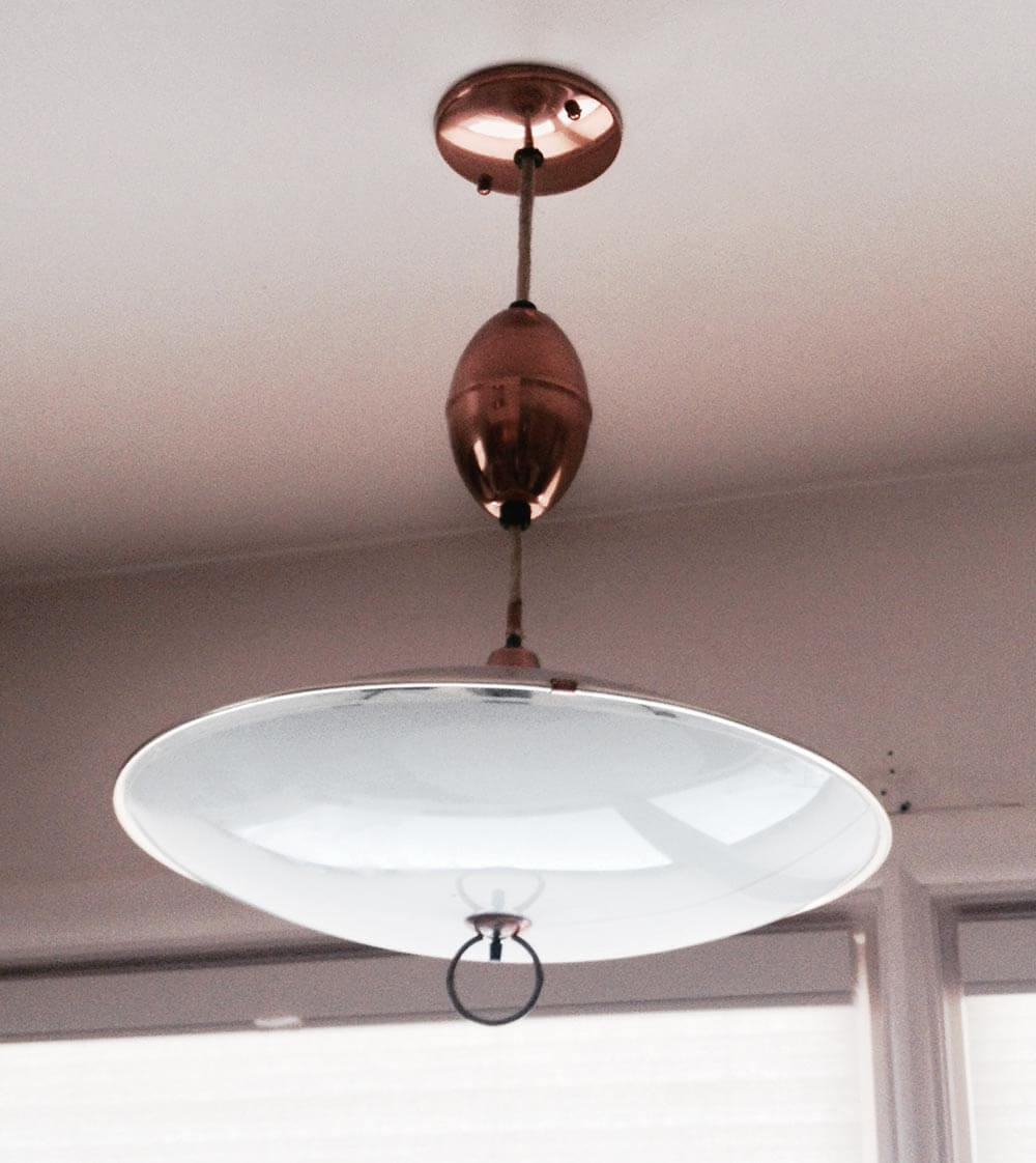

I also attached some pictures of some of our vintage copper light fixtures.
 Then, Pam and I noticed the GOLD SPARKLE LAMINATE countertop that Shannan currently has — the envy of many a Retro Renovator — and wondered why she was replacing it. Was it in bad shape? Shannan replied:
Yes, it is in terrible shape. Do you know of a way to clean it? There are some pretty gross stains on it. It’s not so sparkly anymore. 🙁
Okay, readers — Shannan needs your suggestions for what flooring, countertops, refrigerator and paint to use in her retro kitchen restoration. What do you think?
Pam and Kate respond:
First — Can you love the laminate you have?
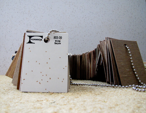
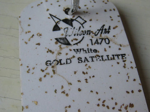 Before we get into the possible solutions, Pam and I both wanted to drive home the point that fundamentally, we love the gold sparkle laminate countertop that Shannan already has. She says it is stained and not in good shape, but … it’s so desirable, can she live with any imperfections? When Pam and I were discussing the solutions for Shannan, we both agreed that if it were available today, gold sparkle laminate would be the perfect solution for Shannan’s countertops — that was before we realized they already were gold sparkle. See our story on Formica’s recommendations for six products to clean laminate. Of it that fails, perhaps cover the stained area with a drop in cutting board or trivet with hudee ring from Vance Industries?
- Gold sparkle laminate countertop — all mine after years of searching
- 70 vintage Wilsonart samples, including “Gold Satellite” shown above
- How laminate is made
All that said, we did consider replacement options…. on to our suggestions…
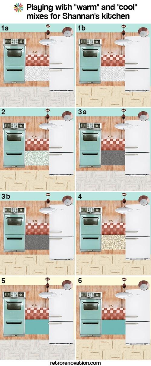
Some fundamental thoughts: Mixing warm and cold can be tricky
Pam here now. I had a tough time with this one — as I did in my own, turquoise-cabinet kitchen. The reason: Your aqua stove is a “cool” color. Your cabinets, cabinet hardware, backsplash, lighting and current countertop: “warm.” I think that getting warn and cool colors to harmonize — especially when you are dealing with very large swaths — such as the mass of cabinets and how they combine with the mass of floor — is tricky.
I drove Kate a little nuts making mood boards to try and begin to assess how to balance warm vs. cool colors. For sure, I would get all the samples, put them in my space and torture myself and DH for a good long time, before I made a final decision.
Here you go:
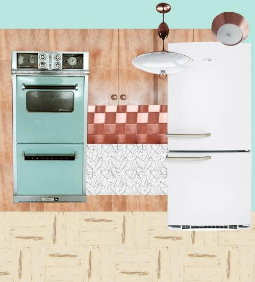
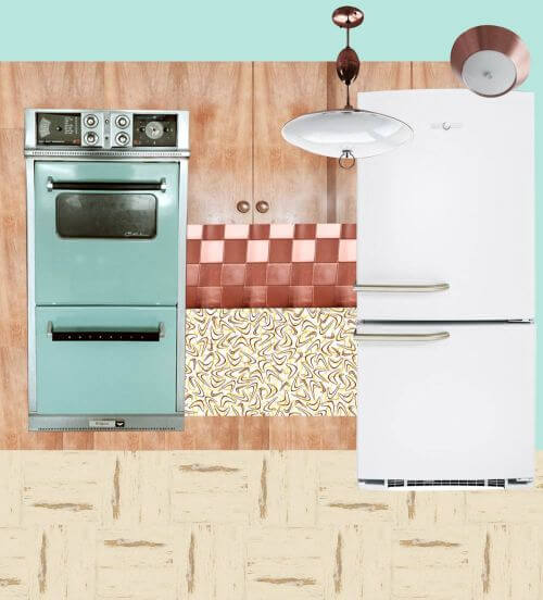
Option 1a: Cool Glacier countertop, Cool Raw Silk floor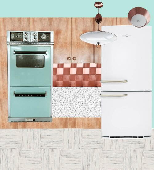
Above:
- White GE Artistry refrigerator
- Vitros Glacier boomerang laminate from Heffron’s
- Azrock TexTile VCT floor in Raw Silk
- Paint — aqua color to match the vintage appliances
This option is Kate’s favorite. It would make for a light feeling kitchen with the light flooring, white and grey countertops and white refrigerator. Making the wall turquoise would add color to the space along with the vintage aqua appliances that Shannan already has. The cabinets and copper backsplash and light fixtures help warm up the space. Shannan could also add a few more pops of orange or pale yellow to bring more visual warmth to the room.
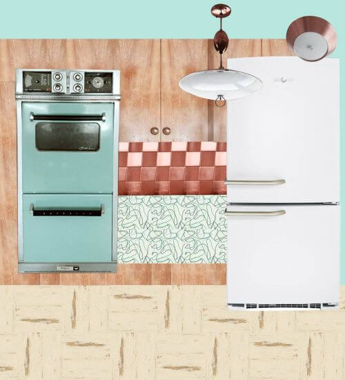
Option 1b: Cool Glacier countertop, Warm Autumn Haze floor
Above:
- White GE Artistry refrigerator
- Vitros Glacier boomerang laminate from Heffron’s
- Azrock Cortina VCT floor in Autumn Haze*— like in Pam’s kitchen
- Paint — aqua color to match the vintage appliances
See how the warm floor and the cool countertop are competing, compared to 1a? Pammy no likey.
*Ugh. After doing all the work on these mood boards, we discovered that Azrock Cortina Autumn Haze has been discontinued. However, there are other colors in the new(ish) Azrock TexTile line that are good substitutes, so we’ll continue as planned…
But, I like the warm floor with the warm cabinets.
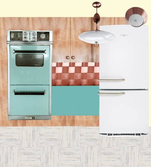
Option 2: Cool turquoise Glacier countertop, Warm Autumn Haze floor
Above:
- White GE Artistry refrigerator
- Vitros Turquoise Glacier boomerang laminate from Heffron’s
- Azrock Cortina VCT floor in Autumn Haze — Haze — like in Pam’s kitchen
- Paint — aqua color to match the vintage appliances
Even though the countertop is still technically cool, Pammy likey better, because there’s more color in the countertop — the aqua — and for some reason, that helps.
YES: In this kitchen, Pam loves the idea of stainless steel edging. It will look great.
Option 3a: Cool Charcoal countertop, Cool Raw Silk floor
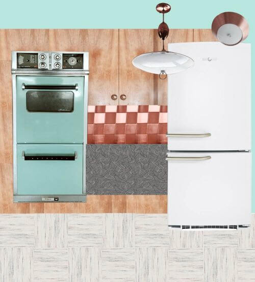 Above:
- White GE Artistry refrigerator
- Formica charcoal boomerang laminate
- Azrock TexTile VCT floor in Raw Silk
- Paint — aqua color to match the vintage appliances
Pam is liking the charcoal Formica. The darkness is picking up on the blackhandles etc. of the stove.
Option 3b: Cool charcoal countertop, Warm Autumn Haze floor
Above:
- White GE Artistry refrigerator
- Formica charcoal boomerang laminate
- Azrock Cortina VCT floor in Autumn Haze — Haze — like in Pam’s kitchen
- Paint — aqua color to match the vintage appliances
To ensure an all-brown/beige interior does not look too drab, (1) be sure the space is well lit and (2) add pops of a well saturaged cool color as an accent.
Option 4: Warm butterscotch countertop, warm Autumn Haze floor
Above:
- White GE Artistry refrigerator
- Wilsonart retro butterscotch boomerang laminate — like Amber used in her kitchen.
- Azrock Cortina VCT floor in Autumn Haze — Haze — like in Pam’s kitchen
- Paint — aqua color to match the vintage appliances
Those butterscotch boomies look great with wood cabinet, but we’re not so sure when your appliances are aqua.
Option 5: Cool solid aqua countertop, cool Raw Silk floor
Above:
- White GE Artistry refrigerator
- Abet Laminati laminate in Azzuro Mary (or coordinating aqua color — we’d likely try to get as close in color to the ovens as possible — get samples to be sure) — like Betty Crafter’s kitchen
- Azrock TexTile VCT floor in Raw Silk
- Paint — light yellow to bring more warmth to the space
A solid countertop aqua could look good.
Option 6: Cool solid aqua countertop, warm Autumn Haze floor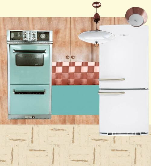
 Above:
- White GE Artistry refrigerator
- Abet Laminati laminate in Azzuro Mary (or coordinating aqua color, get samples to be sure) — like Betty Crafter’s kitchen
- Azrock Cortina VCT floor in Autumn Haze — Haze — like in Pam’s kitchen
- Paint — light yellow to bring more warmth to the space …
- Or.Pam says, this one would look good with the Bradbury Atomic Doodle wallpaper, too. She says that this is also a favorite combo — because like the charcoal countertop, the aqua countertop reads like a new graphical element — and is a stock/deco paper (vs. special order/digital print) laminate.
Paired with the warm floor.
So there you go, Shannan. We bet that helped. Or confused you more. Which?


Lisa says
I vote for 1a.
Jenny says
Could paint the existing fridge to match the beautiful color of the oven. I painted my fridge and it helped tie the whole room together. Inexpensive too.
Steve H says
I vote for 5 or 6 (if the original laminate cannot be saved). I don’t agree at all about losing the copper tile; I think it’s wonderful. Copper and aqua have a natural affinity because the aqua suggests the color of oxidized copper.
pam kueber says
ah, what an interesting comment about the aqua connection to verdigris! great point!
pam kueber says
Back again. Steve, you convinced me with that comment! Aqua countertop “because the aqua suggests the color of oxidized copper” (e.g. verdigris) — BRILLIANT connection made, just brilliant!
pam kueber says
Although now I’m still vacillating – also like the idea of the charcoal boomies — for graphic definition
Robin, NV says
So many great ideas Pam and Kate. #1a is my favorite – very fresh looking. I also like 3a, 5, and 6. A word of warning about solid colored countertops – every crumb shows up on them. For this reason alone, I wish I’d gotten something patterned.
pam kueber says
Yes: Tone-on-tone, multidirectional, small pattern abstract laminate countertop = the gold standard.
pam kueber says
Note, we’ve identified some tone-on-tone aqua laminates in our research see Kitchen Help / Countertops category. My recollection is that they’re a little too contempo, though…
Shannan says
Maybe you missed the part that I found on ebay the matching turquoise cooktop this summer that will be installed so we are definitely not going with a turquoise countertop.
Mary Elizabeth says
You can still use the turquoise or aqua countertop, especially the boomerang. You just have to be sure the sample matches rather than clashes with your cook top. But I really like the charcoal, and you won’t have to worry about staining it.
You didn’t say what you are doing with your kitchen sink. Something else to worry about. 🙂
Shannan says
I have all the Azrock Textile samples and I don’t seem to think that there really is a good crossover from Autumn Haze. The original Autumn Haze seems more yellow than creamy. Is that right? The suggested crossover is Warm Wool. I think that this more gray than creamy. I think the Golden Fleece or Lovely Linen is a better match. What do you think Pam? I have never seen the Autumn Haze in person.
pam kueber says
Shannan, I can’t say without seeing all the samples. Yes, looking at the samples on the internet can be so deceiving. You will need to make the final decision… but it sounds like you understand my points about warm vs. cool. Note, I think that mixing them CAN work, it can just be tricky…
I think, interestingly, that the AVCO Pioneer kitchen I just posted is clearly All Warm.
pam kueber says
Also see this pic https://retrorenovation.com/2011/11/07/azrock-cortina-autumn-haze-flooring-in-four-kitchens-any-more-of-you-out-there/
pam kueber says
Shannan, Lynne used Armstrong Striations. I had forgotten about that one. The Azure is pretty groovy — http://www.armstrong.com/commflooringna/products/biobased-tile/striations/_/N-70fZ1z141rp#
Seems like you could cut them into 12x12s if you like.
More options… original tip, from Roundhouse Sara, who used it in her parents’ kitchen — https://retrorenovation.com/2014/01/13/st-charles-kitchen-cabinets/
Allen says
I wish they would make this at 18 inches so they could be easily cut into 9 inch tiles.
pam kueber says
yup
Lynne says
The floor they show in that Armstrong link is exactly what we chose.
Lisa says
Yes! I just received my samples of Azrock Textiles today and I was trying to get as close to Autumn Haze as possible for my kitchen. I had narrowed it down to Golden Fleece and Lovely Linen. Golden fleece is definitely creamier and, therefore, warmer. But Lovely Linen is definitely “streakier”, which is what I love. But I don’t have a sample of Autumn Haze to know. Wish it was still available.
Pam, could you get the current samples from Azrock Textiles and lay them next to your Autumn Haze and give us the closest match? You’ve all got us hooked on that floor! 🙂
Jay says
Phew! Poor Kate. I was going cross eyed. I thought it was one of those comic page puzzles – can you spot the differences between scenes 1 and 2. I vote for charcoal laminate and yellow walls. Wait, that wasn’t an option.
Regarding the existing laminate – it might just be too worn to keep. My last kitchen had blue sparkle and this kitchen had yellow linen. Since both kitchens had little counter, exisiting primarily both sides of the sink, previous owners had scrubbed the life out of them, wearing off the surface pattern. Painting was not an option so I had to replace with new.
pam kueber says
haha
yes, we wish there was a modular app where we could just post the alternatives and let folks mix and match
Lynne says
I have the Bradbury wallpaper you are showing, and a new bio based/vct turquoise and grey floor in my kitchen. Grey Formica counters. I sure wish I knew how to send pics, because it might really help for Shannan to get a visual.
pam kueber says
Thanks for the photos, Lynne. We’re going to do a stand-alone feature. Sarah: I will say, Lynne’s kitchen is not “warm” — it is consistently “cold”
Shannan says
Where are the pictures?
pam kueber says
we’re doing a separate story
Kim says
I agree with Darnell. I think the copper backsplash clashes with the turquoise and will hinder the overall coordination of color and pattern in the kitchen. I think your design options will expand if you replace the backsplash. I’d like to see the integration of some yellow to compliment the aqua, either with paint or the suggested wallpaper. Love the idea of aluminum metal banding on the counter tops.
Lynn-O-Matic says
I absolutely adore the turquoise and copper combination. There are dozens of vintage kitchen accessories to be had in that color scheme, from canisters, breadboxes, and mixing bowls to table and chair sets. I’d go with a neutral countertop and add some of these vintage goodies.
Darnelle says
All options are nice I have a real problem with the copper backsplash. It sticks out too much in all design options. The lighting is wonderful, but I see no reason to keep the backsplash, to me it even detracts from the wonderful wood.
pam kueber says
hmmm…. I think they look great with all the warm wood!
Jay says
Whoa! If you hadn’t said the copper finish tiles were original, I’d have thought they were a recent project. Nice ovens and light fixtures. Amazing they are still in the kitchen after all these years.
Mary Elizabeth says
Jay, could be many reasons for the condition of the ovens.
When I was house hunting, I saw a couple of places that had original wall ovens, and they were pristine. (Unfortunately, other things had been ripped out of the kitchens that would have made them more appealing to me.) It wasn’t just that they had been kept clean. It’s that the hinges were like new, the surfaces without dings, etc. I asked the real estate agent about it, and she said, “Some people just don’t cook, you know?” I know we picture the mid-century householders eating casseroles and roasts, but I do remember when I was growing up that some women used nothing but stovetops and microwaves and TV dinners (which are covered in foil, so they don’t splash on the oven).