

 Reader Shannan and her husband are in the midst of stripping paint from their original wood cabinets. Shannan’s dilemma: She has asked for our advice on flooring, countertops and paint to complement the lovely woodtones, copper accents and aqua appliances. Bring on your ideas, readers — and Pam and I will be back at noon with our thoughts and some mood boards.
 Shannan writes:
My husband and I peruse your site regularly for restoration ideas. We bought our 1959 ranch in 2013. We knew right away that this was the one. It was the most intact 50’s ranch we found. Most of them have been torn apart. We have painted every wall in the house and replaced the flooring. It was all carpeted, and we wanted something different. We are sticking to period appropriate flooring. We choose cork flooring for the bedrooms. We are in the process of replacing the carpet with red oak hardwood floors in the living room.
We even have a PINK bathroom upstairs. Still need a little work accessorizing, but that just takes time. We still have A LOT to do, but it will all come in time and money!
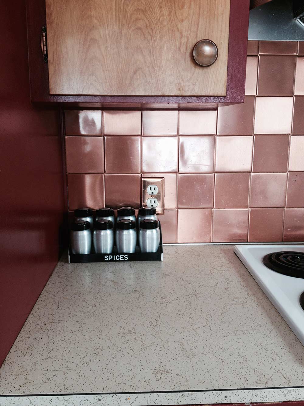
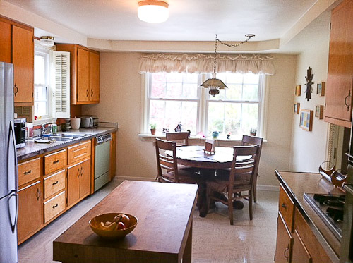
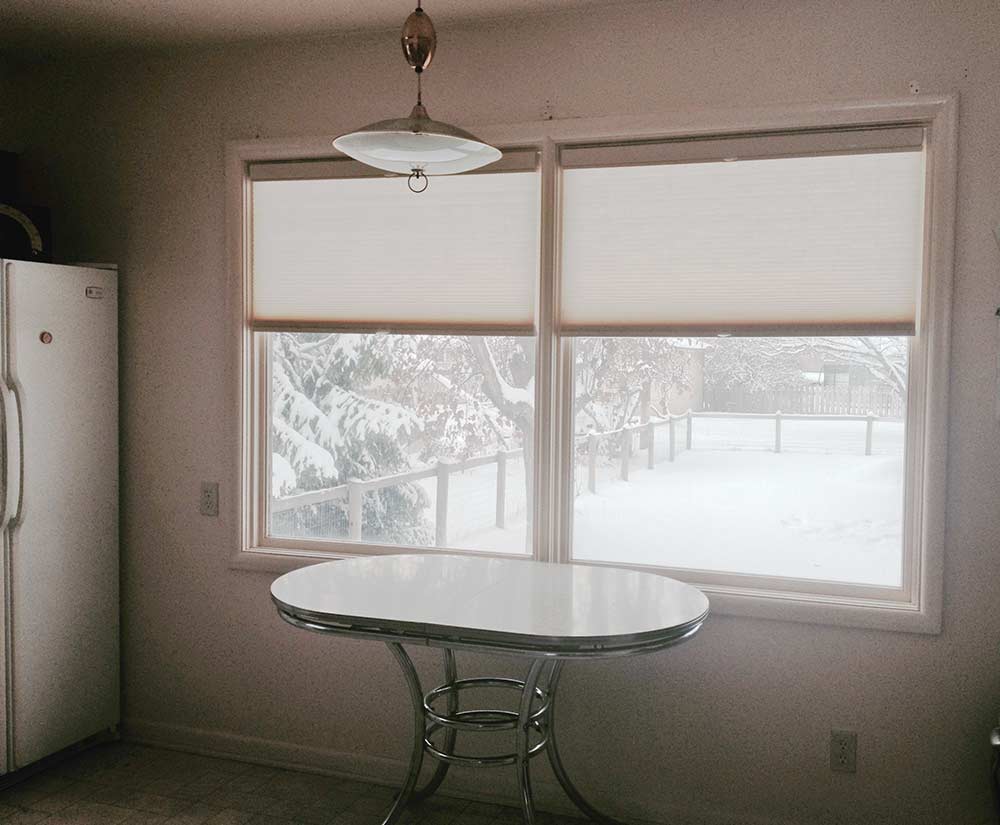 Here are some photos of what our kitchen looks like now. As you can see, it needs some help. We started two summers ago stripping the paint off our kitchen cabinets! We didn’t realize how much work it was and how little time we actually have…. So that project came to a halt. This winter we will be restoring our kitchen with period appropriate flooring and refinishing our birch cabinets, having a contractor come in early in the year to do the whole kitchen for us. Our plans in our kitchen ‘retro restoration’ include stripping cabinets and adding drawer glides and cabinet pull outs.

Also, we are trying to think of a way to better utilize the corner. A new boomerang countertop from Heffrons in Glacier is going to be installed. We are going with a neutral countertop color, because this summer I was lucky enough to find the turquoise cooktop to match the oven!
I have been struggling with a floor pattern. We know we want a VCT floor but are not sure of the color scheme. It needs to complement the original hotpoint turquoise oven and copper backsplash. This where we need some help. We definitely want to go with a VCT that won’t clash with the copper backsplash. We will replace the fridge at a later time. Any recommendations would be helpful too.
I asked Shannon — which Glacier laminate was she contemplating? The grey and white or the turquoise? Her response:
I guess we are still trying to decide between the two for the laminate countertop. I assume we will be putting metal banding too around the edges. Also need some help with a paint color for the contrasting picture window. Or any other paint options you may have in mind. I was looking some old posts of kitchen remodels last night and found one I really like:
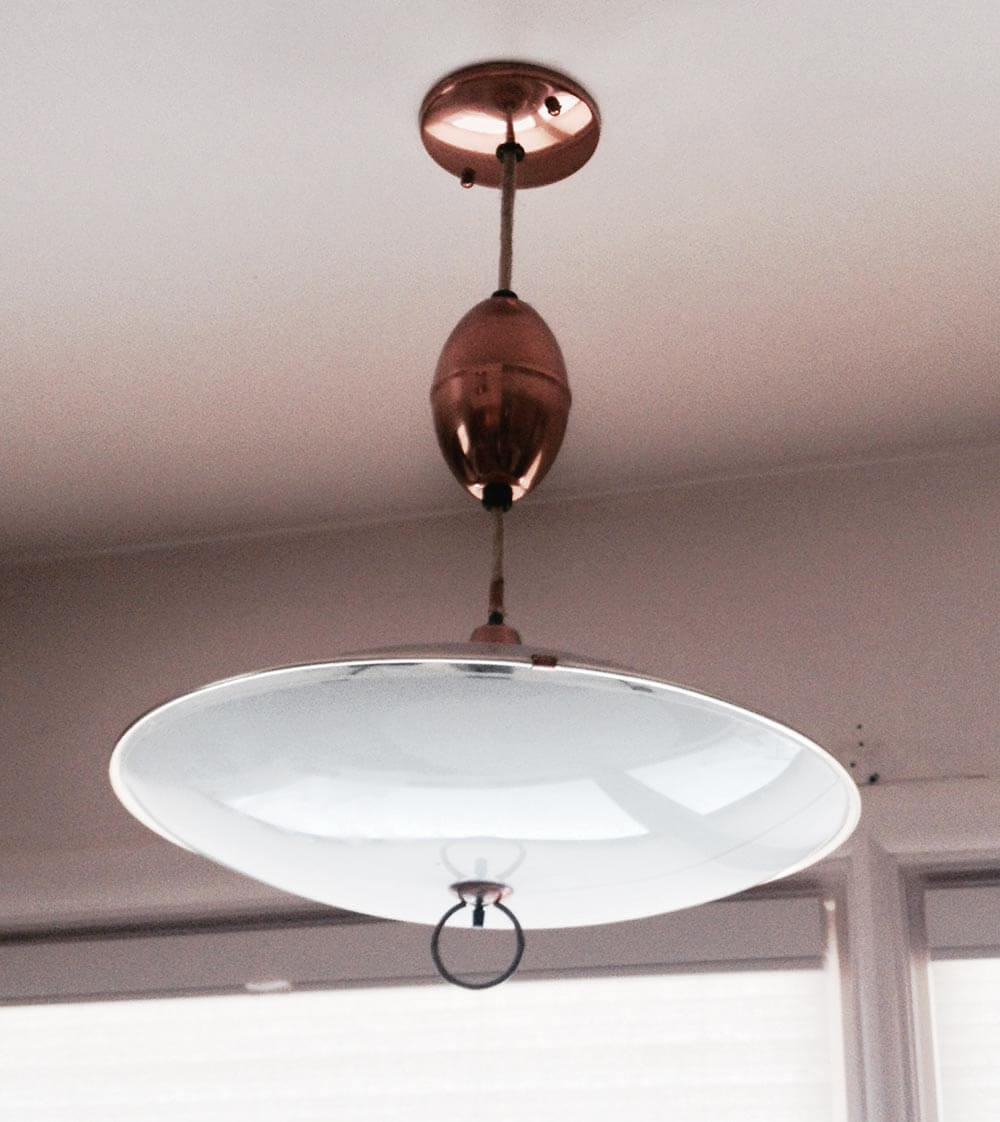

I also attached some pictures of some of our vintage copper light fixtures.
 Then, Pam and I noticed the GOLD SPARKLE LAMINATE countertop that Shannan currently has — the envy of many a Retro Renovator — and wondered why she was replacing it. Was it in bad shape? Shannan replied:
Yes, it is in terrible shape. Do you know of a way to clean it? There are some pretty gross stains on it. It’s not so sparkly anymore. 🙁
Okay, readers — Shannan needs your suggestions for what flooring, countertops, refrigerator and paint to use in her retro kitchen restoration. What do you think?
Pam and Kate respond:
First — Can you love the laminate you have?
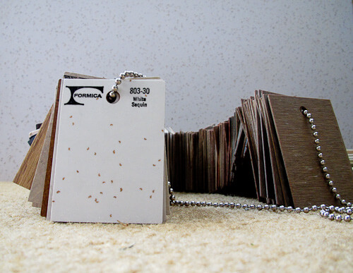
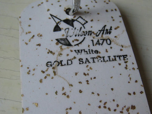 Before we get into the possible solutions, Pam and I both wanted to drive home the point that fundamentally, we love the gold sparkle laminate countertop that Shannan already has. She says it is stained and not in good shape, but … it’s so desirable, can she live with any imperfections? When Pam and I were discussing the solutions for Shannan, we both agreed that if it were available today, gold sparkle laminate would be the perfect solution for Shannan’s countertops — that was before we realized they already were gold sparkle. See our story on Formica’s recommendations for six products to clean laminate. Of it that fails, perhaps cover the stained area with a drop in cutting board or trivet with hudee ring from Vance Industries?
- Gold sparkle laminate countertop — all mine after years of searching
- 70 vintage Wilsonart samples, including “Gold Satellite” shown above
- How laminate is made
All that said, we did consider replacement options…. on to our suggestions…
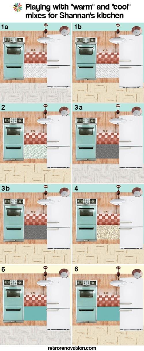
Some fundamental thoughts: Mixing warm and cold can be tricky
Pam here now. I had a tough time with this one — as I did in my own, turquoise-cabinet kitchen. The reason: Your aqua stove is a “cool” color. Your cabinets, cabinet hardware, backsplash, lighting and current countertop: “warm.” I think that getting warn and cool colors to harmonize — especially when you are dealing with very large swaths — such as the mass of cabinets and how they combine with the mass of floor — is tricky.
I drove Kate a little nuts making mood boards to try and begin to assess how to balance warm vs. cool colors. For sure, I would get all the samples, put them in my space and torture myself and DH for a good long time, before I made a final decision.
Here you go:
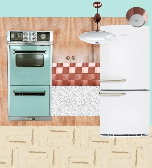
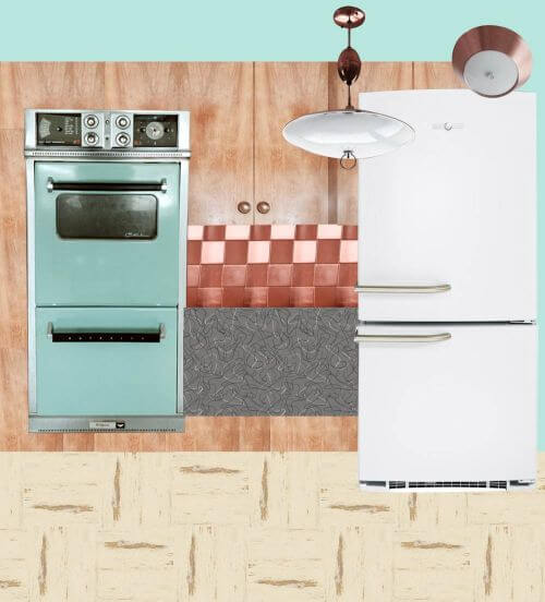
Option 1a: Cool Glacier countertop, Cool Raw Silk floor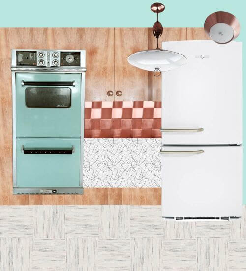
Above:
- White GE Artistry refrigerator
- Vitros Glacier boomerang laminate from Heffron’s
- Azrock TexTile VCT floor in Raw Silk
- Paint — aqua color to match the vintage appliances
This option is Kate’s favorite. It would make for a light feeling kitchen with the light flooring, white and grey countertops and white refrigerator. Making the wall turquoise would add color to the space along with the vintage aqua appliances that Shannan already has. The cabinets and copper backsplash and light fixtures help warm up the space. Shannan could also add a few more pops of orange or pale yellow to bring more visual warmth to the room.
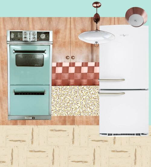
Option 1b: Cool Glacier countertop, Warm Autumn Haze floor
Above:
- White GE Artistry refrigerator
- Vitros Glacier boomerang laminate from Heffron’s
- Azrock Cortina VCT floor in Autumn Haze*— like in Pam’s kitchen
- Paint — aqua color to match the vintage appliances
See how the warm floor and the cool countertop are competing, compared to 1a? Pammy no likey.
*Ugh. After doing all the work on these mood boards, we discovered that Azrock Cortina Autumn Haze has been discontinued. However, there are other colors in the new(ish) Azrock TexTile line that are good substitutes, so we’ll continue as planned…
But, I like the warm floor with the warm cabinets.
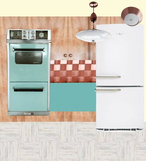
Option 2: Cool turquoise Glacier countertop, Warm Autumn Haze floor
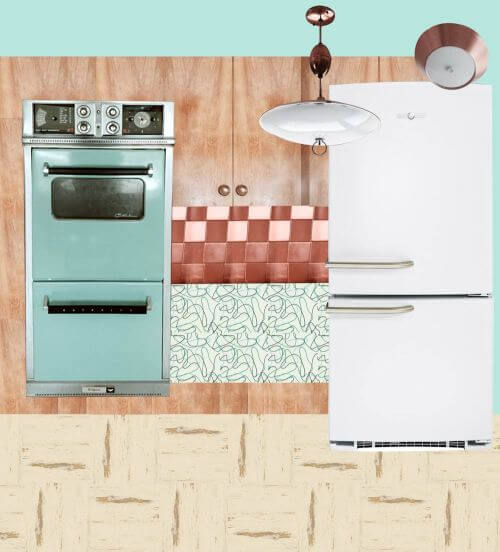
Above:
- White GE Artistry refrigerator
- Vitros Turquoise Glacier boomerang laminate from Heffron’s
- Azrock Cortina VCT floor in Autumn Haze — Haze — like in Pam’s kitchen
- Paint — aqua color to match the vintage appliances
Even though the countertop is still technically cool, Pammy likey better, because there’s more color in the countertop — the aqua — and for some reason, that helps.
YES: In this kitchen, Pam loves the idea of stainless steel edging. It will look great.
Option 3a: Cool Charcoal countertop, Cool Raw Silk floor
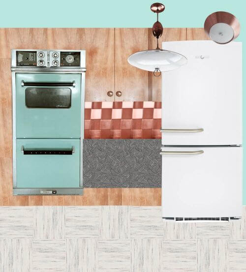 Above:
- White GE Artistry refrigerator
- Formica charcoal boomerang laminate
- Azrock TexTile VCT floor in Raw Silk
- Paint — aqua color to match the vintage appliances
Pam is liking the charcoal Formica. The darkness is picking up on the blackhandles etc. of the stove.
Option 3b: Cool charcoal countertop, Warm Autumn Haze floor

Above:
- White GE Artistry refrigerator
- Formica charcoal boomerang laminate
- Azrock Cortina VCT floor in Autumn Haze — Haze — like in Pam’s kitchen
- Paint — aqua color to match the vintage appliances
To ensure an all-brown/beige interior does not look too drab, (1) be sure the space is well lit and (2) add pops of a well saturaged cool color as an accent.
Option 4: Warm butterscotch countertop, warm Autumn Haze floor
Above:
- White GE Artistry refrigerator
- Wilsonart retro butterscotch boomerang laminate — like Amber used in her kitchen.
- Azrock Cortina VCT floor in Autumn Haze — Haze — like in Pam’s kitchen
- Paint — aqua color to match the vintage appliances
Those butterscotch boomies look great with wood cabinet, but we’re not so sure when your appliances are aqua.
Option 5: Cool solid aqua countertop, cool Raw Silk floor
Above:
- White GE Artistry refrigerator
- Abet Laminati laminate in Azzuro Mary (or coordinating aqua color — we’d likely try to get as close in color to the ovens as possible — get samples to be sure) — like Betty Crafter’s kitchen
- Azrock TexTile VCT floor in Raw Silk
- Paint — light yellow to bring more warmth to the space
A solid countertop aqua could look good.
Option 6: Cool solid aqua countertop, warm Autumn Haze floor
 Above:
- White GE Artistry refrigerator
- Abet Laminati laminate in Azzuro Mary (or coordinating aqua color, get samples to be sure) — like Betty Crafter’s kitchen
- Azrock Cortina VCT floor in Autumn Haze — Haze — like in Pam’s kitchen
- Paint — light yellow to bring more warmth to the space …
- Or.Pam says, this one would look good with the Bradbury Atomic Doodle wallpaper, too. She says that this is also a favorite combo — because like the charcoal countertop, the aqua countertop reads like a new graphical element — and is a stock/deco paper (vs. special order/digital print) laminate.
Paired with the warm floor.
So there you go, Shannan. We bet that helped. Or confused you more. Which?


Mark C says
My wife and I took an unorthodox approach with a ruined laminate countertop. We painted it (white) with tile paint, which sticks to slick surfaces. Then we covered it with BARTOP EPOXY, which requires planning and a blowtorch. The end result is very shiny. It looks a lot like a glass countertop now.
Laura says
I can’t believe the copper tiles are original, just because I haven’t seen them before and they’re so cute!
I agree with above commenters that you don’t want chrome edging with your copper accents — stick with copper, I’d say. I would do a laminate that is a bit more textured, like a linen-style turquoise or an off-white turquoise, vs. a boomerang, which I’m not sure complements the copper tiles. I’d definitely go with VCT squares, maybe a neutral tone that complements the birch cabinets and some squares of a deep aqua in between; cork might be another alternative that you’re already using and great for continuity, and would go well with the tones of the kitchen. I’d consider a deep earthy red as another color in the mix, since I’m loving the color (though not on the cabinets) in photos. Maybe for wall color or accessories?
I think the copper says “rich tones and textures” to me which is why I’d do less of the stereotypical boomerang-and-chrome banding.
Love the light fixtures!!
ShannonV says
My husband and I are retro-renovating a 1965 ranch. We are thinking of using Fritztile in the kitchen. They have a “classic terrazzo” line. They will send you samples of any or all of their flooring for free.
http://www.fritztile.com/tiles/
pam kueber says
LOVE the Fritztile! Great suggestion!
Gerry says
Oh my..the Fritz tile is wonderful! Thank you for the link. I need a new kitchen floor and there are some great choices there.
This is exactly what I love about Retrorenovation….passing on great ideas and product information from Pam, Kate, and all the readers. A PRICELESS community here!!
Gerry
pam kueber says
🙂
Jacki says
I have Fritztile in my bathroom, it is easy to keep up and very pretty.
ShannonV says
Jacki, tell me more! Did you install it yourself or have someone install it?
pam kueber says
That Fritztile is gorgeous!
Robin, NV says
Pam – any idea where to get that copper backsplash these days? I love that look. I found a product on Amazon that might work but just wondering how authentic it would be. http://www.amazon.com/Metal-Wall-Tiles-Square-Copper/dp/B003LUPKME/ref=sr_1_2?ie=UTF8&qid=1420729986&sr=8-2&keywords=copper+tile+backsplash
As far as the floor – there are so many great options with the beautiful birch cabinets and turquoise appliances. I like the look of linoleum with an accent border. How about a neutral color with a turquoise stripe to match the oven? But VCT would look great as well, of course. Personally, I’m a little tired of seeing checkered floors but the right two colors might work (please no black and white check floor in this kitchen).
Jacki says
Even though my kitchen is beige cabinets with pink appliances and accents, I just love turquoise with yellow. The two just seem to complement each other.
Erika says
I’m not sure how badly stained your countertops are, but I have gold fleck white laminate in my kitchen in my apartment, and I’ve had success with just elbow grease, magic eraser, and bleach cleaner.
pam kueber says
I would normally REALLY worry about using these on laminate. But if it’s the last stand, well, I guess, do what you gotta do.
Shannan says
I am going to Lowes tonight to find something to remove stains on counter top that was suggested in post from Pam and Kate on how to clean laminate countertops from Formica!
pam kueber says
You can also try Fantastic. It says it’s specked for laminate.
Shannan says
Any one product I should try first?
pam kueber says
not that I know of…
Mary Elizabeth says
First of all, I have to comment that the few doors that Shannan and her husband have already refinished show the beauty and warmth of the wood cabinets. Yes, it is a lot of work, but what you have done so far serves to show your carpenter what is under all that paint and how you want the cabinets to look when you are done. It will make it a lot easier for him or her to envision because you have done the preliminary work.
Second, I had that exact laminate counter in my 1959 ranch, which I have now covered with another color. Unlike yours, there wasn’t a stain on it, because the original owner scrubbed it twice a week with bleach! The result was that she had scrubbed off the shine and the protective surface, and like yours, the bits of glitter were coming off. Once it starts to come apart like that, you really need to cover it with another laminate.
Now for colors. Are the knobs copper, or do they just look like that in the light? If not, you can look for copper hardware to echo the back-splash and light fixtures, which are gorgeous! (While you’re having professionals come in to work on your kitchen, I would suggest having an electrician rewire them and be sure the hanging fixture is properly installed with the correct mounting of the electrical box.) If you go with the copper hardware, I would not use the chrome edging but instead use the self-edging, as you have now. Or you could go with chrome counter-top edging and chrome knobs to match each other.
As for colors, I see the kitchen as having two predominant colors, copper and turquoise. If you decide on the aqua boomerang laminate (check samples to be sure it is similar enough to your cooktop and oven), you can then introduce a third color for the floor. I am interested to see what Pam and Kate come up with, but I think a neutral vinyl floor (not stark white, but perhaps a darker beige) with a red inlaid border going around the whole room would be nice. Also consider a checkerboard of red and beige or a brick pattern. Then at the window you can add a print valance with pops of red or a gingham valance, which would be period perfect. Since you have all those colors going and finding an aqua fridge would be difficult (unless you want to take yours to the auto body shop and have them paint it), I think a white fridge in a vintage shape (Big Chill or the GE Artistry) would be just fine. Also, did you know you can go to the GE web site and suggest new accent door colors? They are currently taking suggestions, and maybe aqua will be available some time. And your white topped vintage table could be paired with a couple of red kitchen chairs, painted wood or vinyl kitchenette style, along with place mats to match the valance.
Can’t wait to see what Kate and Pam do with the colors.
Shannan says
All the hardware in the kitchen is copper except on the stove. Thanks for all your suggestions!
pam kueber says
Mixing wood and copper is very authentic — see the famous Avco American “Pioneer” kitchen: https://retrorenovation.com/2008/02/29/50s-kitchen-american-brand-coppertone-and-wood-combo/
Mary Elizabeth says
I may have misinterpreted Shannan’s discussion of the condition of her current laminate counter. When she said it was “not so sparkly anymore,” I assumed that the protective layer had worn off and the glitter was coming off, as it did on mine (same exact vintage). That may be why hers is stained. If not, it would be nice for her to preserve it. And I would never use bleach on it. Bleach is the reason the counter-top’s first layer gets worn away and is thus vulnerable to more stain. It is the old vicious cycle.
The idea of making warm and cool tones in balance in the kitchen is spot-on, Pam. If Shannan is going to use some red as an accent, as I suggested, it would have to be a warm red (brick) rather than a cool red (cherry). Likewise, if she uses yellow paint, she should be sure it leans toward warm rather than cool. Although yellow is considered a warm color, you will notice that some are warmer on the spectrum (pale gold, daffodil) rather than cooler (pale lemon).
My favorite color board is 3b, for a couple of reasons. First, the charcoal boomerang laminate will be easy to keep clean. Second, it is a neutral that pulls in both warm and cool tones. And I would definitely go with the Atomic Doodle wallpaper, which seems to have both cool and warm tones already in it.
We’re looking forward to finding out what you do, Shannon. I want to see those cabinets revealed!
pam kueber says
Thanks, Mary Elizabeth. I think 3b. is my favorite, too.
Chad D says
Someone made a comment about painting laminate and then clear coating it with a product made for bars – I wonder if that product could be used without paint on damaged laminate… though I don’t have or know anyone who has old beat up laminate countertops to try it on.
Tracy Perez says
Love the copper tile. Are they still made? Source?
pam kueber says
Only vintage, as far as I know. But they do come up.
ineffablespace says
Frigo Designs makes this style of Copper Tile or other metallic/metallic look tiles.
pam kueber says
Thanks! hi inneffable, seems like we haven’t heard from you for a while, nice to have byou back!
pam kueber says
yikes, $7 per piece. but it’s real copper (unlike the vintage tiles, which I am pretty sure were not real copper)
I have a hoard of NO vintage copper tiles (faux) each with little black Early American weebits on them. That is, copper with one pitcher in the middle… etc.
tee hee
pam kueber says
This ebay seller seems to have 10 boxes of NOS vintage Vikon copper tile — http://www.ebay.com/itm/copper-tile-Vikon-Vintage-Very-Nice-Shine-Tile-Pure-Copper-Metal-/261722442996?pt=Tile_Flooring&hash=item3cefdf8cf4
Diane in CO says
When my mom re-did our kitchen in the 1960’s (I was in HS), she chose that exact same copper tile backsplash paired with a bit-darker pumpkin laminate for the countertops. It was lovely – thanks for the memories!
For your kitchen I love the turquoise boomerang laminate Pam suggests!
Victoria says
This kitchen is so much like my kitchen in details and colors except we have pink appliances instead of aqua. Copper tile, cabinets, same light fixtures exactly. That said, we went for the grey neutral because it worked with the living room too — a galley kitchen with countertop passthrough and frosted glass cabinets share the space. Grey walls on part (sharing a contiguous wall with the living room), random grey and black VCT tile and grey VirVarr (discontinued, unfortunately) Formica. We went for a triadic color scheme — pink, lemongrass green, and aqua with a lot of grey neutral. A bit wild, really. With THIS kitchen, I ABSOLUTELY see grey with orange/pumpkin highlights and more aqua.
BTW, Diane, I live in Wheat Ridge, CO.
Roundhouse Sarah says
Pionite’s cavalcade of the south goes well with azrock’s cortina autumn haze if you want to keep things neutral. You could also put in aqua floor tiles with the autumn haze color in a pattern or intermittently.
Roundhouse Sarah says
I vote 3a or 3b, I like the aqua walls with the charcoal boomies. The floor looks great cool or warm toned.
pam kueber says
Hi RH, yes, I think that the 3 works with either floor.
My kitchen has a very prominent swath of cool — the aqua cabinets, counterpointed by a broad swath of warm — my floor. I worked hard to bring additional warmth in via the accessories and lighting — red and coppertone, and even my wallpaper has gold in it. I think it works fine and I personally prefer warm colors to cool colors. That said, there are days that I look at the kitchen and say, it would have looked even better with a warm floor. Again, all that said, at this point, I’m splitting hairs. Overall, it looks fine.
midmichigan says
I’d go with a “chip” linoleum solid sheet flooring if the largest space dimension is less than 12 feet. You’d have to seam it if it is so you might as well use the VCT tiles. There’s a wealth of info in a book that’s mentioned on this site. It consists of Armstrong flooring and ceiling ideas from the decade. As far as the countertop; maybe a solid color for the top and a contrasting edge band (white / aqua).
You’ve got some great vintage components to work with in your kitchen. The ovens are really cool and the natural wood finished doors with the round pulls were very popular. I hope you’ll share the results when you’re done.
pam kueber says
Yes, my “the bible”. First item on the must-have in your library: https://retrorenovation.com/merry-retro-christmas/