

 Reader Shannan and her husband are in the midst of stripping paint from their original wood cabinets. Shannan’s dilemma: She has asked for our advice on flooring, countertops and paint to complement the lovely woodtones, copper accents and aqua appliances. Bring on your ideas, readers — and Pam and I will be back at noon with our thoughts and some mood boards.
 Shannan writes:
My husband and I peruse your site regularly for restoration ideas. We bought our 1959 ranch in 2013. We knew right away that this was the one. It was the most intact 50’s ranch we found. Most of them have been torn apart. We have painted every wall in the house and replaced the flooring. It was all carpeted, and we wanted something different. We are sticking to period appropriate flooring. We choose cork flooring for the bedrooms. We are in the process of replacing the carpet with red oak hardwood floors in the living room.
We even have a PINK bathroom upstairs. Still need a little work accessorizing, but that just takes time. We still have A LOT to do, but it will all come in time and money!
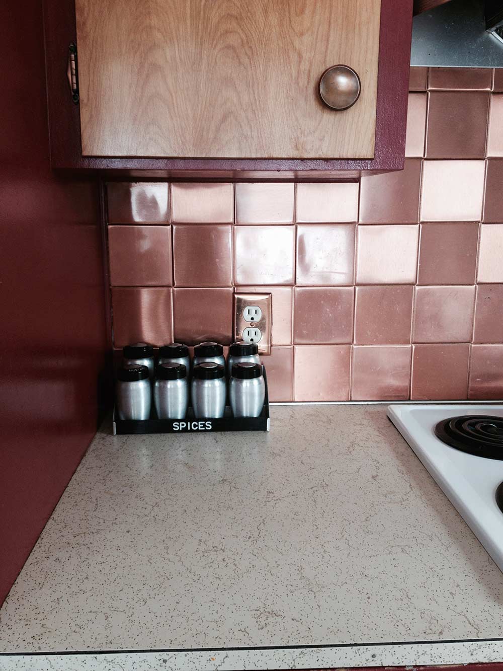
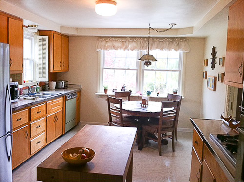
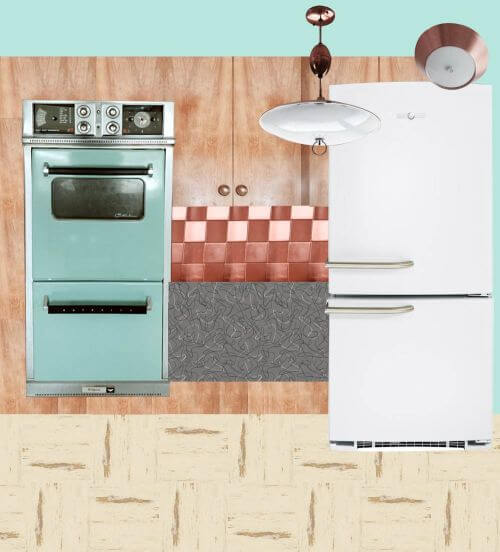
 Here are some photos of what our kitchen looks like now. As you can see, it needs some help. We started two summers ago stripping the paint off our kitchen cabinets! We didn’t realize how much work it was and how little time we actually have…. So that project came to a halt. This winter we will be restoring our kitchen with period appropriate flooring and refinishing our birch cabinets, having a contractor come in early in the year to do the whole kitchen for us. Our plans in our kitchen ‘retro restoration’ include stripping cabinets and adding drawer glides and cabinet pull outs.

Also, we are trying to think of a way to better utilize the corner. A new boomerang countertop from Heffrons in Glacier is going to be installed. We are going with a neutral countertop color, because this summer I was lucky enough to find the turquoise cooktop to match the oven!
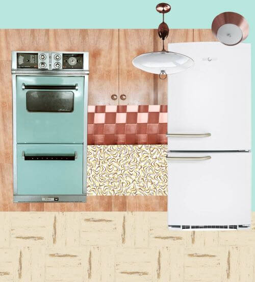
I have been struggling with a floor pattern. We know we want a VCT floor but are not sure of the color scheme. It needs to complement the original hotpoint turquoise oven and copper backsplash. This where we need some help. We definitely want to go with a VCT that won’t clash with the copper backsplash. We will replace the fridge at a later time. Any recommendations would be helpful too.
I asked Shannon — which Glacier laminate was she contemplating? The grey and white or the turquoise? Her response:
I guess we are still trying to decide between the two for the laminate countertop. I assume we will be putting metal banding too around the edges. Also need some help with a paint color for the contrasting picture window. Or any other paint options you may have in mind. I was looking some old posts of kitchen remodels last night and found one I really like:
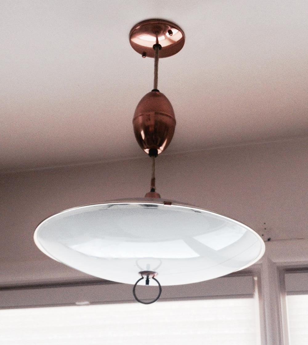

I also attached some pictures of some of our vintage copper light fixtures.
 Then, Pam and I noticed the GOLD SPARKLE LAMINATE countertop that Shannan currently has — the envy of many a Retro Renovator — and wondered why she was replacing it. Was it in bad shape? Shannan replied:
Yes, it is in terrible shape. Do you know of a way to clean it? There are some pretty gross stains on it. It’s not so sparkly anymore. 🙁
Okay, readers — Shannan needs your suggestions for what flooring, countertops, refrigerator and paint to use in her retro kitchen restoration. What do you think?
Pam and Kate respond:
First — Can you love the laminate you have?
 Before we get into the possible solutions, Pam and I both wanted to drive home the point that fundamentally, we love the gold sparkle laminate countertop that Shannan already has. She says it is stained and not in good shape, but … it’s so desirable, can she live with any imperfections? When Pam and I were discussing the solutions for Shannan, we both agreed that if it were available today, gold sparkle laminate would be the perfect solution for Shannan’s countertops — that was before we realized they already were gold sparkle. See our story on Formica’s recommendations for six products to clean laminate. Of it that fails, perhaps cover the stained area with a drop in cutting board or trivet with hudee ring from Vance Industries?
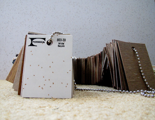
- Gold sparkle laminate countertop — all mine after years of searching
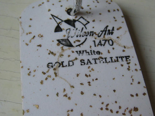
- 70 vintage Wilsonart samples, including “Gold Satellite” shown above
- How laminate is made
All that said, we did consider replacement options…. on to our suggestions…
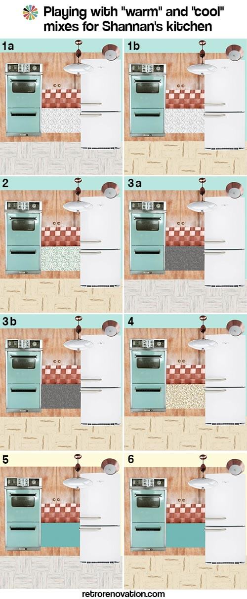
Some fundamental thoughts: Mixing warm and cold can be tricky
Pam here now. I had a tough time with this one — as I did in my own, turquoise-cabinet kitchen. The reason: Your aqua stove is a “cool” color. Your cabinets, cabinet hardware, backsplash, lighting and current countertop: “warm.” I think that getting warn and cool colors to harmonize — especially when you are dealing with very large swaths — such as the mass of cabinets and how they combine with the mass of floor — is tricky.
I drove Kate a little nuts making mood boards to try and begin to assess how to balance warm vs. cool colors. For sure, I would get all the samples, put them in my space and torture myself and DH for a good long time, before I made a final decision.
Here you go:
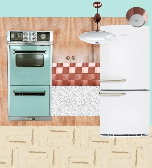
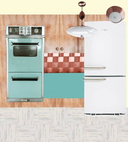
Option 1a: Cool Glacier countertop, Cool Raw Silk floor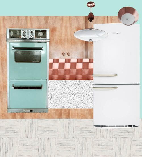
Above:
- White GE Artistry refrigerator
- Vitros Glacier boomerang laminate from Heffron’s
- Azrock TexTile VCT floor in Raw Silk
- Paint — aqua color to match the vintage appliances
This option is Kate’s favorite. It would make for a light feeling kitchen with the light flooring, white and grey countertops and white refrigerator. Making the wall turquoise would add color to the space along with the vintage aqua appliances that Shannan already has. The cabinets and copper backsplash and light fixtures help warm up the space. Shannan could also add a few more pops of orange or pale yellow to bring more visual warmth to the room.
Option 1b: Cool Glacier countertop, Warm Autumn Haze floor
Above:
- White GE Artistry refrigerator
- Vitros Glacier boomerang laminate from Heffron’s
- Azrock Cortina VCT floor in Autumn Haze*— like in Pam’s kitchen
- Paint — aqua color to match the vintage appliances
See how the warm floor and the cool countertop are competing, compared to 1a? Pammy no likey.
*Ugh. After doing all the work on these mood boards, we discovered that Azrock Cortina Autumn Haze has been discontinued. However, there are other colors in the new(ish) Azrock TexTile line that are good substitutes, so we’ll continue as planned…
But, I like the warm floor with the warm cabinets.
Option 2: Cool turquoise Glacier countertop, Warm Autumn Haze floor
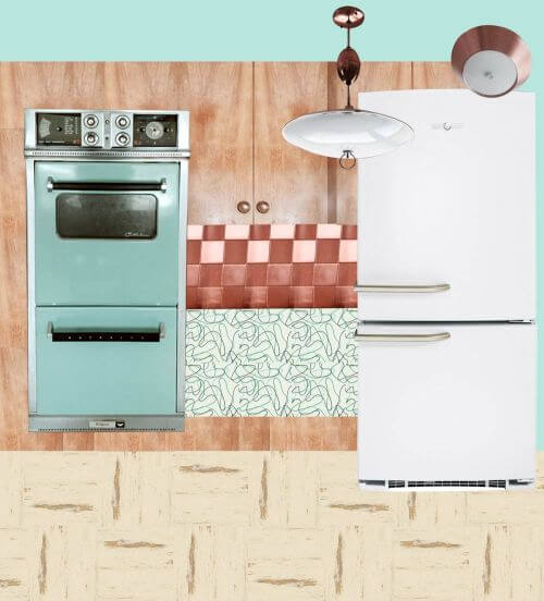
Above:
- White GE Artistry refrigerator
- Vitros Turquoise Glacier boomerang laminate from Heffron’s
- Azrock Cortina VCT floor in Autumn Haze — Haze — like in Pam’s kitchen
- Paint — aqua color to match the vintage appliances
Even though the countertop is still technically cool, Pammy likey better, because there’s more color in the countertop — the aqua — and for some reason, that helps.
YES: In this kitchen, Pam loves the idea of stainless steel edging. It will look great.
Option 3a: Cool Charcoal countertop, Cool Raw Silk floor
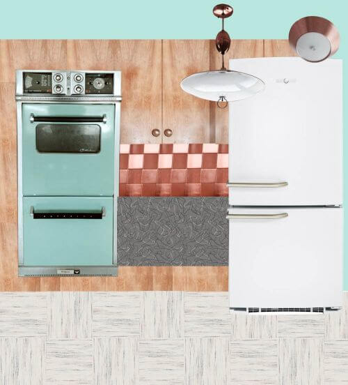 Above:
- White GE Artistry refrigerator
- Formica charcoal boomerang laminate
- Azrock TexTile VCT floor in Raw Silk
- Paint — aqua color to match the vintage appliances
Pam is liking the charcoal Formica. The darkness is picking up on the blackhandles etc. of the stove.
Option 3b: Cool charcoal countertop, Warm Autumn Haze floor

Above:
- White GE Artistry refrigerator
- Formica charcoal boomerang laminate
- Azrock Cortina VCT floor in Autumn Haze — Haze — like in Pam’s kitchen
- Paint — aqua color to match the vintage appliances
To ensure an all-brown/beige interior does not look too drab, (1) be sure the space is well lit and (2) add pops of a well saturaged cool color as an accent.
Option 4: Warm butterscotch countertop, warm Autumn Haze floor
Above:
- White GE Artistry refrigerator
- Wilsonart retro butterscotch boomerang laminate — like Amber used in her kitchen.
- Azrock Cortina VCT floor in Autumn Haze — Haze — like in Pam’s kitchen
- Paint — aqua color to match the vintage appliances
Those butterscotch boomies look great with wood cabinet, but we’re not so sure when your appliances are aqua.
Option 5: Cool solid aqua countertop, cool Raw Silk floor
Above:
- White GE Artistry refrigerator
- Abet Laminati laminate in Azzuro Mary (or coordinating aqua color — we’d likely try to get as close in color to the ovens as possible — get samples to be sure) — like Betty Crafter’s kitchen
- Azrock TexTile VCT floor in Raw Silk
- Paint — light yellow to bring more warmth to the space
A solid countertop aqua could look good.
Option 6: Cool solid aqua countertop, warm Autumn Haze floor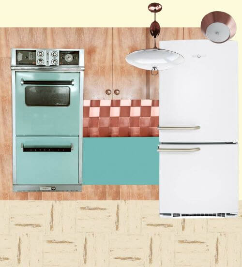
 Above:
- White GE Artistry refrigerator
- Abet Laminati laminate in Azzuro Mary (or coordinating aqua color, get samples to be sure) — like Betty Crafter’s kitchen
- Azrock Cortina VCT floor in Autumn Haze — Haze — like in Pam’s kitchen
- Paint — light yellow to bring more warmth to the space …
- Or.Pam says, this one would look good with the Bradbury Atomic Doodle wallpaper, too. She says that this is also a favorite combo — because like the charcoal countertop, the aqua countertop reads like a new graphical element — and is a stock/deco paper (vs. special order/digital print) laminate.
Paired with the warm floor.
So there you go, Shannan. We bet that helped. Or confused you more. Which?


Lisa says
Shannon, thanks for the update. Can’t wait to see pictures. But, ugh, so sorry about the flooring. But thanks for the heads-up. I was just about to order the “lovely linen” for my kitchen. I guess it’s back to the drawing board. But I did just install a patchwork quilt of different vct squares I had collected over months in my mudroom/pantry/kitchen annex. Of all the different companies and tile lines I laid down, the most quality feeling ones were the “Alternatives” line by Congoleum. They are well priced at Menards.com at about 62 cents a tile. Beautiful colors. They just were much smoother, stronger, and more beautiful than the other tile I had gathered. I think I had some from every company. I think I have to look there now. Wish they were streakier, though. Good luck and keep us updated. 🙂
pam kueber says
Lisa, have you looked at all our research in our Kitchen Help / Flooring category. There’s a new, recent story identifying companies.
Shannan says
Update: The first phase of the kitchen is done. The cabinets look amazing. Can’t wait to show you guys. I wanted to let you all know too that if you are thinking of ordering Azrock flooring, call them first! It has been nothing but drama. We ordered the Golden Fleece VCT in January and have yet to receive it! We just cancelled the order because they are now telling us it won’t see it till June! They recently changed production facilities and they are way behind. I’m little frustrated at the moment.
Heart says
Oh, Pam, what a design flurry you have started! Spinny Head!
Can some one create a spreadsheet with all the options/votes? lol This may be one of the longest threads so far (?)
I think the most levelheaded suggestion was to step back, once the cabinets are brought back to life & the aqua cook top drop-in is complete (nice score BTW Shannan).
I would wait on replacing the sink cabinet till I could breath a little with the new look. Just live with it a bit, allow it to unfold without feeling rushed… The sink cabinet/laminate(if need be)/trim can be done at the same time. The floor will follow organically.
PS: don’t you dare loose those copper accents, tre Kewl!
Reenie says
I like either 1a or 3a. 🙂
Kaze says
Grey and chrome are cold in a kitchen and work against a homey and appetizing feel. If it were me, I would go a little more modern in feeling by adding orange as the primary accent color, either in counter top or paint. And since this is a 1959 house, I’d opt for a square edge on the counter, without metal. The chrome table in the photo is from an earlier time period and, for me, conflicts with the copper and wood. If you don’t have a big dog or loads of kids, cork would make a great kitchen floor. I installed one in mine and have had no issues.
Jan says
I like “1a” far better than any of the other choices. For me, the charcoal boomerang is too dark and the plain turquoise/aqua laminate is too bland. Also, since there are or will be large swaths of “warm” in this kitchen, I think the counter and floor both need to read more “cool.” Otherwise, the warm birch cabinets and warm copper tiles, plus a warm floor or warm counter could overwhelm the whole kitchen.
I’d love to see something besides the ubiquitous boomerang. Unless Shannan decides to keep her to-die-for glitter countertops, maybe a linen or similar would be nice. I like the idea of copper edging, but then that might just be too much copper. So self-edging would probably be best.
Having a cool yellow in the mix someplace would be a nice color combination. Another idea would be a cool floor with just a touch of red in it. My grandmother loved red, and she had a kitchen floor similar to the flooring on the bottom of page 94 in “the bible” (Inspiring 1950s Interiors from Armstrong). Her floor was like the white based squares, only with both black and red streaks (maybe a 60% black streaks and 40% red). It was lovely – she, too, had birch cabinets. Her counter top actually looked like maybe from a linoleum flooring roll – it resembled a long piece of the flooring on page 109 – black base, white or cream streaks.
Anyway, for Shannan, I also think it would be great at some point to paint the refrigerator and dishwasher panel to match the oven and future stovetop. And maybe hang some of those copper gelatin molds…we had those forever in our kitchens growning up! Good luck – looks like a great base, so far!
rachel says
I have the turquoise oven, cooktop, and hood vent. Please please advise me on the paint! I have gotten dozens of samples that look right, then I bring them home and nothing matches that turquoise!! HELP!!! I plan on doing it around the top and maybe the already painted molding and light pink around the cabinets to really make the turquoise pop! I just really can not seem to match that turquoise 🙁
pam kueber says
Our go-to paint palette is this one: https://retrorenovation.com/2011/05/31/sherwin-williams-suburban-modern-paint-collection-download-the-discontinued-brochures-here/
This collection includes many paint colors that should complement your aqua
also see — https://retrorenovation.com/2014/02/24/sherwin-williams-suburban-modern-paint-palette-swatches-secret/
but to match exactly? You’d have to get your appliances computer scanned and even they, it probably wouldn’t match…
rachel says
Thanks! Yeah I Kew I wasn’t going to get anvexacy match, but I really wasn’t even getting close! 🙂
Mary Elizabeth says
I’d find one of those strips of coordinated paint chips at the paint store, find the turquoise that was closest, then move up the chips to a much lighter complementary color, such as pale aqua.
Shannan says
Wow!! Thank you all for your suggestions! I do think we are going to be able to keep gold sparkle countertop! I just cleaned this weekend with baking soda and then shined it with Hope’s shining polish. It looks great! The only that worries me is that we are replacing part of our cabinets under the sink due to water damage. I hope that doesn’t affect our decision to keep the existing countertop. We will be meeting with the contractor again soon. I think someone asked about our sink. We will be getting the old refinished. Then replacing the faucet. Thank you again for all your help!
pam kueber says
Shannan, “refinishing” the sink? What do you mean?
Those kind of paint-on enamel “refinishing” jobs don’t last. And on a kitchen sink — which by definition gets the toughest use in the house — no.
You can get it reporcelained – but the only place we know of to do it has a super long waiting list, apparently. https://retrorenovation.com/2011/09/06/real-porcelain-enamel-coating-to-restore-your-drainboard-sink-tub-or-stove/
You might do better with the replacement Delafield with metal rim from Kohler, if the size is right. Bootz also has two. https://retrorenovation.com/category/kitchen/sinks/ Or, just live with the old sink — see my stories on using ROG products to clean old porcelain.
Shannan says
Ok, there is a guy in town who ‘refinishes’ cast iron sinks, tubs, etc.. I am not sure what he uses but I will definitely ask. So he should be using a porcelain enameled finish, correct? We were quoted $150 for the sink.
pam kueber says
Read the story about porcelain re-enameling…Shannan, you need a high heat vitreous finish — not paint!
Neil says
It seems that, right now, all the different elements in the kitchen are confusing the inner eye, no matter how hard we try. So I say…take it one step at a time.
When the cabinet refinishing gets done the primary color element in the room will be pale gold.
Then, step back and have a long look at what there is to work with: great swaths of gold with a “grounding” of copper and splashes of turquoise; sounds like a truly gorgeous combination, and it will absolutely dictate what comes next, since when the picture begins to simplify the rest will fall into place more easily.
Maybe an aqua boomerang formica counter will complete the appliance story perfectly; maybe the copper element needs no further embellishment, what with the lighting and knobs, and a couple of vintage canisters, scattering its gleam already.
Likely you’ll want to avoid busying-up the room any further; rather, bring out its inherent character and beauty by supporting what’s already speaking so clearly – by unifying the story. The perfect soffit wallpaper may be a stellar choice, along with some pretty curtains, but I’d say the walls and floor want to be quiet.
pam kueber says
I was just thinking about this and agree: Finish the cabinets first — they, yes, step back and assess what to do about the countertop and floor.
Mstark09 says
Can the floor be painted? I’ve seen some really cute painted wooden floors and was thinking if yiu did a speckly paint with orange Aqua and maybe yellow and cream it would tie everything together. I’ve seen kits for painting a garage floor with epoxy – wouldn’t that work in a kitchen too? Would hide dirt like a charm too 🙂
pam kueber says
I know people who’ve painted vinyl floors — they found it very dissatifying, the chips started happening almost immediately.