

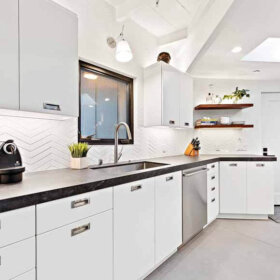
 We took a detailed look at Alan’s Vitralite kitchen “Before” yesterday. Now it’s time for our “After.” Our goal with this Retro Design Dilemma was to unify two key, original elements — the vintage Vitralite green wall tiles and the wood cabinets — while also making the room feel warmer and less sterile. Remember: Alan told us yesterday that with all the green glass tile, the kitchen sometimes felt like a combination of Betty Crocker and morgue. Ouch! Fortunately, we think that our design concept shows that, with with the careful addition of warm color and soft surfaces, it is totally possible to bring out the Betty and bye bye the laboratory — transforming this space into a home sweet retro home sweetheart of a space.

Job One: Bring warm color and softer surfaces into this deco-meets-the-1950s kitchen
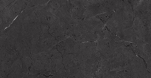
First of all: If you touch one inch of those green Vitralite tiles — we do not want to hear about it! They are a treasure. Ditto-ish: Your original wood cabinets are beautiful. Keep ’em — we love the warm wood with the tile. If the varnish needs work, okay, restore them, but very very carefully. ‘Might be nothing to really compare with the original finish if it’s still in good shape.
In yesterday’s comments, reader ineffablespace said this:
In a general sense, the green Vitrolite is not something that can be “compensated for” or apologized for, in the re-design. It is *the* salient design feature of the kitchen, and as a relative rarity, I would want to highlight it, not downplay it. I don’t think you need to create a 1953 museum, but on the other hand there are very few common/popular 21st century finishes that will do this kitchen any favors.
We very much agree with this assessment, so our mood board doesn’t touch the tile. We’re going with the deco-retro flow.
-
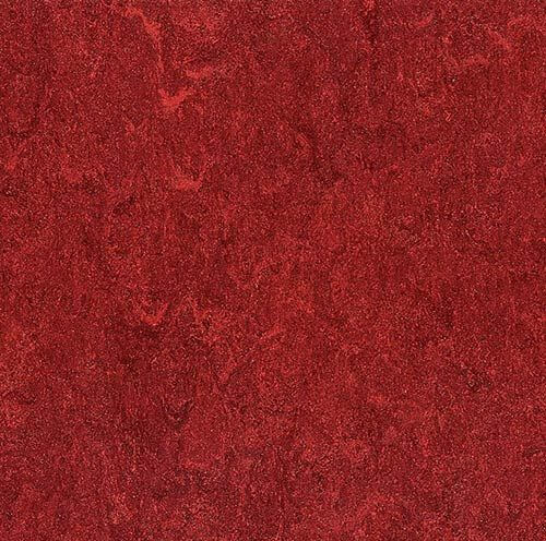
 Flooring: Sheet linoleum: The first order of the day: Bring in colors and softer surfaces and accessories that will help ensure the kitchen doesn’t feel like a laboratory. To start, we tried this cherry red Armstrong Marmorette sheet linoleum floor (update: not sure this is still available, check other manufacturers like Forbo Marmoleum) and loved how it looked. It instantly adds warmth to the space — and the red complements the green walls and looks like it will work well with the color of the cabinets too. And hey, it picks up the red in the clock hand! We chose linoleum rather than ceramic tile or wood, because it’s “resilient” — bouncy — countering the hardness of the wall tile. (Wood is a warm soft surface, too, but we wanted color and and even more softness, as possible.) We decided to use linoleum sheet rather than tiles in order to avoid repeating the grid design already in the wall tile.
- Countertops: Black soapstone-like laminate. When Pam and I discussed this kitchen on the phone, we agreed that the existing white countertops not only contributed to the overall feeling of sterility but also created an overall harsh contrast. Alan mentioned that he was thinking about a solid surface countertop like soapstone, but we caution about adding more laboratory-like hard surfaces. So we went to see what we could find in laminates. I fiddled with some other options in Photoshop — including a solid to match the wall tile and to create one clean line — but when I put in this Wilsonart Black Alicante, golly it just looked great. This makes sense because the kitchen has a fundamental deco feel to it — as you recall from the “before” story, there is black trim tile in the laundry room. That said, if Alan wants to try this laminate, he for sure should get a sample, we are not sure it is really dark enough. We do like the veining, which breaks up the mass; reminds us of Cusheen. Another option: Use black sheet lineoleum in a similar veined colorway. The addition of stainless steel metal edging, similar to what Pam used in her kitchen, helps mesh the countertops with the existing chrome cabinet pulls and add a bit of bling to the space. You also could go for ribbed aluminum edging in this kitchen — it would probably look really great given that this kitchen is streamlinefeel.
. In comments yesterday, reader Diane in CO was thinking alike and recommended Wilsonart Oiled Soapstone. She said: The smashing laminate is Wilsonart “Oiled Soapstone.” It reads “black” in the room but is much softer and has “shadowing” – hard to describe. I liked the look so much I used it for the vanity top in a small black-and-white bathroom redo. It’s so good-looking!
. - Exhaust fan: We suggest that Alan keep his vintage stove, but get a new vent hood in white to match. For our mood board purposes, I’ve just recolored his harvest gold range hood in white to match — yes, you could also likely just spray paint your exhaust fan white, if it’s still serviceable.
. - Stove: Alan had mentioned thinking about swapping out his white stove for stainless steel. We would say: No. Again, stay away from anything that says “laboratory” — and that includes stainless steel. Either keep what you have — that stove looks fine — or how about getting a vintage stove — talk about Betty Crocker — you will surely have the neighbors drooling over that! For vintage kitchens from this era, we usually suggest a Kohler Delafield sink with hudee ring instead of that stainless steel sink. Ditto the new fridge, we probably would have went with white.
.  Window treatments:
- Wood blinds: To continue to soften the space, we think that Alan could get some 2″ wood blinds like this style from Blinds.com in a shade that matches the original cabinetry and window trim. These will get more warm wood up onto the wall area and cover the glaring white vinyl replacement window frames. Covering the white window frames also reduces the number of grids that can be seen — at least when the shades are closed — further calming and softening the room’s hard edges. If and when you ever decide or need to replace those windows, well, you can guess what we have to say about the white vinyl. And remember, we now have good advice on whether and when to turn the blinds up or down 🙂
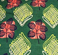
. - Patterned fabric valance: Adding the fabric valance over the wood blinds creates another layer of decor that helps to soften hard edges in this kitchen. Pam and I each searched for about an hour (we are power users of Google chat for sharing ideas in rapid fire succession) for a “just right” fabric with the right colors, right pattern and a retro-deco feel compatible with Alan’s kitchen wall tile and cabinetry until we found some coordinating vintage barkcloth fabric on Ebay (alas, sold a while ago) that could have been used to make fabric valances for the windows. The fabric picks up the red from the floor, black from the countertops, white from the range and adds another level of green to coordinate with the wall as well as inserting a pop of yellow. We were careful to find a pattern that was not grid-like to continue our efforts downplaying the strong gridlines found on the wall tiles.
.
Reader Melinda agreed: With the abundance of tile I do feel like choosing a color opposite, such as red or pink will balance things out. Plenty of fabrics such as curtains, decorative towels and throw rugs will do a lot to soften this space.
.
- Wood blinds: To continue to soften the space, we think that Alan could get some 2″ wood blinds like this style from Blinds.com in a shade that matches the original cabinetry and window trim. These will get more warm wood up onto the wall area and cover the glaring white vinyl replacement window frames. Covering the white window frames also reduces the number of grids that can be seen — at least when the shades are closed — further calming and softening the room’s hard edges. If and when you ever decide or need to replace those windows, well, you can guess what we have to say about the white vinyl. And remember, we now have good advice on whether and when to turn the blinds up or down 🙂
- Paint color for the ceiling: Next we turned our attention to the ceiling, which Pam thought she might paint a light beige to bring down the contrast.
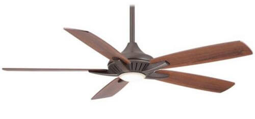
- Ceiling fan: We presume you have a ceiling fan with a light for a reason, so we went and looked for one that could provide the functionality you need but that lookedTo continue adding warmth in the space, we found the Minka Aire F1000 ceiling fan — you can get it on Amazon (affiliate link) in three colors. We like the streamline look, and we liked it in bronze to coordinate with the wood tone of the cabinets. Note: There are a lot of reviews also on Amazon, which can be helpful to a degree. One commenter says you can also get this fan, $70 cheaper, at Home Depot, it’s the Petersford. But there’s only one brite metal finish, and the design is a bit different; nah.
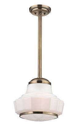
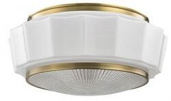
- Ceiling and pendant lighting: Alan had mentioned wanting can lights, but Pam has become wary of this idea ever since reading Martin Holladay’s 10 Rules of Lighting. Holladay wrote, “The U.S. is cursed by a plague of senseless recessed can fixtures…. Recessed cans do a great job of illuminating the floor, but they keep your ceiling dark.” So, instead of cans, we went looking for a ceiling light fixture — ambient lighting — that would get the light out and about more successfully. Then we found a matched pair of Hudson Valley Lighting light fixtures from lightology — the Odessa flush mount style and coordinating Odessa pendant light — both in a warm, gold-tone which continues to add visual warmth (bringing the gold of the cabinets up to the ceiling) — and light — to the kitchen. We quite like these Odessa lights for a prewar or sweetheart 1950s kitchen or a kitchen with deco lines.Reader Robbie Kendall added this helpful tidbit about being mindful with the lighting: First things first, I would start with the ceiling kitchen and work my way down: rather than the two hanging fixtures and fan that are there now, I would replace these three items with three identical up-light fixtures that bounce the light off of the flat (or eggshell) white ceiling using spectrum corrected bulbs. And if these fixtures were copper, so much the better. Also, I know that Pearl Paint, in New York, used to carry a white paint imported from the Netherlands that had a very slight blue tint to it so that as it aged, the yellowing counteracted the blue and the white became purer over time. My point here is that with these, beautifully, overpowering walls, it is best to let the look be highlighted by pure spectrum lighting and not degraded by standard yellowed tungsten or too ‘clinical’ compact fluorescent bulbs.
. - Vintage dinette: ‘Most nothing makes a kitchen homier than a vintage dinette. There looks like there’s room so how about obsessing to find something like this deep green table and chairs from our uploader. Alternately, reader Heidi Swank chimed in with this tip: Kitchen Table: The one end of the kitchen with the cool radiator/vent cover calls out for a high kitchen table with two stools. A high table wouldn’t obstruct the heat flow but would give that end of the room something to do.
. - Accessories: Finally, adding homey accessories that repeat the main colors in the space — red, green and even the yellow pulled from the valances — will help finish off the look and create a cohesive space. We found delightful vintage fruit canisters on Ebay, classic FiestaWare in Scarlet Red and Sunflower Yellow and of course, everyone’s favorite — the red KitchenAid mixer.
.
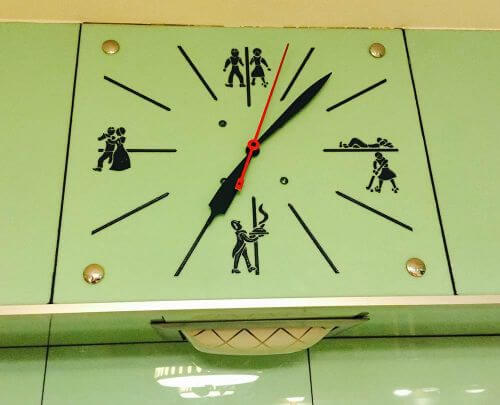
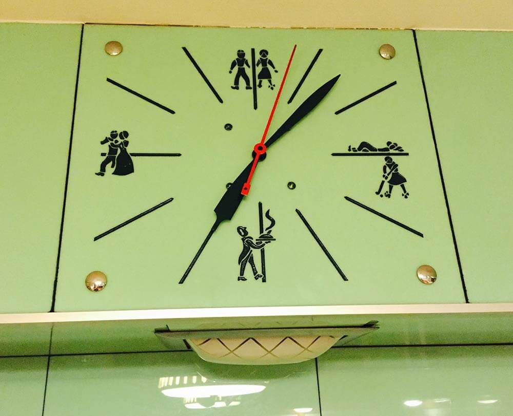
And reader Dan had these two good points regarding the decor in Alan’s kitchen: It looks like that sash window opens onto another room. Let’s fill it in with display shelving….I’d love to see the figures on the clock used somehow. Perhaps similar figures could be silk screened on fabric for window treatments!


Barbara says
I like the red floor and think it looks warm and cozy. I have a ceiling fan in my kitchen and hate it. However the only window in the room doesn’t open, so I need it for the air flow.
Brooke says
I might even suggest just painting the upper cabinets a white (or go a very pale version of the tile or a light grey almost white) and leaving the lowers wood. The white (light green etc) uppers would help to make the space feel brighter and lighter. The painted range hood would then blend in and the white would look so nice with the green tile. I know someone will probably shoot me for suggesting paint but it wasn’t out of place to have have multi coloured cabinets in the 50’s/60’s
I too am struggling with the red floor, I find it a weird combination with that particular colour of green.
Azroc makes a 16’x16′ Solid Vinyl Tile which sort of looks like Terrazzo and it comes in a ton of colours. Something with a touch of grey-green, a white, or a darker version of the tiles would be nice.
http://azrock.com/Products/tabid/242/Default.aspx?cid=72
Brooke says
I should say I’m not a big “fan” of keeping the ceiling fan either. I think go with matching pendants or with matching flush or semi-flush ceiling lights
pam kueber says
Okay. But, re: all the fan comments, we assumed they actually used it for function. If they have central air, yes, take it out.
Tom says
even if they don’t have central air take it out and put in a beautiful vintage NUTONE Kitchen Exhaust fan with chrome cover.
Diane in CO says
A Vornado fan on the counter when needed?
https://retrorenovation.com/2014/10/07/vornado-vintage-reproduction-fan/
pam kueber says
yes! I think they have them on stands, too. Or: Get vintage!
Brooke says
True, if they need it then it should definitely stay 🙂
Tom says
If they MUST keep the ceiling fan this one isn’t too offensive has option of light or no light.
I wouldn’t install a ceiling fan in this kitchen but if it had to I think this might work.
http://www.amazon.com/Minka-Aire-F518-BN-44-inch-Concept-Ceiling/dp/B0000DI4NQ
Brooke says
🙂 If I have unsolicited photoshoped images of this kitchen with a different floor can I send them? I wont be offended if you don’t want to see them!
pam kueber says
sure
Tom says
That ceiling fan must go! If the ceiling fan stays it’s not worth dumping much money into this project it will have the feeling of part retro, part Home Depot either go retro or Home Depot the mix of both is painful.
Diane in CO says
Agree!! Could always add a deco-inspired Vornado fan on the counter.
Carol says
Brilliant idea. My grandmother had the original one and kept it UNDER the kitchen table. It moved a lot of air in the room, and you didn’t get a direct “hit”. I miss Grandma’s kitchen. She had jadeite green tile on the walls.
Ed says
JMHO, the floor and countertop ideas look rather dark. Maybe a white/speckled linoleum floor and white countertop with metal edging? A ceiling fan might be nice while cooking a large meal, perhaps for a holiday gathering, I’m not sure how practical it’d be most of the time. Would Sputnik lights be too wacky in this application?
LuAnn says
I know that current design show stars detest ceiling fans, but if you live in a hot climate like I do, they are so awesome. Yes, I have air conditioning, but I do not have an open concept kitchen. It gets hot when I’m in there cooking and/or washing dishes. It’s not that close to the stove, so no flying grease problem. I’m a ceiling fan fan. Ha ha 🙂
Tom says
“I think the red floor brings Betty Crocker screaming back into the kitchen.” I didn’t mean that in a good way, I think the red floor is very out of place here. This tile is rare and beautiful why downplay that beauty and rarity? I say add class and style not softness. This is a bold kitchen and should be brought back as a bold design not a softened version of a great design.
Diane in CO says
Tom, I couldn’t agree more!! I stick with my concept of Green/Black/White. Pam you even say, above, that the kitchen has a STREAMLINE feel. Streamline and “Betty Crocker” seem antithetical.
If you google Vitrolite Kitchens, the high-contrast, art deco, stylish images seem to be more in line with what I envisioned. No patterned window coverings or farmhouse canisters. No Betty Crocker. Streamline, as you said. Just MHO…
pam kueber says
Plenty of red used with this color, historically. But, yes, analogous or monochromatic-with-black, too.
We were trying to warm up and soften the space. To make it less like a laboratory. Hence, the addition of the red. Jadeite+butter yellow+rich red = a total classic color combo for prewar and early postwar, both.
Tom says
I think the red floor brings Betty Crocker screaming back into the kitchen. I think the colors green, white, black with small details of chrome to go with the drawer pulls would be very classy and timeless. The ceiling fan is really odd idea who has a ceiling fan in their kitchen? I noted yesterday to paint the hood white too and gave links to some amazing green stone counters which the owner said they wanted “green stone”
Wood blinds would probably be impossible to match up to the original finish of the cabinets so they would look probably look very odd.
I don’t think the homeowners want black counters if they’re joking about it looking like a morgue.
There are some great ideas and it will be interesting to see which ideas are chosen for their project.
Mary says
Something about the ceiling just feels busy to me – before and after. I love the pendent light over the table, but I’d ditch the fan and the other light. The nod to modernity that I’d do is some kind of small canned lights that are on a dimmer (for ambiance!). You get really great light at your work stations and it would highlight the pendent, rather than competing with it.
Carolyn says
I like how you incorporated the KitchenAid mixer – useful yet decorative. I looked up “renovate” and the first word comes up is “modernize”. So what we’re all trying to do here is to bring present day conveniences into our modern old houses.
I’d lose the fan because, seriously, does anyone know anyone who actually uses it? My theory is that one of the kids was goofing around and broke one of the 3 original lights at the time the ‘next big thing’ was the ceiling light/fan combo.
So…did you gals have the vision before you opened it up to your followers or is this one of those situations where great minds think alike? I really hope Alan reports back this time next year to show and tell.
pam kueber says
Thanks, Carolyn. We prepared the several weeks ago… so, yes, a lot of similar ideas came up!
Jen says
Terrific job, you guys! Amazing how the wood blinds with the valance really warmed the place up. Love the red linoleum floor! Can I have this kitchen?
Carol says
That tile is to die for, and it’s in the laundry room. Pam did a fabulous job and it certainly looks Betty Crocker cozy now. Please keep the cabinet hardware and the stove. To find a new stove to fit that space will be soooo pricey. The hood is awesome, just paint it or have a bodyshop paint it. The black counters with the metal banding looks great with the warm wood cabinets. The light fixtures Pam picked make the room look period appropriate and homey. The window treatments make a world of difference. I’m such a huge fan of the 40’s jadite green and butter yellow combo that I’m having a hard time with the red floor. I do think marmoleum is the way to go. That kitchen is ready for Thanksgiving and all that is needed is a retro apron. ( The perfect floor would be the linoleum Pam featured in an article. It was from the late 30’s to 40’s period and was pale grey with clusters of abstract circles with lines in several colors. Oh my!)