

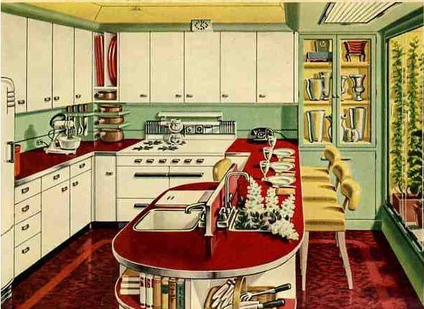
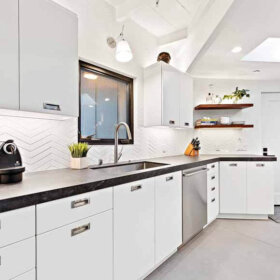
 We took a detailed look at Alan’s Vitralite kitchen “Before” yesterday. Now it’s time for our “After.” Our goal with this Retro Design Dilemma was to unify two key, original elements — the vintage Vitralite green wall tiles and the wood cabinets — while also making the room feel warmer and less sterile. Remember: Alan told us yesterday that with all the green glass tile, the kitchen sometimes felt like a combination of Betty Crocker and morgue. Ouch! Fortunately, we think that our design concept shows that, with with the careful addition of warm color and soft surfaces, it is totally possible to bring out the Betty and bye bye the laboratory — transforming this space into a home sweet retro home sweetheart of a space.

Job One: Bring warm color and softer surfaces into this deco-meets-the-1950s kitchen
First of all: If you touch one inch of those green Vitralite tiles — we do not want to hear about it! They are a treasure. Ditto-ish: Your original wood cabinets are beautiful. Keep ’em — we love the warm wood with the tile. If the varnish needs work, okay, restore them, but very very carefully. ‘Might be nothing to really compare with the original finish if it’s still in good shape.
In yesterday’s comments, reader ineffablespace said this:
In a general sense, the green Vitrolite is not something that can be “compensated for” or apologized for, in the re-design. It is *the* salient design feature of the kitchen, and as a relative rarity, I would want to highlight it, not downplay it. I don’t think you need to create a 1953 museum, but on the other hand there are very few common/popular 21st century finishes that will do this kitchen any favors.
We very much agree with this assessment, so our mood board doesn’t touch the tile. We’re going with the deco-retro flow.
-
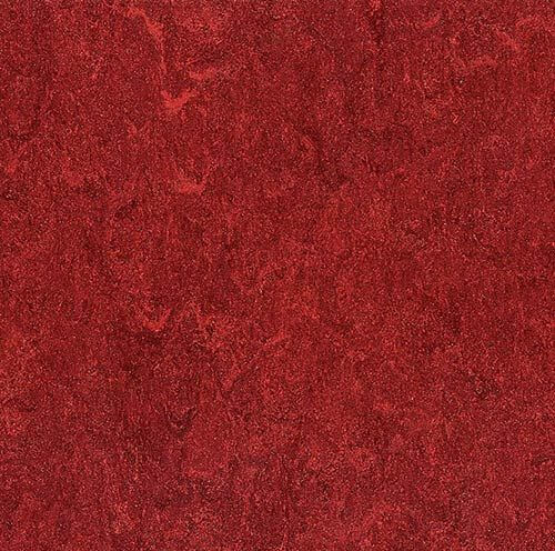
 Flooring: Sheet linoleum: The first order of the day: Bring in colors and softer surfaces and accessories that will help ensure the kitchen doesn’t feel like a laboratory. To start, we tried this cherry red Armstrong Marmorette sheet linoleum floor (update: not sure this is still available, check other manufacturers like Forbo Marmoleum) and loved how it looked. It instantly adds warmth to the space — and the red complements the green walls and looks like it will work well with the color of the cabinets too. And hey, it picks up the red in the clock hand! We chose linoleum rather than ceramic tile or wood, because it’s “resilient” — bouncy — countering the hardness of the wall tile. (Wood is a warm soft surface, too, but we wanted color and and even more softness, as possible.) We decided to use linoleum sheet rather than tiles in order to avoid repeating the grid design already in the wall tile.
- Countertops: Black soapstone-like laminate. When Pam and I discussed this kitchen on the phone, we agreed that the existing white countertops not only contributed to the overall feeling of sterility but also created an overall harsh contrast. Alan mentioned that he was thinking about a solid surface countertop like soapstone, but we caution about adding more laboratory-like hard surfaces. So we went to see what we could find in laminates. I fiddled with some other options in Photoshop — including a solid to match the wall tile and to create one clean line — but when I put in this Wilsonart Black Alicante, golly it just looked great. This makes sense because the kitchen has a fundamental deco feel to it — as you recall from the “before” story, there is black trim tile in the laundry room. That said, if Alan wants to try this laminate, he for sure should get a sample, we are not sure it is really dark enough. We do like the veining, which breaks up the mass; reminds us of Cusheen. Another option: Use black sheet lineoleum in a similar veined colorway. The addition of stainless steel metal edging, similar to what Pam used in her kitchen, helps mesh the countertops with the existing chrome cabinet pulls and add a bit of bling to the space. You also could go for ribbed aluminum edging in this kitchen — it would probably look really great given that this kitchen is streamlinefeel.
. In comments yesterday, reader Diane in CO was thinking alike and recommended Wilsonart Oiled Soapstone. She said: The smashing laminate is Wilsonart “Oiled Soapstone.” It reads “black” in the room but is much softer and has “shadowing” – hard to describe. I liked the look so much I used it for the vanity top in a small black-and-white bathroom redo. It’s so good-looking!
. - Exhaust fan: We suggest that Alan keep his vintage stove, but get a new vent hood in white to match. For our mood board purposes, I’ve just recolored his harvest gold range hood in white to match — yes, you could also likely just spray paint your exhaust fan white, if it’s still serviceable.
. - Stove: Alan had mentioned thinking about swapping out his white stove for stainless steel. We would say: No. Again, stay away from anything that says “laboratory” — and that includes stainless steel. Either keep what you have — that stove looks fine — or how about getting a vintage stove — talk about Betty Crocker — you will surely have the neighbors drooling over that! For vintage kitchens from this era, we usually suggest a Kohler Delafield sink with hudee ring instead of that stainless steel sink. Ditto the new fridge, we probably would have went with white.
.  Window treatments:
- Wood blinds: To continue to soften the space, we think that Alan could get some 2″ wood blinds like this style from Blinds.com in a shade that matches the original cabinetry and window trim. These will get more warm wood up onto the wall area and cover the glaring white vinyl replacement window frames. Covering the white window frames also reduces the number of grids that can be seen — at least when the shades are closed — further calming and softening the room’s hard edges. If and when you ever decide or need to replace those windows, well, you can guess what we have to say about the white vinyl. And remember, we now have good advice on whether and when to turn the blinds up or down 🙂
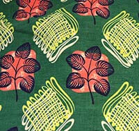
. - Patterned fabric valance: Adding the fabric valance over the wood blinds creates another layer of decor that helps to soften hard edges in this kitchen. Pam and I each searched for about an hour (we are power users of Google chat for sharing ideas in rapid fire succession) for a “just right” fabric with the right colors, right pattern and a retro-deco feel compatible with Alan’s kitchen wall tile and cabinetry until we found some coordinating vintage barkcloth fabric on Ebay (alas, sold a while ago) that could have been used to make fabric valances for the windows. The fabric picks up the red from the floor, black from the countertops, white from the range and adds another level of green to coordinate with the wall as well as inserting a pop of yellow. We were careful to find a pattern that was not grid-like to continue our efforts downplaying the strong gridlines found on the wall tiles.
.
Reader Melinda agreed: With the abundance of tile I do feel like choosing a color opposite, such as red or pink will balance things out. Plenty of fabrics such as curtains, decorative towels and throw rugs will do a lot to soften this space.
.
- Wood blinds: To continue to soften the space, we think that Alan could get some 2″ wood blinds like this style from Blinds.com in a shade that matches the original cabinetry and window trim. These will get more warm wood up onto the wall area and cover the glaring white vinyl replacement window frames. Covering the white window frames also reduces the number of grids that can be seen — at least when the shades are closed — further calming and softening the room’s hard edges. If and when you ever decide or need to replace those windows, well, you can guess what we have to say about the white vinyl. And remember, we now have good advice on whether and when to turn the blinds up or down 🙂
- Paint color for the ceiling: Next we turned our attention to the ceiling, which Pam thought she might paint a light beige to bring down the contrast.
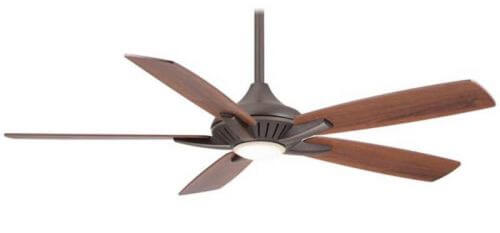
- Ceiling fan: We presume you have a ceiling fan with a light for a reason, so we went and looked for one that could provide the functionality you need but that lookedTo continue adding warmth in the space, we found the Minka Aire F1000 ceiling fan — you can get it on Amazon (affiliate link) in three colors. We like the streamline look, and we liked it in bronze to coordinate with the wood tone of the cabinets. Note: There are a lot of reviews also on Amazon, which can be helpful to a degree. One commenter says you can also get this fan, $70 cheaper, at Home Depot, it’s the Petersford. But there’s only one brite metal finish, and the design is a bit different; nah.
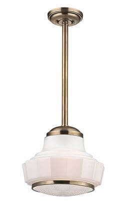
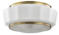
- Ceiling and pendant lighting: Alan had mentioned wanting can lights, but Pam has become wary of this idea ever since reading Martin Holladay’s 10 Rules of Lighting. Holladay wrote, “The U.S. is cursed by a plague of senseless recessed can fixtures…. Recessed cans do a great job of illuminating the floor, but they keep your ceiling dark.” So, instead of cans, we went looking for a ceiling light fixture — ambient lighting — that would get the light out and about more successfully. Then we found a matched pair of Hudson Valley Lighting light fixtures from lightology — the Odessa flush mount style and coordinating Odessa pendant light — both in a warm, gold-tone which continues to add visual warmth (bringing the gold of the cabinets up to the ceiling) — and light — to the kitchen. We quite like these Odessa lights for a prewar or sweetheart 1950s kitchen or a kitchen with deco lines.Reader Robbie Kendall added this helpful tidbit about being mindful with the lighting: First things first, I would start with the ceiling kitchen and work my way down: rather than the two hanging fixtures and fan that are there now, I would replace these three items with three identical up-light fixtures that bounce the light off of the flat (or eggshell) white ceiling using spectrum corrected bulbs. And if these fixtures were copper, so much the better. Also, I know that Pearl Paint, in New York, used to carry a white paint imported from the Netherlands that had a very slight blue tint to it so that as it aged, the yellowing counteracted the blue and the white became purer over time. My point here is that with these, beautifully, overpowering walls, it is best to let the look be highlighted by pure spectrum lighting and not degraded by standard yellowed tungsten or too ‘clinical’ compact fluorescent bulbs.
. - Vintage dinette: ‘Most nothing makes a kitchen homier than a vintage dinette. There looks like there’s room so how about obsessing to find something like this deep green table and chairs from our uploader. Alternately, reader Heidi Swank chimed in with this tip: Kitchen Table: The one end of the kitchen with the cool radiator/vent cover calls out for a high kitchen table with two stools. A high table wouldn’t obstruct the heat flow but would give that end of the room something to do.
. - Accessories: Finally, adding homey accessories that repeat the main colors in the space — red, green and even the yellow pulled from the valances — will help finish off the look and create a cohesive space. We found delightful vintage fruit canisters on Ebay, classic FiestaWare in Scarlet Red and Sunflower Yellow and of course, everyone’s favorite — the red KitchenAid mixer.
.
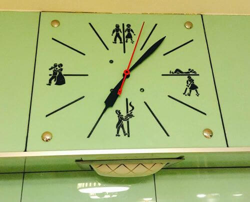
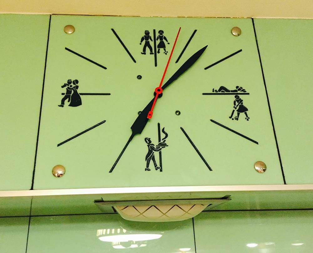
And reader Dan had these two good points regarding the decor in Alan’s kitchen: It looks like that sash window opens onto another room. Let’s fill it in with display shelving….I’d love to see the figures on the clock used somehow. Perhaps similar figures could be silk screened on fabric for window treatments!


lynda murray says
Hi, I really like the red floor. It made me think of Lauryn and Dennis’ Humble kitchen. I think Allen should look at their kitchen for some inspiration. I really think your Ideas are great for this kitchen.
sherree says
Great job Pam and Kate. I absolutely love the mock up! I could move right in and start baking. It says “early 50’s” which is appropriate to the era of the home. What I don’t understand is why so many are against ceiling fans for the kitchen? It is clearly the warmest room (temp wise) in a home (if you cook/ bake/ entertain). Here in the Midwest, where it can be a humid 90 degrees most of the summer, a little air circulation in the kitchen is a welcome addition to the central air. I have had one in all of my kitchens. For my recent kitchen reno I found one that is sleek and modern and the blades look like airplane propellers. In black and silver it goes well in my “space age meets modest” ranch kitchen and looks good with my sputnik ceiling lights.
Retroski says
Woot! Celing fans are swell! We have one too, but it’s over the kitchen table area. I think the problem here is that pedants are celing fan are in a tussle with each other, but that can be solved by placement.
Elizabeth says
Love it. I can move in by 5pm today!
As another poster mentioned, I even loved the before photo. But the after photo is so homey and warm. I would have never thought of these combos.
Mike S says
Okay, at the risk of being banned from this site, I say you have two options: Totally gut your kitchen and do what you darn well please, or; keep the tile and go totally Jetsons with the thing. I mean, go Sputnik light fixtures, chrome-edged counter tops with modern solid surface stuff, a white porcelain sink, retro-modern appliances, and a kickin’ cool retro-modern dine-in set. If you keep the green tile, then you gotta go space-chic, and all the way–otherwise, gut the thing and go with what pleases you and the rest of the house. Hey, they’re YOUR digs, so do what flows, yeah? Peace out, everyone:)
lynda says
I think this answer makes a lot of sense! The recycled glass would work with the retro-modern look too.
oh Holland says
The red floor, beige ceiling, orange-y cabs and ceiling fan just muddy up the room’s POV, and fight with the mint green walls. Edit the vision to let the walls be the star, with a supporting cast of a classic black and white checkerboard floor, white ceiling, white enameled cabinets with black hardware, black soapstone-look laminate countertops and white appliances. That clean palette allows accents in virtually any color, like a cherry red dinette or pink fridge. Clean, warm, 40s feel.
Lovetiles says
The kitchen does not have to go full retro to be homey. What this kitchen needs is visual texture as it has too many even, flat surfaces. The floors look like hardwood, wood be a shame to replace them. I would replace the counter tops with the solid surface 60’s terazzo look that has the recycled bits of glass, white background, with caramel bits and a small amount of green glass chips, making sure it works with both warm & cool whites as I am sure the owner is stuck with the vinyl white windows. That is the least attractive, although I am sure very energy efficient, feature of this kitchen. Can the overlay for the “divided lights” be removed? The wood blinds are a brilliant choice, I would pick one with multiple wood tones, the color of the cabinets plus darker. For the dining set I would go for some mid-century teak or rattan, darker than the cabinets. I like the lights already in place. This is a great space and a delightful challenge. Good luck!
Mag says
I don’t know if linking like this works, so I’m putting it as my website as well. When Tom kept talking about the green-black look, something kinda-sorta like this was coming to mind. I don’t have access to the original photo, so I can not give credit where credit is due. My apologies.
http://img.allw.mn/content/f6/j6/bu9rxpui.jpg
Karin says
Well done! You folks never cease to amaze me. I’m thrilled with the black soapstone laminate counters with steel edges. I would never have thought of deep warm red floors, but now that I see them they look right. The fan is stunning-its bronze color blends perfectly. The accessories are homey and cute. It sure doesn’t look like a lab anymore! It’s a valid concern for the owner. Sometimes Art Deco interiors in the past looked somewhat cold and clinical.
This is a well considered solution. Thank you, great post.
Diana says
I’m not so sure the homeowner wants to play up the Betty Crocker or even the retro look esp considering the design ideas he mentioned. I think he’s truly stumped as to just what to do. I do wish we knew more of what the rest of house looked like esp the bathrooms if they are still intact. I agree that it should tie together if possible.
Carol says
Knowing what the rest of the house looks like is a key factor and more importantly, does the homeowner like those elements. Is the house a midcentury modest? Does the house have deco elements like corner windows which were still popular into the sixties. Alan can go two ways with this. He can dial the kitchen back to the forties with white cabinets and white appliances, marmoleum floors and counters with metal banding. He can follow Pam and Kate’s lead and go with midcentury design. The cabinets do compete with the tile as opposing design elements in my opinion, however, Pam managed to pull these two together with her design. Those cabinets are beautiful and appear to be in great shape. IF I were Alan, I would keep Pam’s plan minus the red floor (sorry) and fan. I would paint the cabinets white (sorry again) and play up the 40’s look. It’s already there with the window treatments, the light fixtures, counters, and accessories. The stove and exhaust fan look great as far as style. They may be newer, but we have all had to replace appliances. The emerald looks smashing with the tile color. Maybe emerald marmoleum with black lines in it. Very deco. I would love this kitchen in both decades.
Carolyn says
Well, everyone, can we now see why poor Alan had such a hard time with the kitchen? Even those who agreed yesterday are now not so much of the same mind.
So just how many eras are in the house currently? When were the tiled walls installed, like the 1940’s? Then 1950’s cabinets, ‘updated’ 1970’s counters, dishwasher and exhaust fan, ’80’s/’90’s fan/light combo and ending with 2010’s SS fridge. No wonder the house couldn’t tell him what it wanted and needed.
pam kueber says
I am assuming the tile and the cabinets both went in in 1953, when the house was built. Even though I/we think of Vitrolite as a prewar/deco material, obviously, it was still considered and used after the war…
This mismatch-ish of eras is another reason Kate and I came up with the design we did — we wanted to bring the prewar tiles more firmly into the postwar house.