

 We took a detailed look at Alan’s Vitralite kitchen “Before” yesterday. Now it’s time for our “After.” Our goal with this Retro Design Dilemma was to unify two key, original elements — the vintage Vitralite green wall tiles and the wood cabinets — while also making the room feel warmer and less sterile. Remember: Alan told us yesterday that with all the green glass tile, the kitchen sometimes felt like a combination of Betty Crocker and morgue. Ouch! Fortunately, we think that our design concept shows that, with with the careful addition of warm color and soft surfaces, it is totally possible to bring out the Betty and bye bye the laboratory — transforming this space into a home sweet retro home sweetheart of a space.

Job One: Bring warm color and softer surfaces into this deco-meets-the-1950s kitchen
First of all: If you touch one inch of those green Vitralite tiles — we do not want to hear about it! They are a treasure. Ditto-ish: Your original wood cabinets are beautiful. Keep ’em — we love the warm wood with the tile. If the varnish needs work, okay, restore them, but very very carefully. ‘Might be nothing to really compare with the original finish if it’s still in good shape.
In yesterday’s comments, reader ineffablespace said this:
In a general sense, the green Vitrolite is not something that can be “compensated for” or apologized for, in the re-design. It is *the* salient design feature of the kitchen, and as a relative rarity, I would want to highlight it, not downplay it. I don’t think you need to create a 1953 museum, but on the other hand there are very few common/popular 21st century finishes that will do this kitchen any favors.
We very much agree with this assessment, so our mood board doesn’t touch the tile. We’re going with the deco-retro flow.
-
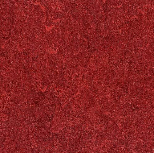
 Flooring: Sheet linoleum: The first order of the day: Bring in colors and softer surfaces and accessories that will help ensure the kitchen doesn’t feel like a laboratory. To start, we tried this cherry red Armstrong Marmorette sheet linoleum floor (update: not sure this is still available, check other manufacturers like Forbo Marmoleum) and loved how it looked. It instantly adds warmth to the space — and the red complements the green walls and looks like it will work well with the color of the cabinets too. And hey, it picks up the red in the clock hand! We chose linoleum rather than ceramic tile or wood, because it’s “resilient” — bouncy — countering the hardness of the wall tile. (Wood is a warm soft surface, too, but we wanted color and and even more softness, as possible.) We decided to use linoleum sheet rather than tiles in order to avoid repeating the grid design already in the wall tile.
- Countertops: Black soapstone-like laminate. When Pam and I discussed this kitchen on the phone, we agreed that the existing white countertops not only contributed to the overall feeling of sterility but also created an overall harsh contrast. Alan mentioned that he was thinking about a solid surface countertop like soapstone, but we caution about adding more laboratory-like hard surfaces. So we went to see what we could find in laminates. I fiddled with some other options in Photoshop — including a solid to match the wall tile and to create one clean line — but when I put in this Wilsonart Black Alicante, golly it just looked great. This makes sense because the kitchen has a fundamental deco feel to it — as you recall from the “before” story, there is black trim tile in the laundry room. That said, if Alan wants to try this laminate, he for sure should get a sample, we are not sure it is really dark enough. We do like the veining, which breaks up the mass; reminds us of Cusheen. Another option: Use black sheet lineoleum in a similar veined colorway. The addition of stainless steel metal edging, similar to what Pam used in her kitchen, helps mesh the countertops with the existing chrome cabinet pulls and add a bit of bling to the space. You also could go for ribbed aluminum edging in this kitchen — it would probably look really great given that this kitchen is streamlinefeel.
. In comments yesterday, reader Diane in CO was thinking alike and recommended Wilsonart Oiled Soapstone. She said: The smashing laminate is Wilsonart “Oiled Soapstone.” It reads “black” in the room but is much softer and has “shadowing” – hard to describe. I liked the look so much I used it for the vanity top in a small black-and-white bathroom redo. It’s so good-looking!
. - Exhaust fan: We suggest that Alan keep his vintage stove, but get a new vent hood in white to match. For our mood board purposes, I’ve just recolored his harvest gold range hood in white to match — yes, you could also likely just spray paint your exhaust fan white, if it’s still serviceable.
. - Stove: Alan had mentioned thinking about swapping out his white stove for stainless steel. We would say: No. Again, stay away from anything that says “laboratory” — and that includes stainless steel. Either keep what you have — that stove looks fine — or how about getting a vintage stove — talk about Betty Crocker — you will surely have the neighbors drooling over that! For vintage kitchens from this era, we usually suggest a Kohler Delafield sink with hudee ring instead of that stainless steel sink. Ditto the new fridge, we probably would have went with white.
.  Window treatments:
- Wood blinds: To continue to soften the space, we think that Alan could get some 2″ wood blinds like this style from Blinds.com in a shade that matches the original cabinetry and window trim. These will get more warm wood up onto the wall area and cover the glaring white vinyl replacement window frames. Covering the white window frames also reduces the number of grids that can be seen — at least when the shades are closed — further calming and softening the room’s hard edges. If and when you ever decide or need to replace those windows, well, you can guess what we have to say about the white vinyl. And remember, we now have good advice on whether and when to turn the blinds up or down 🙂
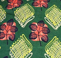
. - Patterned fabric valance: Adding the fabric valance over the wood blinds creates another layer of decor that helps to soften hard edges in this kitchen. Pam and I each searched for about an hour (we are power users of Google chat for sharing ideas in rapid fire succession) for a “just right” fabric with the right colors, right pattern and a retro-deco feel compatible with Alan’s kitchen wall tile and cabinetry until we found some coordinating vintage barkcloth fabric on Ebay (alas, sold a while ago) that could have been used to make fabric valances for the windows. The fabric picks up the red from the floor, black from the countertops, white from the range and adds another level of green to coordinate with the wall as well as inserting a pop of yellow. We were careful to find a pattern that was not grid-like to continue our efforts downplaying the strong gridlines found on the wall tiles.
.
Reader Melinda agreed: With the abundance of tile I do feel like choosing a color opposite, such as red or pink will balance things out. Plenty of fabrics such as curtains, decorative towels and throw rugs will do a lot to soften this space.
.
- Wood blinds: To continue to soften the space, we think that Alan could get some 2″ wood blinds like this style from Blinds.com in a shade that matches the original cabinetry and window trim. These will get more warm wood up onto the wall area and cover the glaring white vinyl replacement window frames. Covering the white window frames also reduces the number of grids that can be seen — at least when the shades are closed — further calming and softening the room’s hard edges. If and when you ever decide or need to replace those windows, well, you can guess what we have to say about the white vinyl. And remember, we now have good advice on whether and when to turn the blinds up or down 🙂
- Paint color for the ceiling: Next we turned our attention to the ceiling, which Pam thought she might paint a light beige to bring down the contrast.
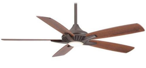
- Ceiling fan: We presume you have a ceiling fan with a light for a reason, so we went and looked for one that could provide the functionality you need but that lookedTo continue adding warmth in the space, we found the Minka Aire F1000 ceiling fan — you can get it on Amazon (affiliate link) in three colors. We like the streamline look, and we liked it in bronze to coordinate with the wood tone of the cabinets. Note: There are a lot of reviews also on Amazon, which can be helpful to a degree. One commenter says you can also get this fan, $70 cheaper, at Home Depot, it’s the Petersford. But there’s only one brite metal finish, and the design is a bit different; nah.
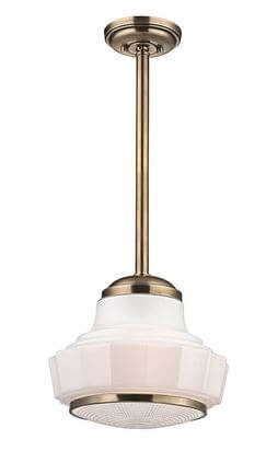
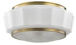
- Ceiling and pendant lighting: Alan had mentioned wanting can lights, but Pam has become wary of this idea ever since reading Martin Holladay’s 10 Rules of Lighting. Holladay wrote, “The U.S. is cursed by a plague of senseless recessed can fixtures…. Recessed cans do a great job of illuminating the floor, but they keep your ceiling dark.” So, instead of cans, we went looking for a ceiling light fixture — ambient lighting — that would get the light out and about more successfully. Then we found a matched pair of Hudson Valley Lighting light fixtures from lightology — the Odessa flush mount style and coordinating Odessa pendant light — both in a warm, gold-tone which continues to add visual warmth (bringing the gold of the cabinets up to the ceiling) — and light — to the kitchen. We quite like these Odessa lights for a prewar or sweetheart 1950s kitchen or a kitchen with deco lines.Reader Robbie Kendall added this helpful tidbit about being mindful with the lighting: First things first, I would start with the ceiling kitchen and work my way down: rather than the two hanging fixtures and fan that are there now, I would replace these three items with three identical up-light fixtures that bounce the light off of the flat (or eggshell) white ceiling using spectrum corrected bulbs. And if these fixtures were copper, so much the better. Also, I know that Pearl Paint, in New York, used to carry a white paint imported from the Netherlands that had a very slight blue tint to it so that as it aged, the yellowing counteracted the blue and the white became purer over time. My point here is that with these, beautifully, overpowering walls, it is best to let the look be highlighted by pure spectrum lighting and not degraded by standard yellowed tungsten or too ‘clinical’ compact fluorescent bulbs.
. - Vintage dinette: ‘Most nothing makes a kitchen homier than a vintage dinette. There looks like there’s room so how about obsessing to find something like this deep green table and chairs from our uploader. Alternately, reader Heidi Swank chimed in with this tip: Kitchen Table: The one end of the kitchen with the cool radiator/vent cover calls out for a high kitchen table with two stools. A high table wouldn’t obstruct the heat flow but would give that end of the room something to do.
. - Accessories: Finally, adding homey accessories that repeat the main colors in the space — red, green and even the yellow pulled from the valances — will help finish off the look and create a cohesive space. We found delightful vintage fruit canisters on Ebay, classic FiestaWare in Scarlet Red and Sunflower Yellow and of course, everyone’s favorite — the red KitchenAid mixer.
.
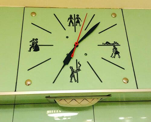
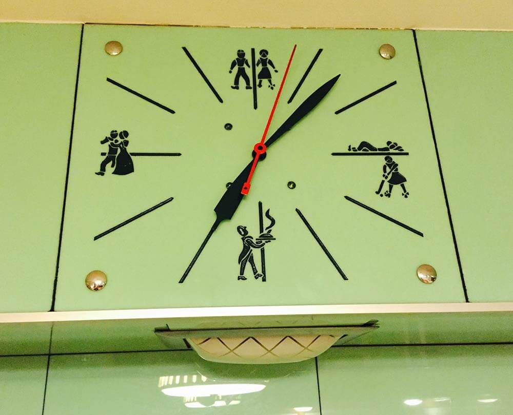
And reader Dan had these two good points regarding the decor in Alan’s kitchen: It looks like that sash window opens onto another room. Let’s fill it in with display shelving….I’d love to see the figures on the clock used somehow. Perhaps similar figures could be silk screened on fabric for window treatments!


Tisha says
Based on Alan’s comments, I don’t think he’s wedded to the cabs as-is, so I’m going to suggest that the bottom cabs be painted black. I agree with Diane in CO (I’m in CO too!) that the orange of the cabs is not good with the red (or the green tile IMO). I love the black and green combo in the laundry room, think maybe it would be good to spread that into the kitchen more. Would also make it a bit more modern, although I’m in the white appliance camp, if for no other reason than stainless is very “morgue” to me.
Virginia says
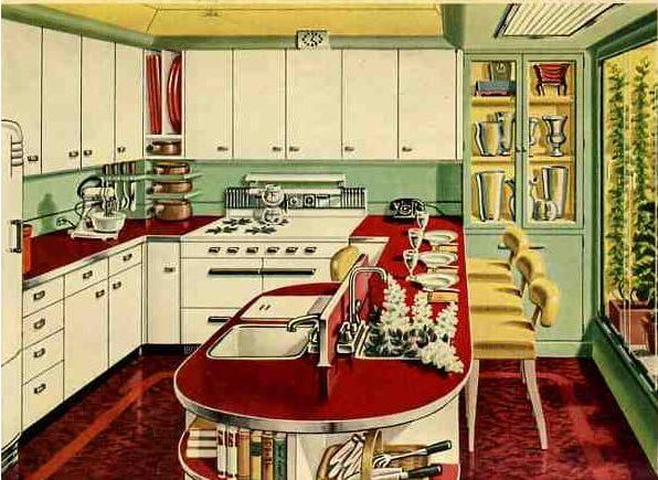
I found this gorgeous image of a kitchen in one of those dreadful “Rules for ’50s Housewives” lists. The use of red and green together really pops!
http://cdn9.littlethings.com/app/uploads/2015/11/wife-11-600×723.jpg
(You can read the whole dreadful article, and look at the other great pictures, at http://bit.ly/1Mmo08o .)
Scott says
Love the green and never understood why the companies doing retro color palettes in matching sinks and toidys always seem to skip over it. Green seems like it would be a much easier sell than yellow or gold.
Joe Felice says
Just wondering why red for the floor. Room looks too “Christmassy” to me, but then, I simply do not like red. Also, I would bring the color of the chairs into the room by making the counter top the same color, and maybe even painting the soffit to match. I like the light fixtures, but I’d ditch the ceiling fan. Homes back then simply did not have ceiling fans, so, to me, they look out of place. A retro counter-top or floor fan would look more authentic. The valance is a nice touch, but a little-too long. I am not a fan of wood-slat blinds. I would have used a swag curtain, as these were popular back then. There is simply too-much wood in this room. I normally decry painting over stained wood, but, in this case, I’d paint the trim. Maybe a dark green. And finally, chrome switch plates and outlet covers throughout the room.
pam kueber says
Red is the opposite of green on the color wheel. A natural complement… that, along with the other reasons I detailed in a comment. Like 7 more reasons or something!
tom says
I think most people agreed the red was not the favorite color for these incredible green tiles.
Red takes control of the room when the true star of the room should be the green Vitralite tiles.
It shocked me too to try and downplay the beauty and importance of such a cool tile.
Lizzy says
Don’t get the ceiling fan – it’s out of place for the period, and they’re just plain hideous! Especially in brown cause they these huge visual lumps crowding the room. Later additions cause so called “energy efficiency”, but they aren’t. Try cooking with one going, it literally blows the heat off the pots.
You can get a tiny, super high efficiency table fan that’s not only period right but works much better at a Walgreens. Or where ever. Since it’s directional, it will stir the air while not blowing all the heat off the stove and pots. You can aim it to do exactly what’s needed, and these are powerful little things! At about 12′ x 12′ the ones I have are unobtrusive and work much better than those big ugly dirt catchers. Here in the Deep South we use ceiling fans – on porches. It takes a very high ceiling to have them work properly and they still catch a ton of dirt and blow even more all over.
Now this is mostly an opinion, but still, it does negate all that time and energy (electric or gas) put into cooking. Past that, the kitchen looks great! All those citrusy colors are marvelous.
priscilla says
This is a great article
http://www.decopix.com/the-vitrolite-story/
lynda says
Thanks, very good article. So I wonder which green color is in the kitchen above?
priscilla says
Jade or Tropic green. It looks darker or lighter depending on the photos.
Jeanette Ranow says
For cleanliness, never put a ceiling fan in the kitchen! Please!
Cynthia says
Agree – no paddle-style ceiling fans in kitchens. Also, the ceiling is too low for a fan.
Mary Elizabeth says
I have a ceiling fan in my kitchen, and it doesn’t create any health/sanitation problems. I “Swiffer” the dust off the fan regularly and take off the paddles twice a year to wipe them down with vinegar and water.
The fan is centered over the kitchen island, so there is no problem with the ceiling height. Centering it over a table would also work.
I really need that fan in the kitchen, as there is no AC in there and no suitable place to put one. Also, there isn’t sufficient counter space to set up a portable fan near the work area.
jivesnake says
I’ve got a fan in my kitchen too with no problems. In Texas you need a fan in every room 🙂
Robbie Kendall says
I have been looking at both the ‘Before’ and ‘After’ posts over the weekend and find that it is so great that we can come here and opine on this. Thank you (!), Pam, for creating this blog, and to you too, Kate, for being part of it.
The only way I can state how I feel about the ‘After’ ideas, which I really enjoy, is to say what I would do if this were my kitchen and I was presented with this design concept. So, first things first, more RED. Love the floor – perfect. Why not bring in more with the table and chairs, too? The patterned fabric valance is the perfect choice as is the black countertop with the stainless steel metal edging. I would then, repeating myself from ‘Before,’ use copper countertop appliances rather than the red and gold currently suggested and go with a stainless steel stove and ventilating fan to match the style and brand of the current refrigerator. I usually love white appliances – not here for some reason. I find it too much contrast with the cabinets and it picks up on the one bad architectural element in the space which is the white vinyl window.
jivesnake says
How about a Formica countertop in Red Ellipse? Black looks just like those acid resistant black counter tops they always have in labs.
lisa in seattle says
Wilsonart tip: go to their website and order large samples of the laminates that interest you. They will send you 8×10″ samples at no cost to you! It is impossible to understand what the laminates really look like from the website, and pretty difficult from the tiny samples available in home centers (also, no one carries the full line in samples). What I found was that the finish on the laminate made a huge difference; probably even more than the underlying image. Alicante was attractive online, but has a textured finish that didn’t appeal to me in real life. Most of the stone-look laminates seem to feature this “3-d” finish which from a distance does make them look more realistic. However, we see our kitchen counters up close every day, and in my opinion the 3d looks odd when you are closer to it. My two faves were Oiled Soapstone and Rustic Slate, two of their matte finish options. There’s a very pretty marble-look also available in matte. I loved the few high gloss options as well, but was a bit concerned about fingerprints. We went with the soapstone.
pam kueber says
Thanks for these tips, Lisa! Yes, they have some patterns which are “embossed” — that is, a plate stamps the sheet some time during production to give it “realistic” ridges. This may or may not appeal to readers. Note: This embossing process is newer — so if you want “retro” — get a glossy or matte finish. Re high gloss: More so than fingerprints, my concern would be scratching, which will be more visible on a glossy surface than a matte surface. That said, in way back time, I am pretty sure the finishes were high gloss.
lisa in Seattle says
I ordered a large sample of one of the high gloss options and tried to beat it up. In my very unscientific tests, scratching wasn’t an issue, but greasy fingerprints were. I’d advise anyone considering any of the finishes to get a sample for themselves and play around with it using their normal kitchen equipment. The high gloss was super-pretty and was one of the more retro-looking options. I also got a few wood-look samples and found they looked really different from online (some better, some worse), and again it was the embossed ridges that eventually turned me away from that idea.
pam kueber says
Thanks, Lisa! Yup: Samples ESSENTIAL!